
Two common charting techniques in Tableau are shared and dual axis charts. They are both great when wanting to compare data points; save (dashboard) space and highlight relationships. But...
TC23, this year's Tableau conference, has been over for a while. Some 8,000 members of the #DataFam gathered in the wonderful world called Las Vegas....
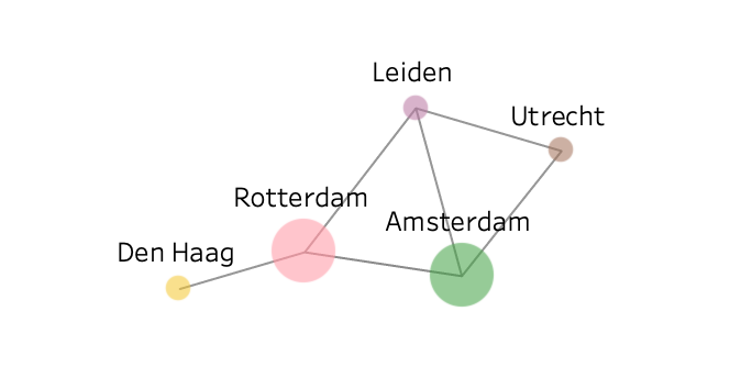
A network graph (also known as a link chart, a node-link diagram, a network map, or just a graph) represents a collection of interlinked entities. This type of graph...
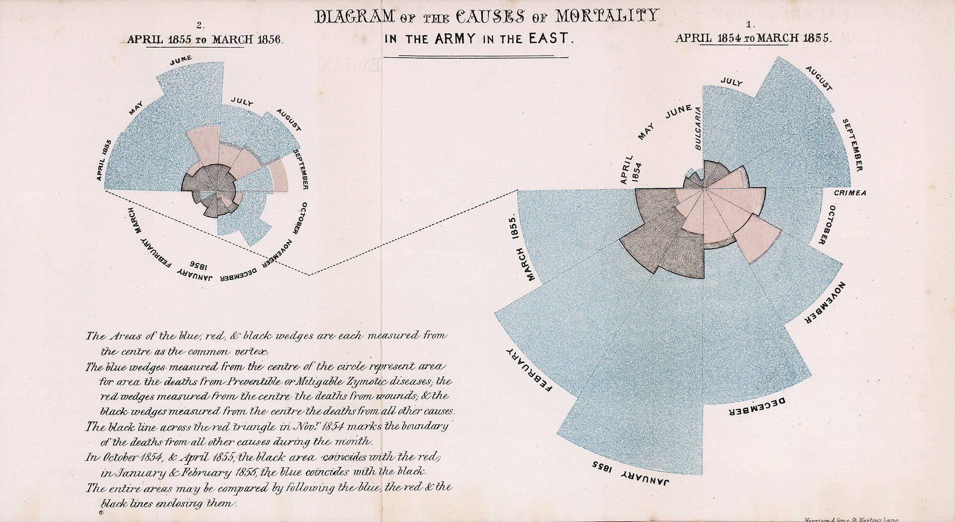
Tableau, Power BI, Qlik Sense, visualizing data has never been easier or more widespread. Yet data visualizations are not exactly a modern invention. In fact, the ancient Egyptians...

Our brain has a wonderful third memory system in addition to short- and long-term memory: sensory memory. In my previous blog, I showed how this memory helps us recall important information at lightning speed and...
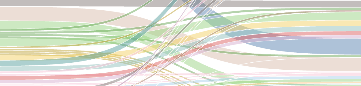
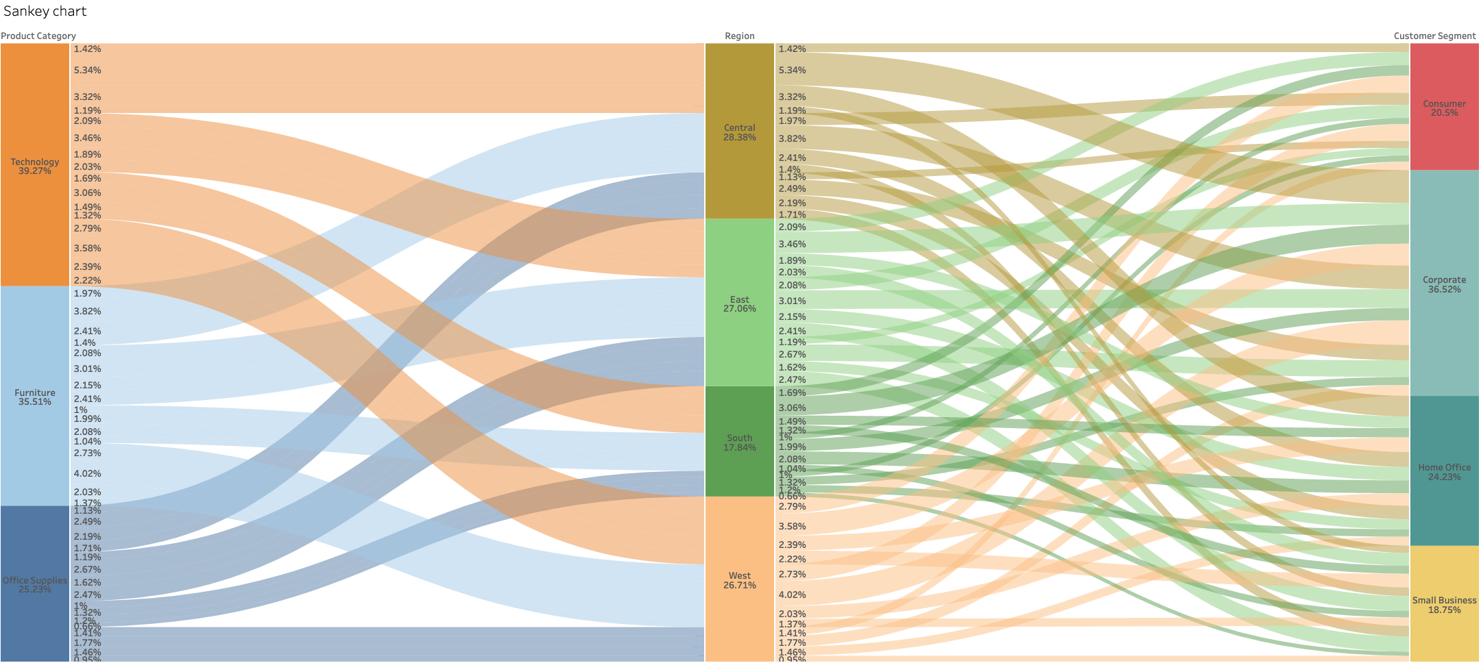
Sankey diagram on Tableau eLearning data to visualize the repeated Courses in various Role Path curricula; how to get Role Badges faster.
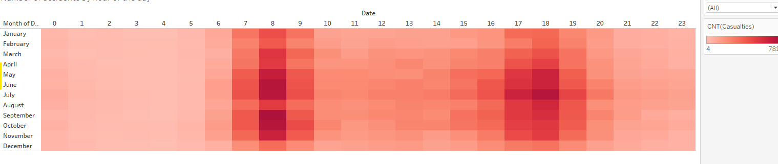
Combining times: a heatmap with two time axes Every organisation talks about growth, developments, trends. So you can compare the turnover of different years to find out what...

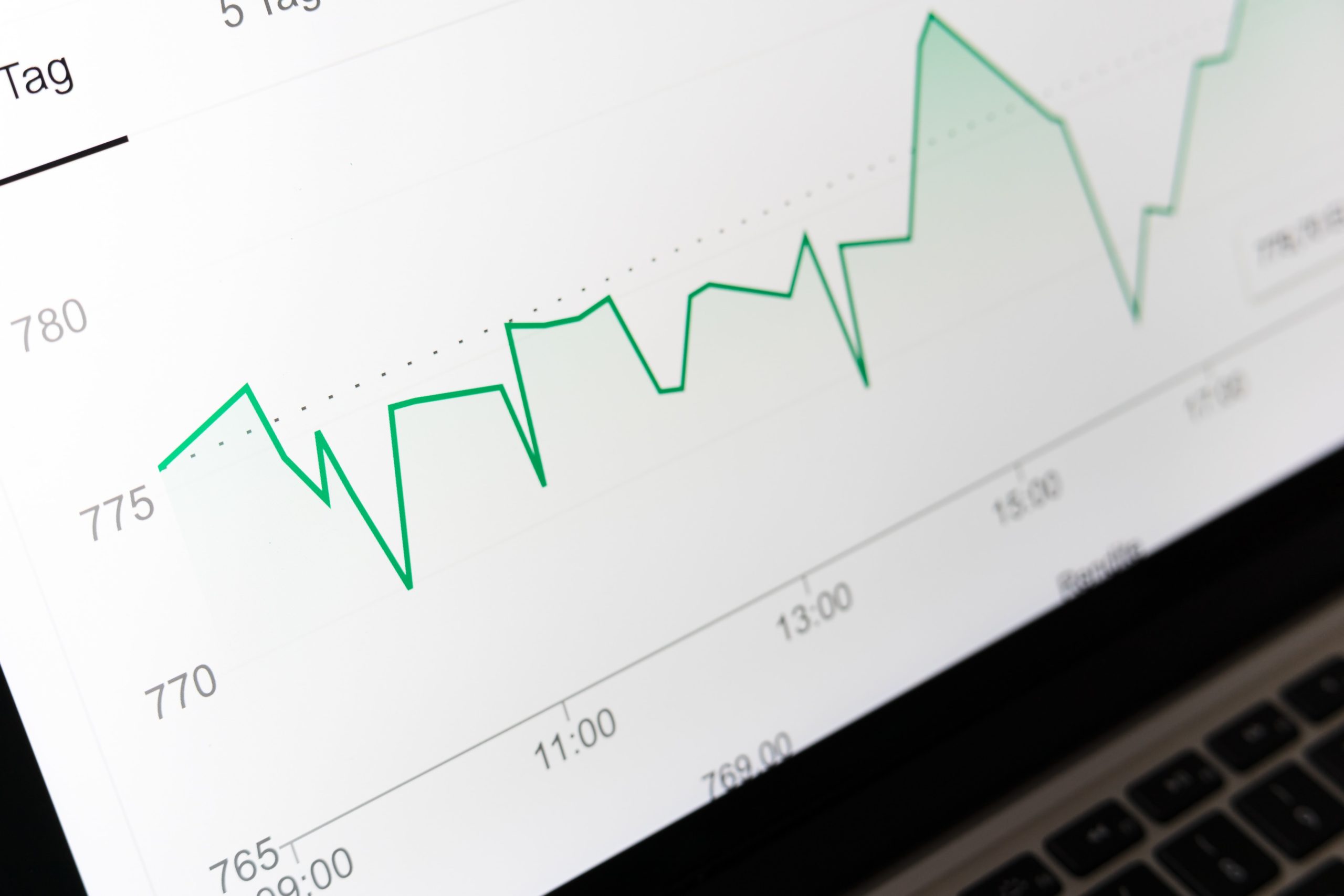
Time is a complex concept, even before you bring in Einstein's theories. Yet time is indispensable if you want to show developments or trends in your dashboards, or periods...

The dataset we will examine, taken from A century of weather in The Netherlands on Kaggle, covers 120 years of observations made in De Bilt, the KNMI base office,...