
Two common charting techniques in Tableau are shared and dual axis charts. They are both great when wanting to compare data points; save (dashboard) space and highlight relationships. But...
TC23, de Tableau conferentie van dit jaar, is alweer even achter de rug. Zo’n 8000 leden van de #DataFam kwamen samen in de wonderlijke wereld die Las Vegas heet....
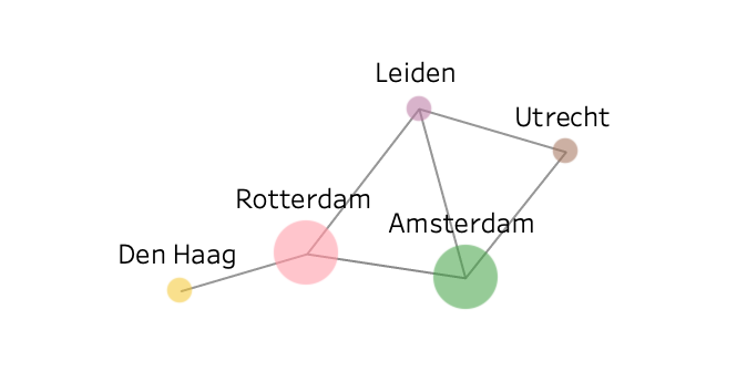
A network graph (also known as a link chart, a node-link diagram, a network map, or just a graph) represents a collection of interlinked entities. This type of graph...
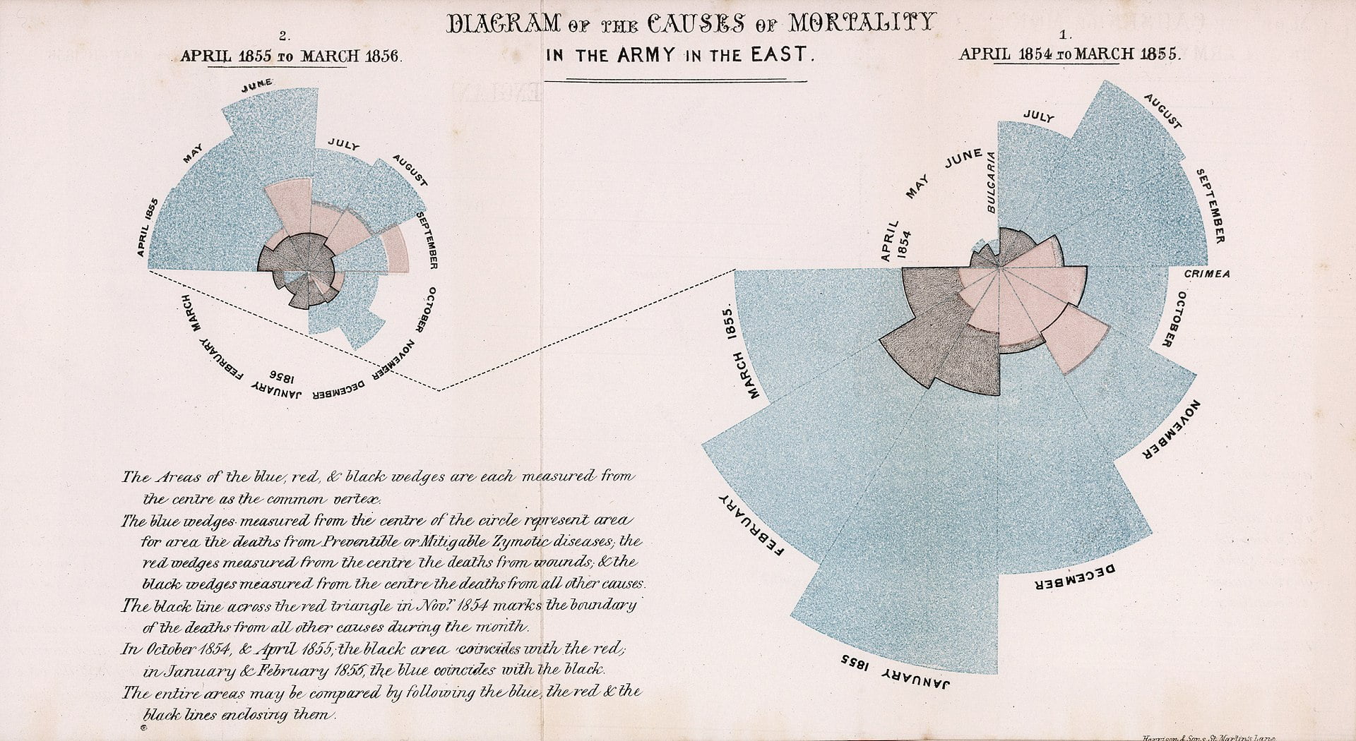
Tableau, Power BI, Qlik Sense, het visualiseren van data was nog nooit zo gemakkelijk en wijdverspreid. Toch zijn datavisualisaties niet bepaald een moderne uitvinding. Sterker nog: de oude Egyptenaren...

Ons brein beschikt over een wonderlijk derde geheugensysteem naast het korte- en langetermijngeheugen: het zintuiglijk geheugen. In mijn vorige blog liet ik zien hoe dit geheugen ons helpt razendsnel belangrijke informatie te...
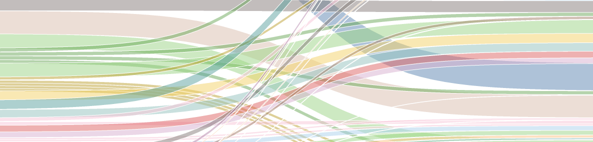
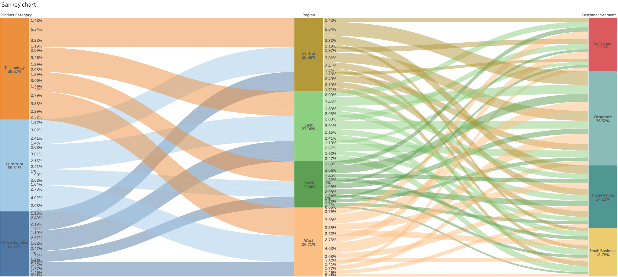
Sankey diagram on Tableau eLearning data to visualise the repeated Courses in various Role Path curricula; how to get Role Badges faster.
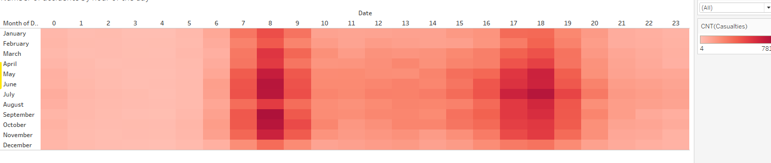
Tijden combineren: een heatmap met twee tijdsassen In elke organisatie gaat het over groei, ontwikkelingen, trends. Zo kun je de omzet in verschillende jaren met elkaar vergelijken om te...

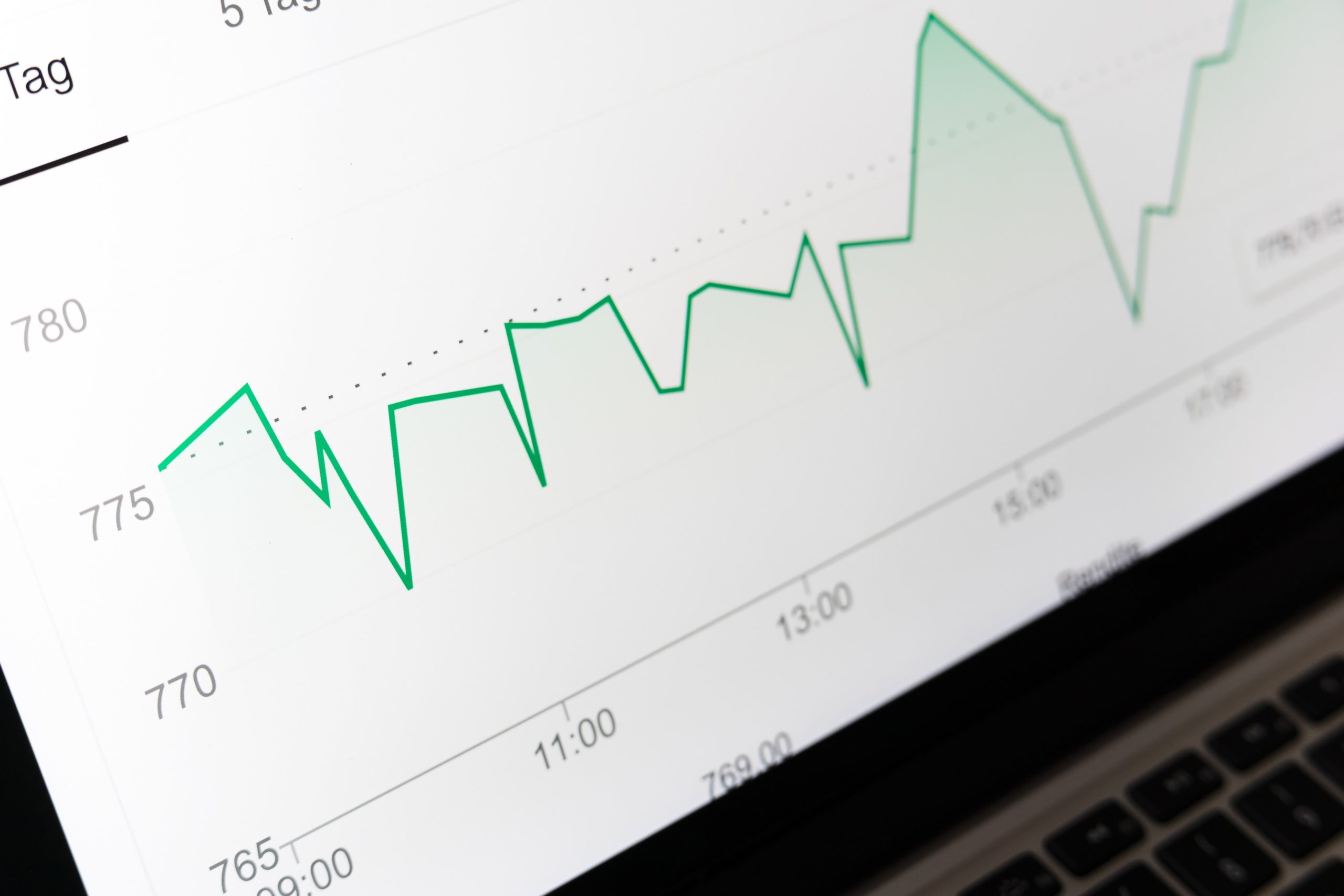
Tijd is een complex begrip, zelfs nog voordat je Einsteins theorieën erbij haalt. Toch is tijd onmisbaar als je ontwikkelingen of trends wil weergeven in je dashboards, of periodes...

The dataset we will examine, taken from A century of weather in The Netherlands on Kaggle, covers 120 years of observations made in De Bilt, the KNMI base office,...