
On the last day of the first quarter Tableau released 2022.1. And there are some very good features in it. But my two favourite parts are...

As Tableau evolves in your company over time, there will need to be some adjustments made to your sites. This is called site management. Site management consists of a...
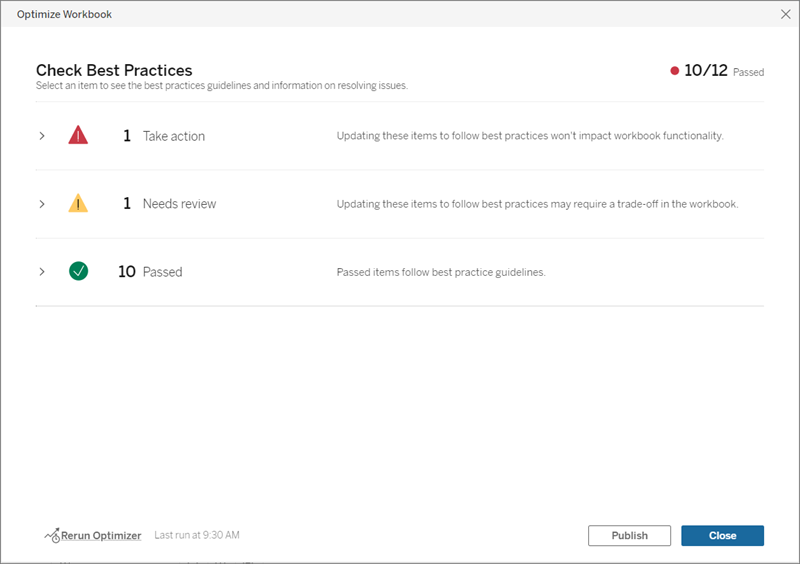
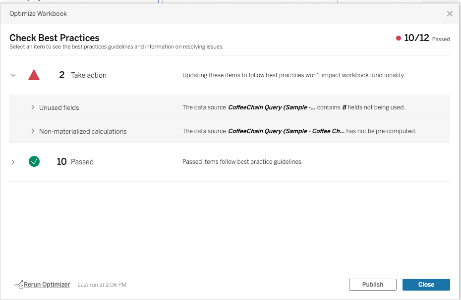
"What can I do to improve Tableau's performance?" is a question that comes up a lot at The Information Lab. The power of Tableau is that visualisations...
Have you been working on a nice dashboard, want to be able to filter on two (sub)dimensions, suddenly you are looking at a blank screen! If you know that the...
After a long slog, your visualisation is ready. Informative, intuitive, clean and... boring? Tableau's white background is practical, but not always the most visually appealing option. How do you add...
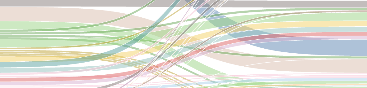
Sankey diagram on Tableau eLearning data to visualize the repeated Courses in various Role Path curricula; how to get Role Badges faster.
What is a slope chart? Slope charts (or graphs) are essentially a streamlined version of a line chart. Meaning that a slope chart shows the developments between two points....

This blog tells you how to Prepare and Pass Tableau Desktop Specialist Certification as a New User. At the least it provides a great list of useful links.
In my previous blog post I made an attempt to make the Logshark application more user-friendly for the MacOS user. After testing with users, it became clear that the updated...