
What is a Slope Chart?
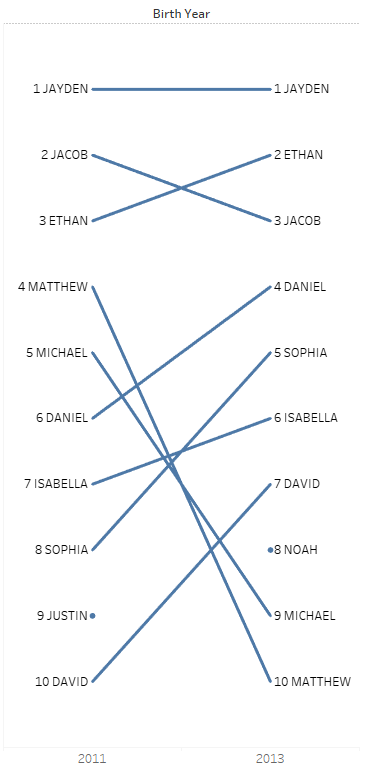
Slope charts (or graphs) are essentially a streamlined version of a line chart. Meaning that a slope chart shows the developments between two points. The slope connecting the two points in the graph is linear, with 1 out of 3 directions: upwards, downwards or same level. These charts are a good solution to communicate a story taking place in two different timelines. They look something like this:
Why Slope Charts?
There are several reasons why you might want to use a slope chart in your views, because:
- It is one of the best ways to visualize the trend between multiple instances over two periods of time.
- It is less cluttered than line charts.
- The story the data is trying to convey is easily understood.
- It is good for showing crucial aspects of business (changes in sales, costs prices,…).
- Details are not necessary to show.
How to make a Slope Chart in Tableau
To make a slope chart, make sure you have two different instances that you can compare your data with, such as a time interval, countries, or essentially two different categories. In this example, I will use two different years to compare the most popular names in the United States.
In my dataset, I have:
- Name: The baby name
- Count: the count for how many times that name has been used
- Birth Year: the year ranging from 2011 to 2014
Creating the Chart
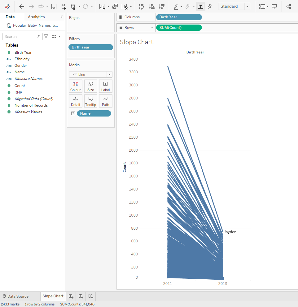
First, I will drag the “Birth Year” field into columns and have the “SUM(Count)” on the rows. Make sure you have the year field on discrete.

Remember that slope charts work for visualizing the trends between two categories. Therefore I should have a filter on year, only showing two, such as 2011 and 2013, as shown below:

The next step is to label the individual names on the view. For this, I will drag the “Name” field into the Label marks card:
After this step, it is crucial to add a rank table calculation to the “SUM(Count)” and compute using “Name“.
- Right-click “SUM(Count)” pill on columns > Quick Table Calculation > Rank
- Right-click “SUM(Count)” pill on columns > Compute Using > “Name“
This will result in me being able to visualize the the difference in the number of times a name has occurred in 2011 and 2013. Here is how it looks:
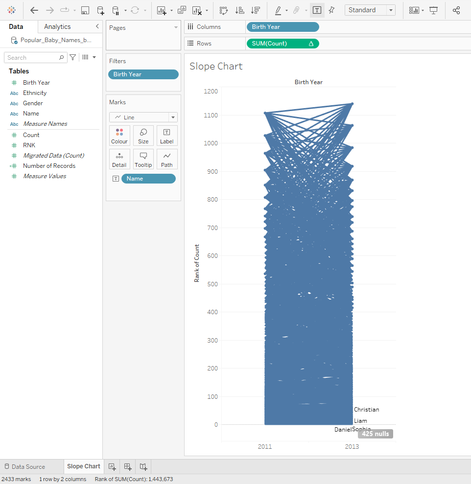
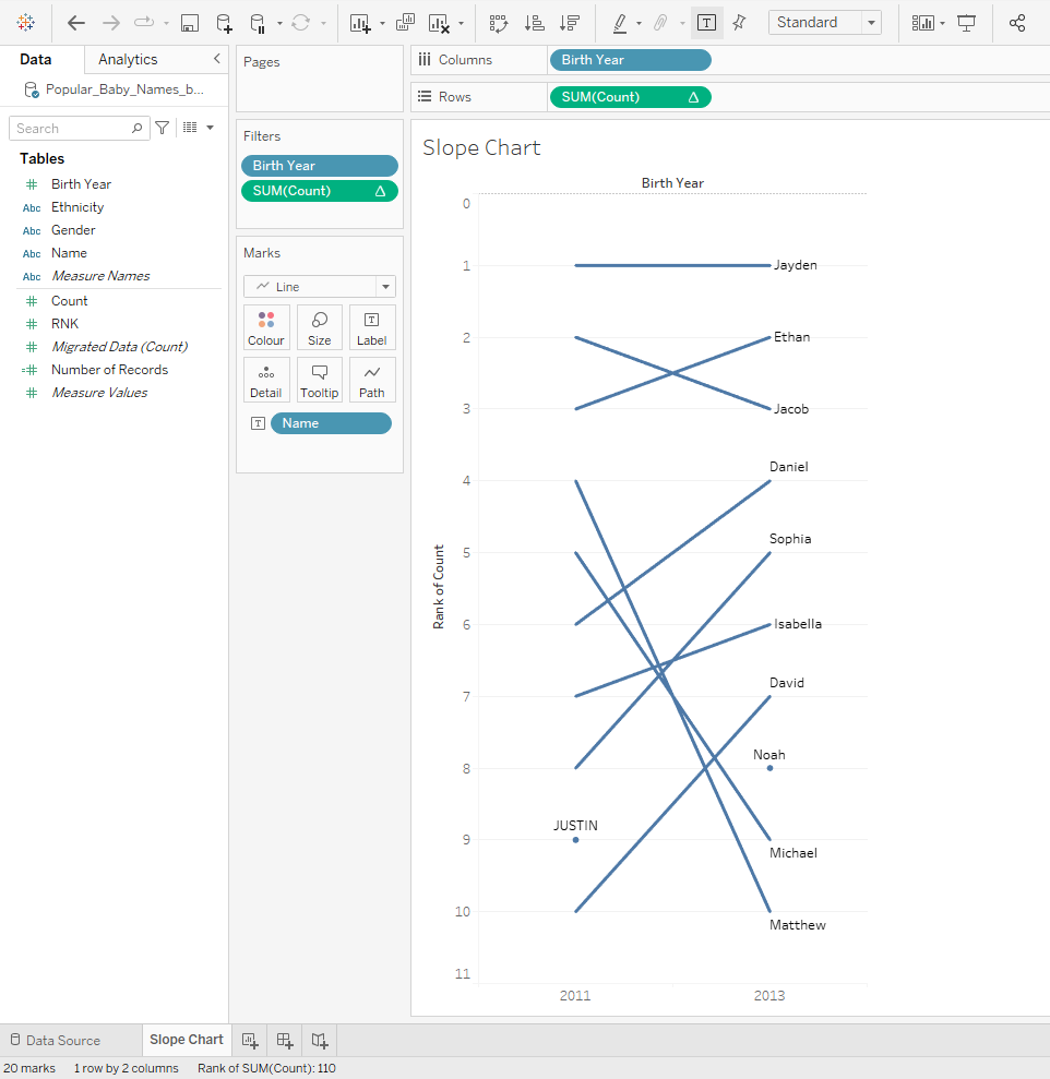
However, this chart looks really cluttered. It would be best practice to filter the names. For the next step, I will add a filter to “SUM(Count)” that ranges from 1 to 10. That way I can see the top 10 names used in the years 2011 and 2013:
- (CTRL + drag) the “SUM(Count)” pill to the Filters shelf > Select “Range of Values” > add “1” on the left text box and “10“on the right text box.
- Press OK.
- Right-click the “Rank of Count” axis > Select Edit Axis > Check “Reversed” box under Scale.
Without reversing the axis, we would see a descending order. And in normal ranking situations, number 1 is generally displayed at the top.
Cleaning the Chart
This is pretty much all the steps you need to take to make a slope chart in Tableau. However, the steps after this include cleaning of the view which I think is quite important as well.
Steps for cleaning the view:
- Edit Labels: Right-click and drag the “SUM(Count)” pill to the Label Marks card > Click the Label card and press “…” next to “Text” > Format the text to be: “
<Rank of SUM(Count)> <Name>“ - Align View: Click Label card and select “Line Ends” under Marks to Label heading > While on Label, select “Middle” under Alignment.
- Hide Axis and Grid Lines: Right-Click “Rank of Count” Axis and un-check “Show Header” > Right-click the view > Select “Format” > Navigate to “Lines” tab > Select “Rows” > Choose “None” for the Grid Lines.
Once you complete these steps, the view looks like this:
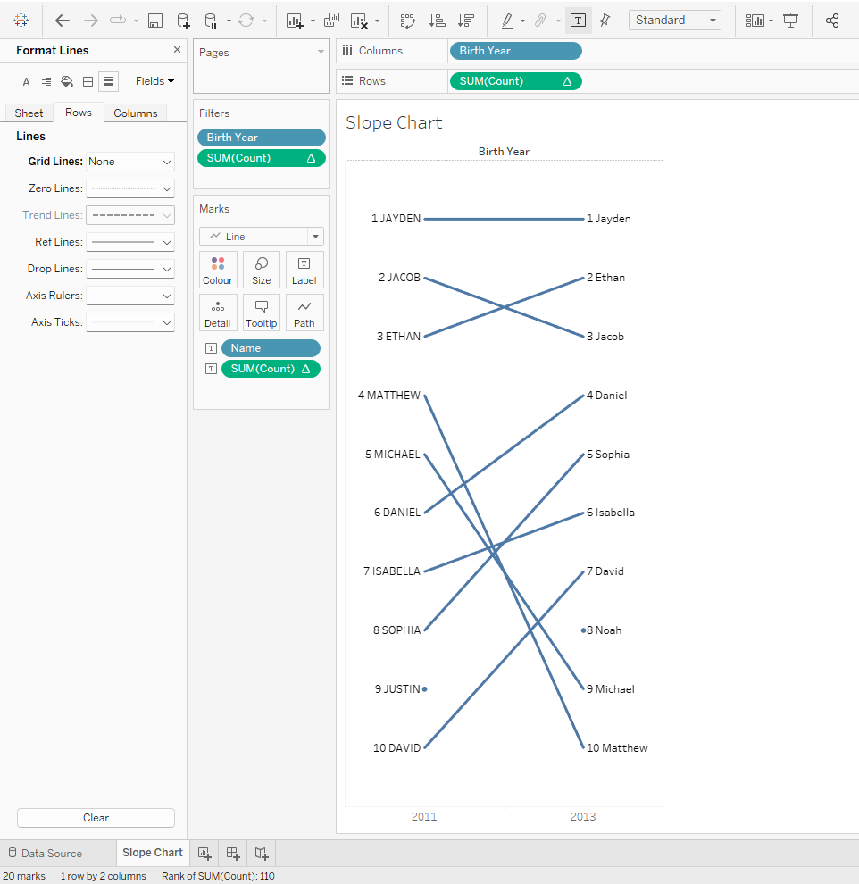
From this view, I can observe the changes that occurred in ranking of the most popular baby names between 2011 to 2013 with a glance. “Jayden” seems to be the most popular name across the two timelines meanwhile the name “Matthew” has dropped significantly in popularity from 4th place to 10th.
In this blog post, I have described what a slope chart is and why and in what contexts it can be used. I also showed you an example on how to create one yourself.
To read more blogs about Tableau and Alteryx, our training offerings and consultancy details, visit our page The Information Lab NL for more.