
Introduction
Tableau Pulse, a newly released tool belonging to the Tableau AI suite, transforms the way analytics are consumed by introducing an intelligent and tailored data experience. It stands out by making data easily accessible and understandable for all employees, including those without the luxury of time to dive into new technologies, those needing immediate insights for fast decision-making, and those curious about the underlying reasons behind their data.
This innovative tool integrates directly into users’ workflows, providing personalized data insights, context-specific analytics, and the convenience of natural language queries for straightforward data exploration.
Additionally, Tableau Pulse enhances user engagement with features that allow for goal setting, metric monitoring, detailed root cause analysis, and the application of data in real-life contexts. As part of the broader Tableau Platform, Tableau Pulse leverages trusted generative AI to elevate data analysis and insight sharing, ensuring data privacy and security remain uncompromised.
With a few weeks into the release of Tableau Pulse, all Tableau Cloud customers are now able to make use of Tableau Pulse.
After this short introduction of what Tableau Pulse is, this blog will go over how to create and use metrics and certain elements to watch out for to get the best out of this tool.
How Does Pulse Work?
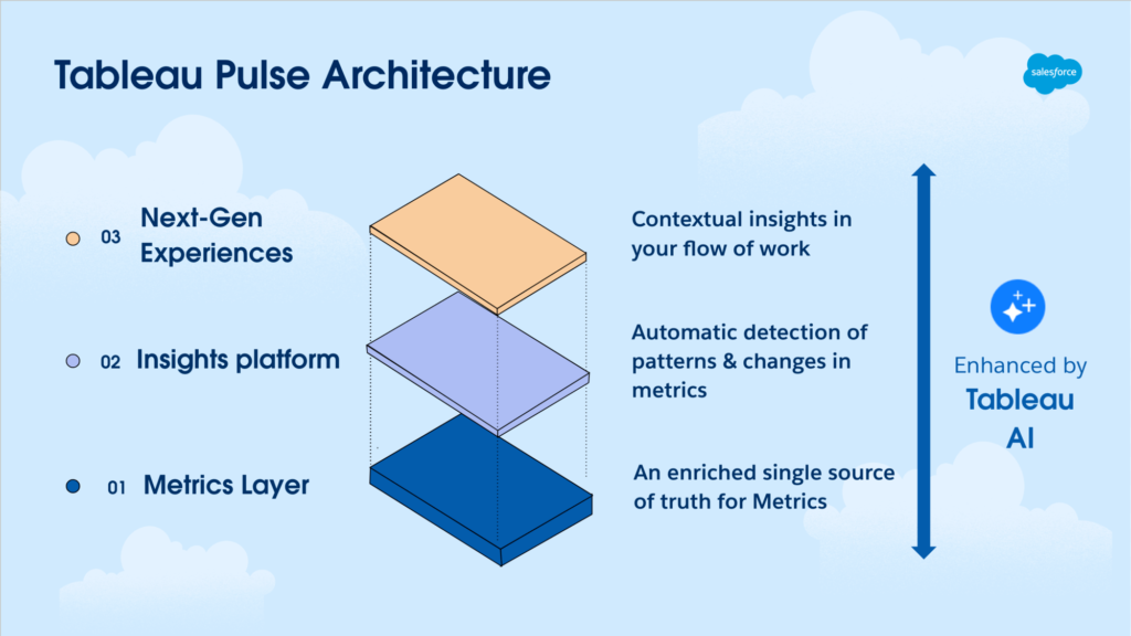
Tableau Pulse introduces the capabilities of a Metrics Layer into Tableau’s ecosystem. This allows for the centralized definition of metrics and KPIs, which can be uniformly accessed throughout the organization. It streamlines the analysts’ workflow and promotes consistency by providing a unified source of trusted data.
Built on this Metrics Layer, an Insights platform employs a statistical engine to automatically analyze defined Metrics. It evaluates and prioritizes these insights, and then articulates them in easy-to-understand language through the use of generative AI. Additionally, it prompts users with guided questions for further exploration, tailored to the specific nuances of the data.
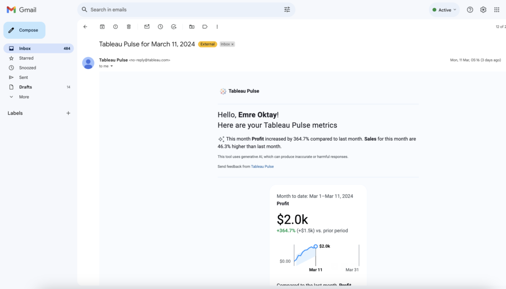
Moreover, Tableau Pulse enhances user engagement by offering Next-Gen Experiences. It makes data easily accessible in a user-friendly manner within everyday tools like Slack, email, and the Tableau web application, encouraging the sharing and discovery of metrics akin to interacting with social media. With the assistance of generative AI, it distills data into concise summaries, highlighting crucial trends, anomalies, and shifts, ensuring that key data points capture the user’s attention.
How to Build a Metric
Enable Tableau Pulse First
Building a metric from your data using Tableau Pulse is now a relatively easy experience. However, first and foremost, Tableau Pulse must be enabled from the site settings of Tableau Cloud. Note: Only users with admin rights will be able to do this.
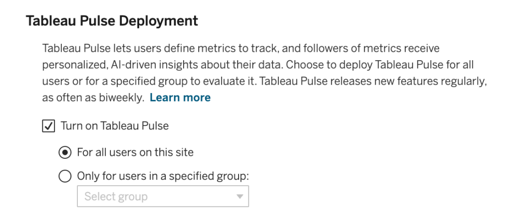
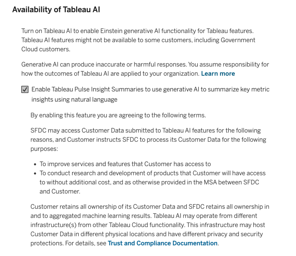
In addition to this setting right below, you can turn on Tableau AI in order to enable the Einstein generative AI functionality. This option is necessary for Pulse to summarize key metric insights in natural language.
After you enable the setting, as a Creator or Explorer, you can start building metrics. Check out the video below to see how I would build a metric using the Sample – Superstore Data Source for Sales.
What essentially is built is a line chart. Tracking month-to-date values of the selected measure across a date field by default. Additionally, dimensions can be added to deep dive into further insights.
After the metric is built, it needs to be followed to show up on your main page.
How to use Metrics
Now it is time to get to how we can use the metrics. The main change that comes with Pulse metrics rather than the deprecated metrics, is that now you can interact with the metric. In the form of changing filters and asking questions to the metric to get further insights.
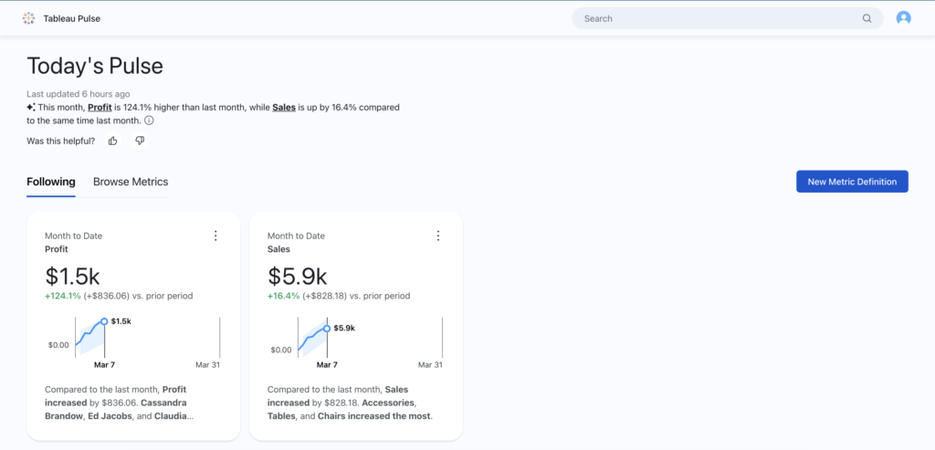
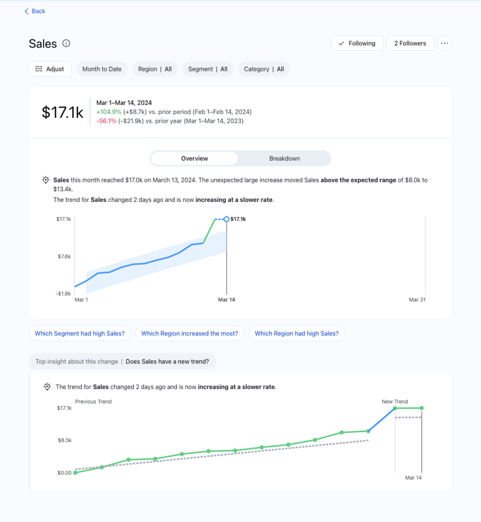
Within the metric, we can see:
- The top section: where we change the date logic and filtering options.
- The KPIs: The prior period and prior year comparisons along with the final value as the big number.
- The Overview tab, where we have a summary and a line chart highlighting trends within the date logic specified.
- The Breakdown tab will show us a bar chart with the breakdown of the metric with the specified dimensions.
- Preset questions where we can query the metric to give us back the answers with natural language and visualizations. Each question asked gets stacked.
Here is a short video showing the use:
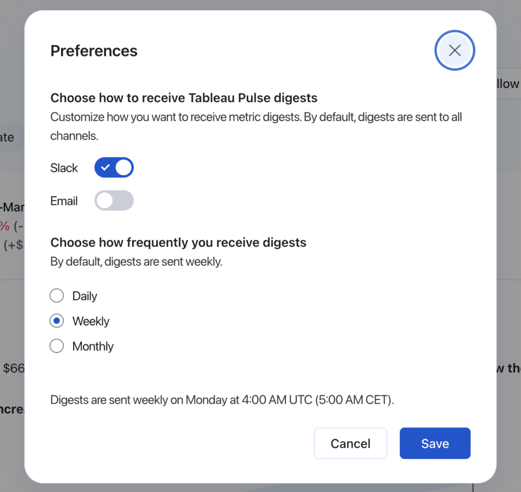
In addition, to get the next-gen experience, a digest from the following metrics can be directly delivered to Slack and/or email. The preferences can be set from the person icon on the very top right corner of the page.
Important Considerations
One of the most important considerations to have is firstly how should the data be prepared to get the most out of Pulse. In other words,
What are the Data Source Requirements?
- It is a single published data source. Embedded sources in workbooks will not work.
- You have the connect permissions to the data source.
- The data source contains:
- A measure to be aggregated.
- A time dimension. Attention, tableau pulse tracks values through time. Therefore a single point in time values will not produce a valid metric. It works best with regular data (daily, weekly, monthly) rather than sporadic (quarterly, yearly).
- At least one dimension is used to filter and to produce insights.
Making Metrics from Aggregated Measures is not the Default
If you try to make a metric tracking a pre-aggregated measure in the form of a calculated field, you will get a 400: Bad Request error. The workaround for this is to create a “Create Advanced Definition”. The Advanced definition window might be more familiar to Tableau users since it features the classic Tableau UI. Check out the video below for the problem and the workaround:
The advanced metric creation can also be used for pre-filtering dimensions as well with the filtering pane.
Changing Metric Definitions will Spawn New Metrics
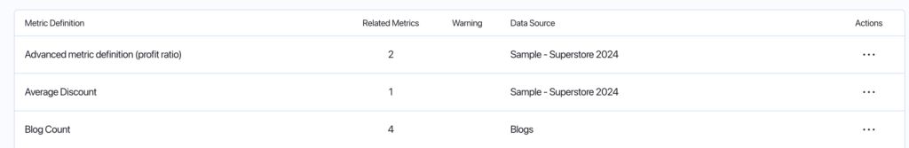
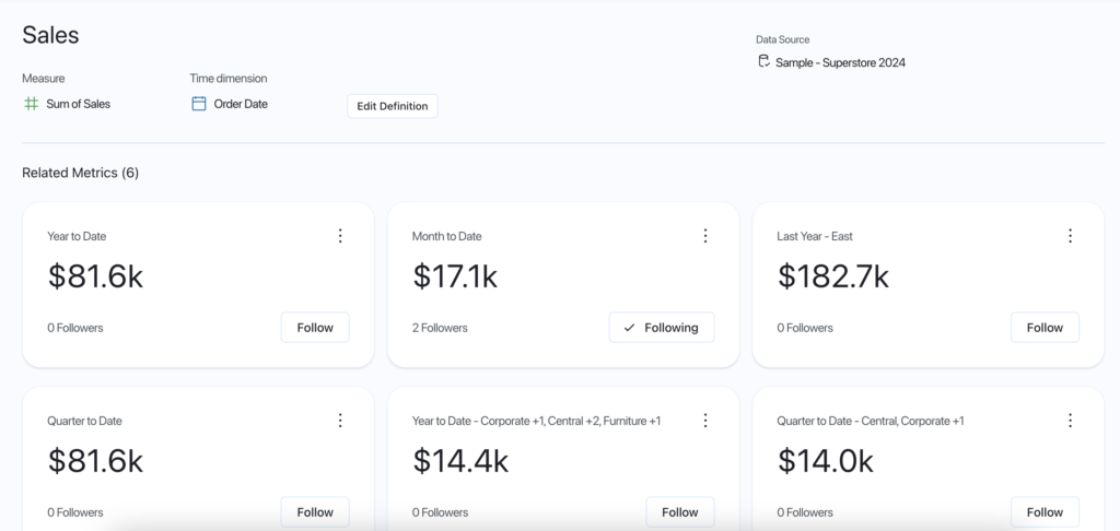
After an initial metric is created, that is considered to be the parent metric. Every time the metric changes in terms of the filtering and date logic. A new child metric is created. That is why in the “Browse Metrics” section on the home page, you can see a column showing “Related metrics” as well. This is a positive to tailor different metrics to users. However, currently, there is no option to delete the child metrics. Only the parent metric. Where when deleted, all the child metrics will be deleted along with.
Security Considerations When Using Tableau AI
Tableau Pulse makes use of the Tableau AI. Tableau AI leverages the advanced capabilities of generation AI (GAI) that enable machines to understand patterns, learn from data, and create something entirely new. Other Tableau functionalities have used Tableau AI such as Explain Data, Ask Data, and Data Stories.
On the topic of security, a major concern arises in the area of company data being used to train the AI models. Tableau and Salesforce ensure that this is not the case with the use of the Einstein Trust Layer. The Trust layer uses techniques such as data masking to strip sensitive data processed by the Large language models. model generations are also scanned for toxicity and bias as well as audited.
Once an external model processes a prompt, both the prompt and the resulting generation are immediately forgotten, with no data being stored or retained under any circumstances.
What is in the Future of Pulse?
All things considered, Tableau Pulse is still relatively new and hot. Therefore I suspect there is going to be a lot of attention to grow and improve the product further. As it is also said from Tableau: Throughout 2024, Tableau will release additional features that will provide even more value to those using Tableau Pulse, including:
- Goals and thresholds for metrics
- Additional analytics and insights
- Additional metrics types (e.g. fiscal year support)
The list will most likely grow from the feedback that Tableau will receive from their customers as well.
Thank you for reading this blog. Also check out our other blogs page to view more blogs on Power BI, Tableau, Alteryx, and Snowflake here.
Work together with one of our consultants and maximize the effects of your data.
Contact us, and we'll help you right away.