
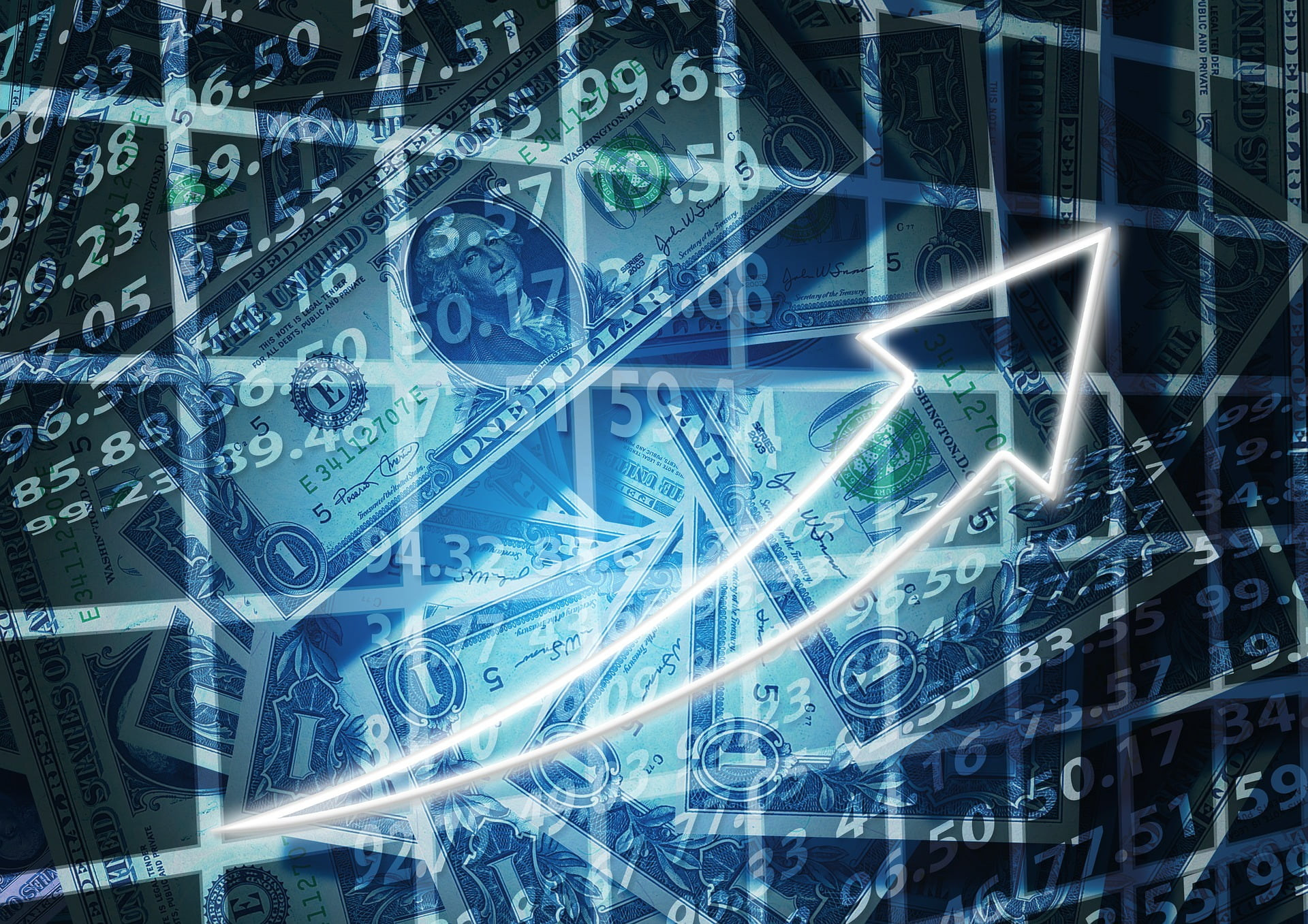
How to create your own personal Tableau Currency Exchange Calculator using Google Finance API and Google Sheets.
Colours are powerful tools for anyone who creates dashboards! Our brain registers colours long before the form and content of texts. Tableau, of course, already has a considerable...
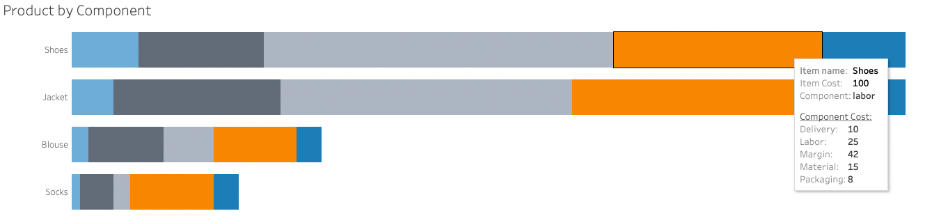
This article illustrates the risk of data redundancy and how to resolve it using Tableau Prep and create an insightful Vizualisation or Dashboard

After a long slog, your visualisation is ready. Informative, intuitive, clean and... boring? Tableau's white background is practical, but not always the most visually appealing option. How do you add...
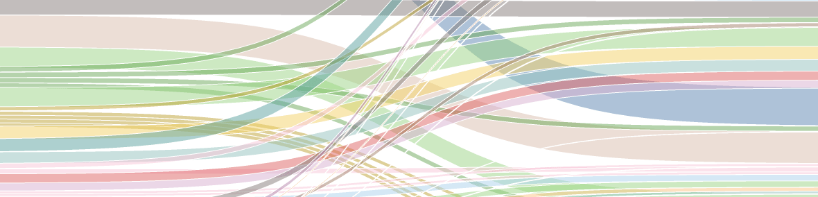
Sankey diagram on Tableau eLearning data to visualize the repeated Courses in various Role Path curricula; how to get Role Badges faster.
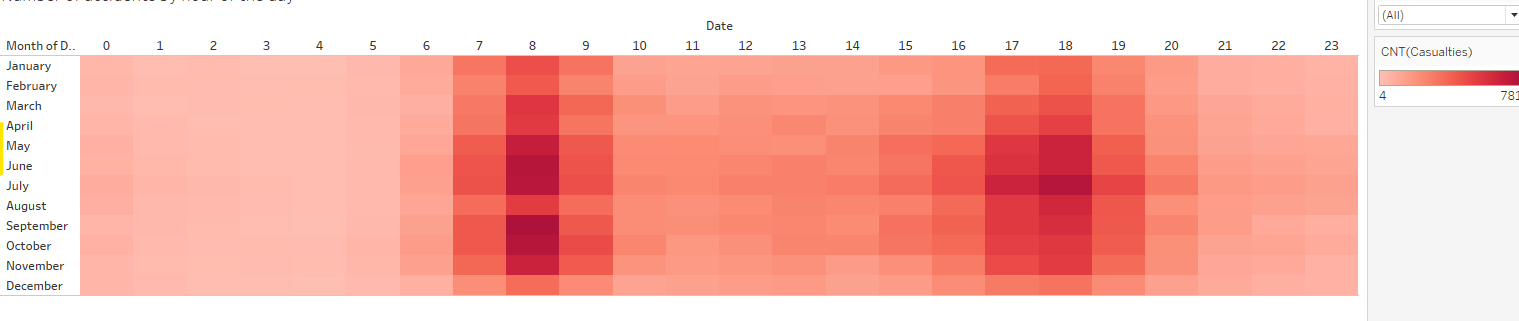
Combining times: a heatmap with two time axes Every organisation talks about growth, developments, trends. So you can compare the turnover of different years to find out what...

You have just created two worksheets in Tableau Desktop and merged them into a dashboard. Now you want one of the visualisations - when you click on a data point there...

Time is a complex concept, even before you bring in Einstein's theories. Yet time is indispensable if you want to show developments or trends in your dashboards, or periods...
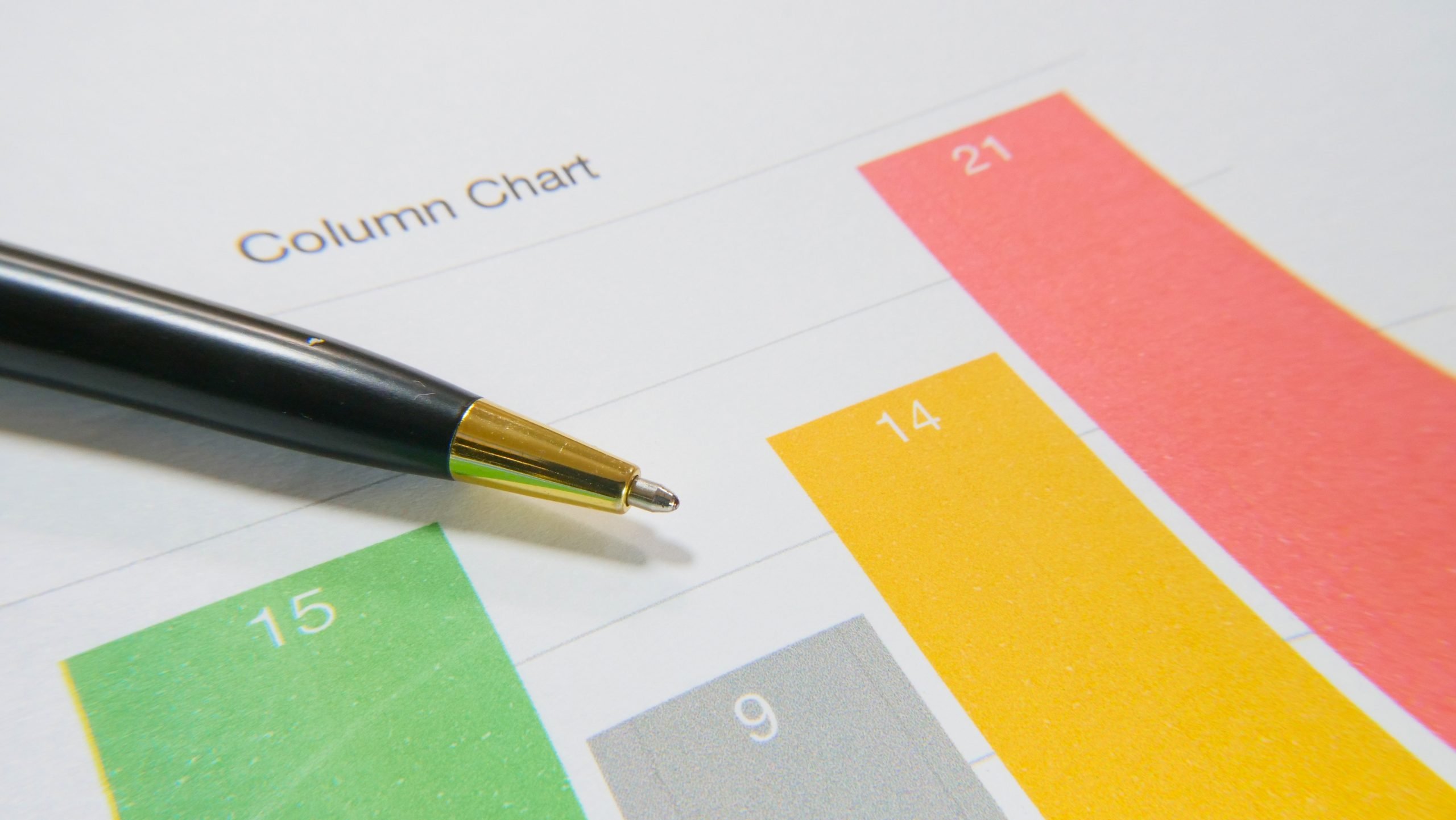
Bar charts (or bar graphs) are considered one of the most common ways to communicate data through visualizations. They are used for plotting categorical data. Simply put, bar charts...