
Bar charts (or bar graphs) are considered one of the most common ways to communicate data through visualizations. They are used for plotting categorical data. Simply put, bar charts consist of rectangular bars where each bar represents a category with their heights/lengths representing a specific value.
However, there is not only one type of bar charts but several, each is more useful in their way to describe the data that they are working with.
In this blog post, I will talk you through the different types of bar charts and go through use cases and advantages for each type. I am using Tableau Desktop to create my bar charts and the “Global Superstore” sample data.
Vertical / Horizontal Bar Charts
Horizontal and vertical bar charts are the most classic type of bar chart. In a vertical bar chart, the categories are listed in the x-axis of the graph with the values on the y-axis. And in the horizontal bar chart, they are switched. Here are two examples of vertical and horizontal bar charts:
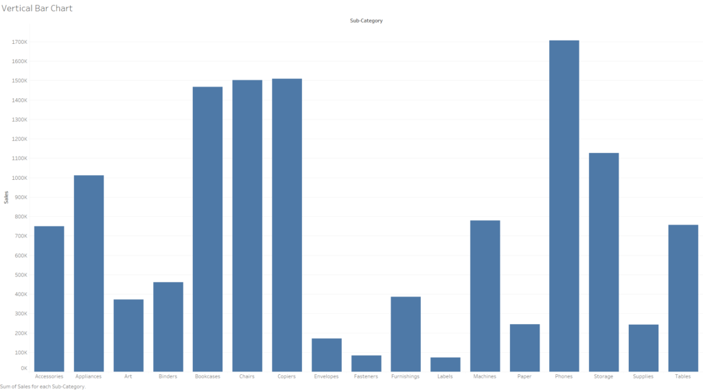
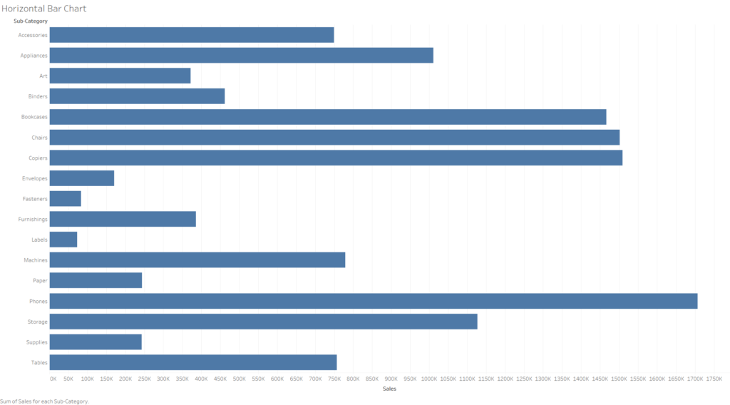
Here, I have plotted the sum of sales with each sub-category of items. They both communicate the same message of comparing the sales of each sub-category with each other. Most of the time, choosing between the two comes to personal preference. Or for design purposes for creating dashboards to see which variation will fit the overall look the best. However in some cases, they both have their advantages.
Advantages of Vertical Bar Chart:
- Better at displaying negative values.
- Works better with Ordinal data.
Advantages of Horizontal Bar Chart:
- Longer label names are easier to fit in the chart.
- More categories can be displayed easier.
- Could work better with Nominal data.
Stacked Bar Chart
Technically, the horizontal and vertical divide discussed above apply to all types of bar graphs. The stacked bar chart is no exception. In a stacked bar chart, one bar is divided into two or more sections using different colors. It is mainly used to break down and compare sections of a whole. Pretty much adding categories within categories. Here is an example:
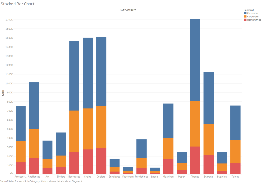
In this example, I have used the same fields of “Sales” and “Sub-Category” for the bar chart examples before. However, I added the “Segment” field to create categories within each bar. This way I can see which proportions of my sales for each sub category are divided between the segments of “Consumer, Corporate or Home Office”.
Side-by-side Bar Chart
Another variation of a bar chart is the side-by-side bar chart. This type is very similar to the stacked bar chart discussed above where both types add another categorical dimension into the visualization. But, in the side-by-side bar chart, the second dimensions within a category are not stacked on top of each other, but displayed side-by-side. Here is an example of one:

The main difference between the side-by-side and stacked bar graphs is that the side-by-side graph shows the values in separate bars within a category. But what are the advantages and disadvantages?
Advantages of stacked bar charts:
- Easier to understand what proportions of a whole are divided between segments.
- Visually aggregates each proportion.
Advantages of side-by-side bar charts:
- Easier to compare heights of each individual entity.
- Better for comparison among groups.
Bar-in-bar Charts
The bar-in-bar chart type is very self explanatory, meaning that there are two interlocking bars. This bar chart type proves to be useful when comparing a value change between two points. This type is again very similar to side-by-side bar charts. However, the bar-in-bar chart type is better for comparing the same value in different observations.
As for a use case, the two interlocked bars could represent the sales observed in two different years. Here is an example of such use case:

From this graph, we observe the sales figures from two different years per sub-category. It is easier to see for which sub-categories the sales figures have done better in 2019 than 2018 for example.
In this blog, we have explored the different types of bar graphs as well as in what areas they work the best in. If you would like to check out more blogs about visualizations, Tableau,or Alteryx. Check out our Blog page on The Information Lab NL.