

Adding a splash color to highlight data on a table can greatly amplify cognition. Tables are one of the most common ways to visualize data still. (Even though it...
Data visualization is a crucial aspect of modern data analysis, and Tableau has long been a go-to tool for creating beautiful and informative visualizations. With the release of Tableau...

Combining Data in Tableau When it comes to combining our data within Tableau, we have three options. Joins, Relationships, and Blends. Each technique has its best use cases as...
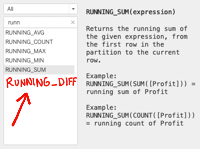
Have you ever encountered the need to calculate the difference in a measure row compared to the value of the previous row? This is called a Running Difference. A...
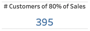
Have you ever had the need to create a KPI that represents the # of *dimension* that represents the X% of a *measure*. For example, this happened to a...

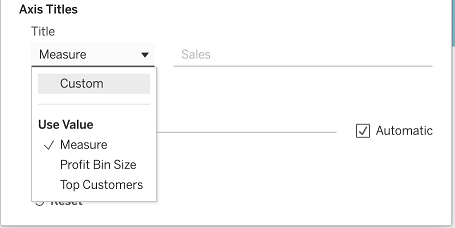
How do you keep the departments of HR, who wants to see hours worked by month, and Finance, who wants to see everything with ISO? In other words, how do I get hours worked in months and...
Suppose a dashboard needed to show how many hours were spent per role/function in a project. The dashboard needed to show what the...
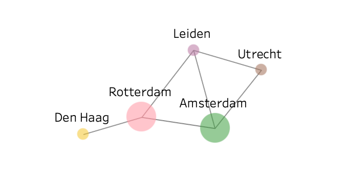
A network graph (also known as a link chart, a node-link diagram, a network map, or just a graph) represents a collection of interlinked entities. This type of graph...
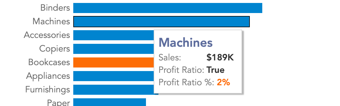
You have a visualization where the marks or in this case the bars are conditionally colored. In this example with "Profit Ratio." The problem is that the tooltip does not...