
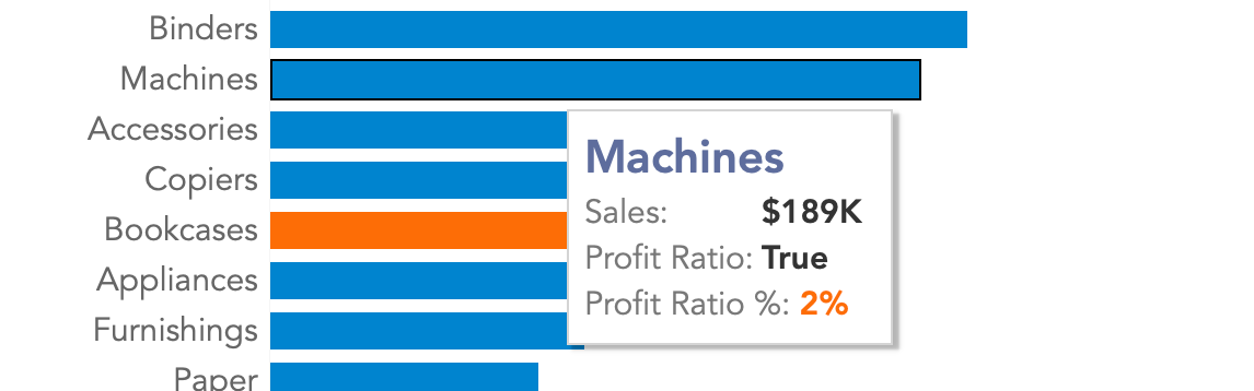
You have a visualization where the marks or in this case the bars are conditionally colored. In this example with "Profit Ratio." The problem is that the tooltip does not...
If you have been working with data for some time you will probably have seen, or even created, several dashboards. You may find that you don't understand the concept of a dashboard and how...

In 2021, we will be (sort of) used to online events that were previously "in-person" as we now call them. At the beginning of this year, I wrote about Tableau Live...
The Tableau Conference is the place to hear about new developments, gain knowledge and network with fellow data enthusiasts. Until 2020, these were held "live" on...

How do you calculate the Percent of Total if your data is filtered in Tableau Desktop? When you use a Table Calculations like Percent of Total in Tableau...
Google Analytics is a very useful tool for gaining insight into which pages on your website are performing well, so that you can respond to this with the...
A KPI indicator shows in a visual way what the current state of your KPI is. This blog describes how you can do this...
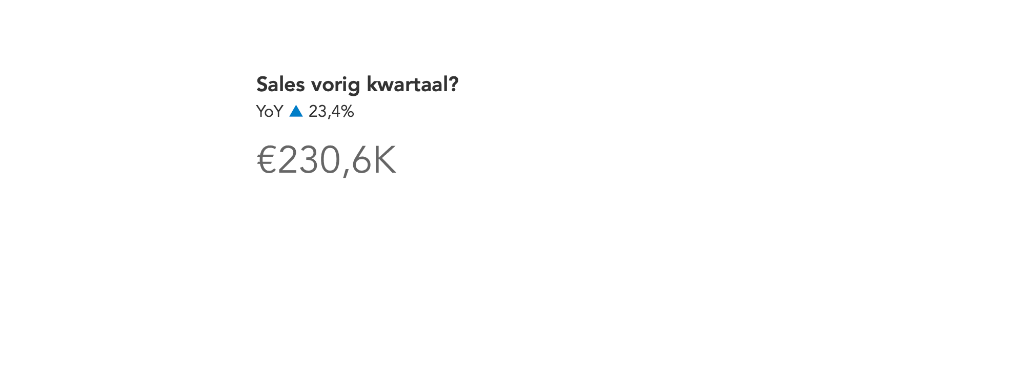
The use of a KPI indicator can be a very useful visual tool to indicate whether your KPI, key performance indicator, has gone up or down. For this...
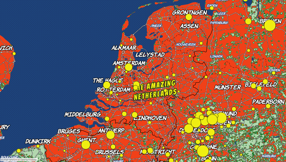
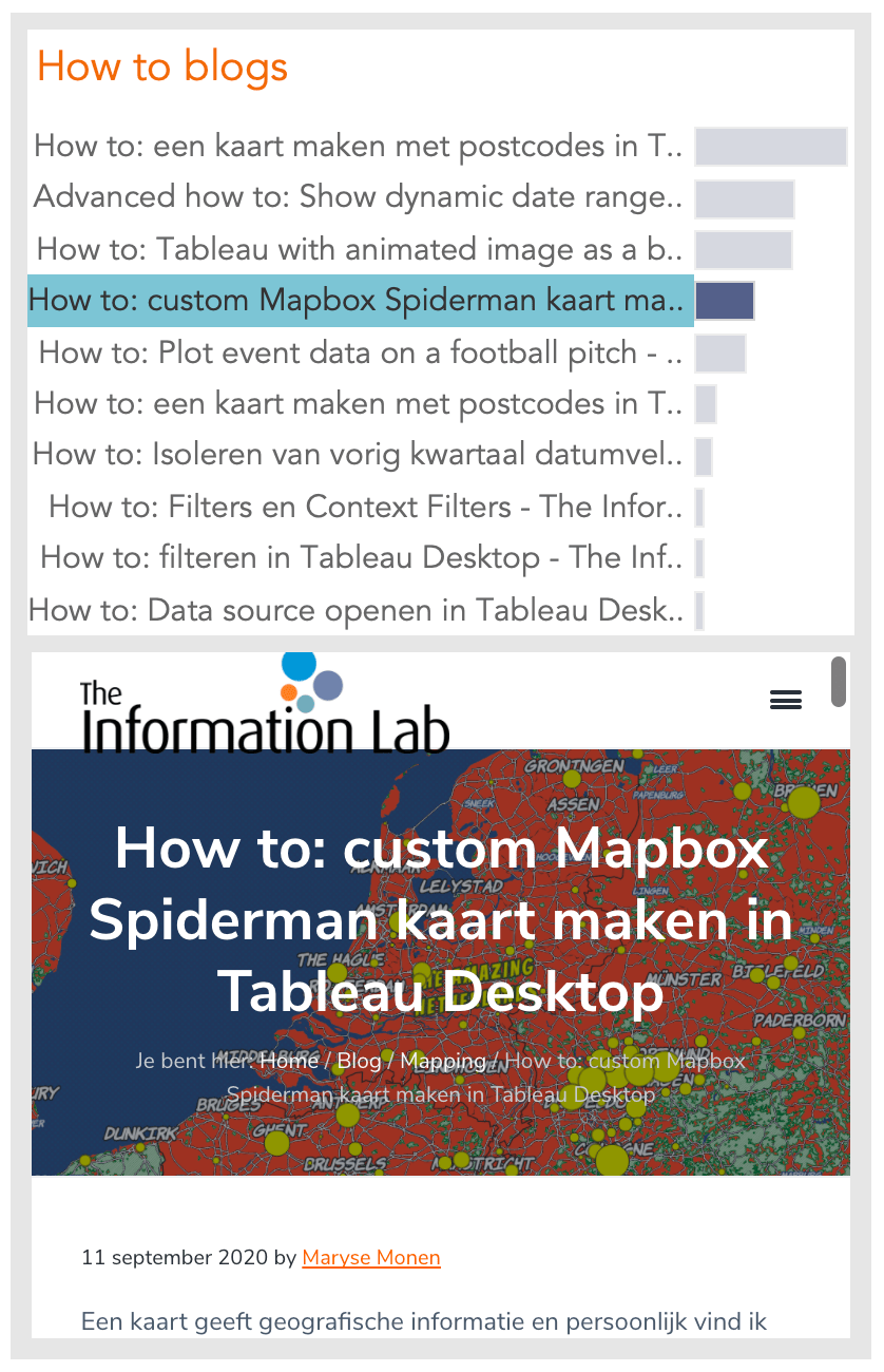
A map provides geographical information, and personally I find maps very interesting to look at as well. It is visual, and grabs your attention immediately. Although I find the...