
In a time where data-driven decisions shape our world, it's crucial that data visualizations are accessible to everyone. Many BI tools offer a wide range of features to ensure accessibility. In this blog, I will explore what accessibility means in the context of these tools and how to make your visualizations more inclusive.
Understanding Accessibility
When it comes to BI tools such as Tableau or Power BI, accessibility means designing and presenting data visualizations in a way that allows individuals with disabilities to access, understand, and interact with the content. It's about removing barriers to information and making it available to a wider audience (including those with visual, auditory, or motor impairments).
Here are some key aspects of accessibility and some best practices:
#1: Screen Reader Compatibility
Many visually impaired individuals use screen readers to navigate digital content. To make your visualizations accessible, ensure that your dashboard elements, such as titles, captions, and labels, are properly tagged and descriptive. They should be clear and concise, which would help not only screen reader users comprehend your content, but provide context to all users.
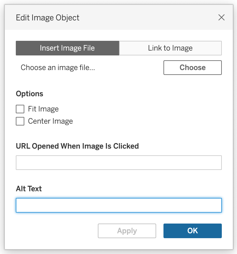
For images and other non-text elements in your dashboard, Tableau and Power BI for example have the option of providing Alt Text within your visualizations. Alt Text should describe the content or purpose of these elements in your dashboard, which is crucial for users who rely on screen readers.
It is important to note that while screen readers can read most elements on a dashboard, it cannot always read every single thing. In Tableau, tooltips, axis labels and headers are a few elements screen readers cannot read. I recommend regularly testing your dashboard with a screen reader to identify any accessibility issues, as well as help you understand the user experience for visually impaired individuals.
#2: Keyboard Navigation
Some users may rely solely on keyboard navigation due to motor impairments. To cater to this audience, ensure that your dashboards can be navigated and interacted with using keyboard shortcuts - without the need for a mouse. This includes ensuring logical tab orders and providing clear instructions for keyboard users in your dashboard.
To get an idea of which keys are used for which action in Tableau, here are the three most important ones:
| Action | Key |
| Move to next component | Tab |
| Move to previous component | Tab + Shift |
| Activate button | Space or Enter |
For a full list of Tableau keyboard features, go to this page and for Power BI keyboard features, navigate to this page.
#3: High Contrast and Color Choices
For visually impaired individuals, it is important to consider colour choices carefully. Avoid using color that doesn't have any purpose or meaning in your dashboard, as colorblind individuals for example may have difficulty distinguishing between certain colors. This also means steering clear of color combinations like red-green, as they can be problematic for these kinds of users. It is best practice to use high-contrast color schemes and patterns to enhance readability for all users.
When To Use These Practices?
Now that I have listed a few best practices, you might wonder when to use them. Well, that depends. In order to design a dashboard with accessibility in mind, it is important to raise the concern of accessibility right from the project's inception. When planning a new data visualization project, identify those who will be using your dashboard and set accessibility goals based on this audience.
On the other hand, I do believe that accessibility should be a standard practice. Colorblindness, for example, is very common among the general population. By defaulting to accessible design principles, you can create visualizations that cater to a wide range of needs.
Conclusion
As data professionals, we should empower each other to create visualizations that can be accessed and understood by a diverse audience. This means ensuring screen reader compatibility and logical keyboard navigation, as well as paying attention to color choices that are distinguishable by everyone.
By following these best practices and considering the needs of all users, you can ensure that your visualizations are inclusive and accessible. In doing so, you not only promote inclusivity, but also enhance the impact of your data insights by making it available to all.
For more resources on this topic, check out this page on more best practices within Tableau and this YouTube video on how to edit the Alt Text in your dashboard in Tableau.
This blog is inspired by Collin Smith, who is an advocate for accessibility in Tableau.