
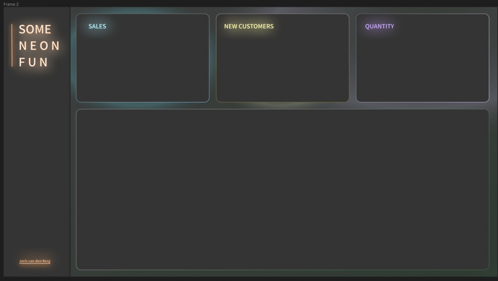
Fan van felle kleuren? Wil je wat opvallends in je dashboards? Zoek dan niet verder! In dit blog leg ik je uit hoe je een dashboard met neon effecten maakt in Tableau. Ik leg stap voor stap uit hoe ik mijn dashboard heb gemaakt, en voeg ook wat neon iconen toe die je zelf kunt gebruiken.
Stap 1: neon dashboard achtergrond
We kunnen momenteel in een Tableau dashboard nog geen neon tekst of achtergrond maken. Ik heb daarom in een andere tool de achtergrond inclusief teksten gemaakt. In een latere stap voegen we vervolgens de Tableau visualisaties toe om er een geheel van te maken. Ik heb zelf Figma gebruikt, maar uiteraard kun je vergelijkbare tools gebruiken die jij fijn vindt werken.
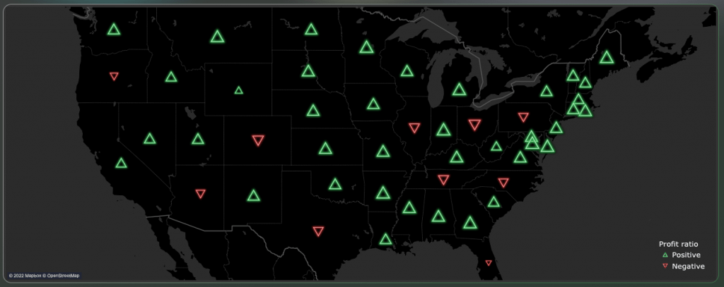
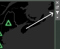
Stap 2: kaart met neon iconen
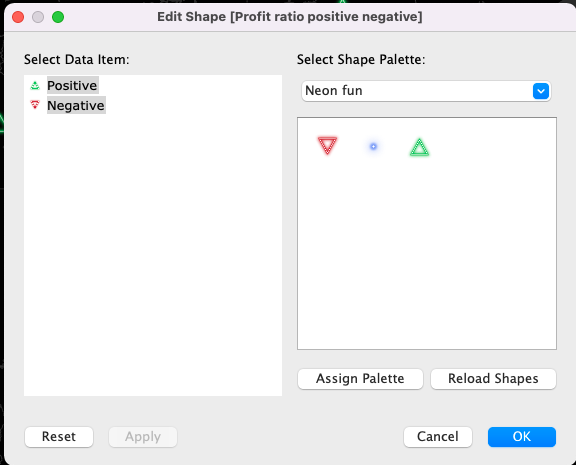
Op de kaart tonen we met neon iconen of de winst omhoog of omlaag gegaan is ten opzichte van vorig jaar. De iconen zijn custom shapes, deze kun je onderin de blog gratis downloaden om te gebruiken. Lees hier hoe je custom shapes aan Tableau kunt toevoegen.
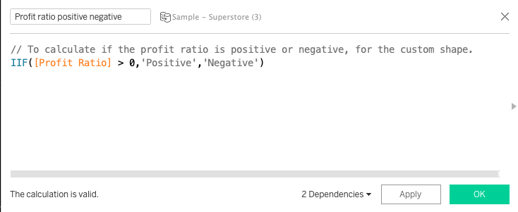
Eerst maken we een berekend veld die kijkt of de winst positief of negatief is. Deze berekening bepaald of de profit ratio positief of negatief is, en zet positief of negatief in een kolom.
Als we onze kaart gemaakt hebben, zetten we in de marks pane de dropdown op Shape. Vervolgens slepen we ons berekende veld naar shape zodat we een custom shape kunnen kiezen voor de positieve en negatieve profit ratio’s per staat.
Stap 3: neon area charts
Bovenin het dashboard staan neon area charts. Deze bestaan uit 3 verschillende visualisaties over elkaar heen gezet. Dit was lastig om te maken, maar gelukkig kreeg ik wat hulp vanuit de Flerlage twins. Zij hebben een blog geschreven over hoe je shaded area charts kunt maken in Tableau. Ik heb hun workbook gedownload en het een en ander aangepast.
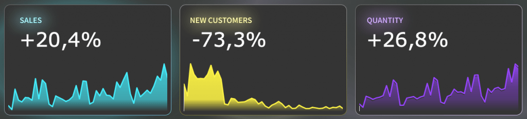
Ten eerste heb ik de kleuren aangepast. Ik heb een handig tooltje gebruikt om de kleur van de achtergrond langzaam te laten verlopen naar de neon kleur. Zo creëer je een beetje het glow effect. Ik heb de kleuren uit de tool opgeslagen als custom kleuren in Tableau (lees hier hoe je custom kleuren kunt toevoegen). Hier zijn de kleurcodes die ik heb gebruikt:
	 <color-palette name="Neon fun blue" type="ordered-sequential">
        <color>#343434</color>
        <color>#3fa6af</color>
        <color>#40b3bd</color>
        <color>#41bec9</color>
        <color>#45edfc</color>
    </color-palette>
	 <color-palette name="Neon fun yellow" type="ordered-sequential">
        <color>#343434</color>
        <color>#e4db43</color>
        <color>#e9e043</color>
        <color>#f0e744</color>
        <color>#fcf245</color>
    </color-palette>
	 <color-palette name="Neon fun purple" type="ordered-sequential">
        <color>#343434</color>
        <color>#533973</color>
        <color>#5e3b8a</color>
        <color>#743fb7</color>
        <color>#9645fc</color>
    </color-palette>
Tot slot heb ik nog los een lijn toegevoegd in de felste kleur. Om een extra neon effect te maken. De drie sheets (2 uit de blog van Ken) en de lijn die je zelf hebt gemaakt, moeten dan precies over elkaar heen gezet worden. Let daarbij op dat de achtergronden van al je sheets transparant zijn.
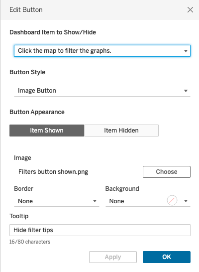
Stap 4: neon dashboard buttons
Aan de linkerkant van het scherm heb ik ook wat neon buttons gemaakt. Wanneer je hier op klikt lijken ze op te gloeien. Hiervoor heb ik zelf afbeeldingen gemaakt in Figma die ik gebruik als image button. Na het maken van show/hide buttons, kun je zelf image buttons instellen zoals ik hieronder laat zien. Ik heb de image buttons in het neon fun bestand gezet die je onderaan de pagina kunt downloaden.
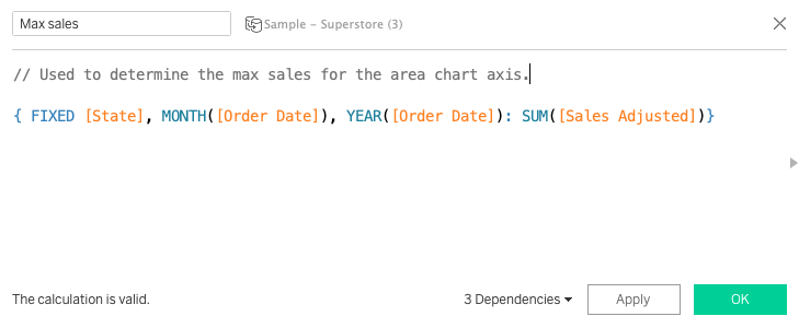
Stap 5: kaart gebruiken als filter
Tot slot heb ik nog een functie toegevoegd zodat je met de kaart de area charts kunt filteren. Omdat de as van de area charts bepaald is, moeten we een parameter actie toevoegen om de as aan te passen wanneer de gebruiker in de kaart klikt. Ik bereken daarom eerst wat de waarde van de as moet worden. De as moet de hoogste waarde van de afgelopen jaren kunnen tonen. Omdat in de kaart alle jaren worden getoond gebruik ik een LOD calculatie.
Ik zorg vervolgens dat deze waarde in de parameter wordt gezet wanneer de gebruiker in de kaart op een staat klikt. Dit doe ik met een parameter actie. De parameter die de as van de area chart bepaald, verandert daardoor mee wanneer de gebruiker in de kaart klikt. Als de gebruiker de selectie ongedaan maakt, wordt de waarde van de parameter weer op maximaal gezet.
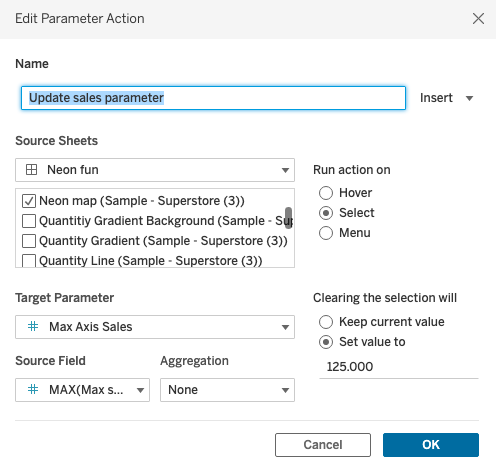
We selecteren in de kaart vervolgens ‘use as filter’. Zodat alle sheets gefilterd worden wanneer een gebruiker op een staat klikt.
Download de Tableau neon dashboard fun set
Dat was het! Hopelijk kunnen jullie met deze tips een mooi fluoriserend dashboard maken. Om je op weg te helpen kun je een folder met wat van mijn custom shapes downloaden. Ik ben erg benieuwd met wat voor neon creaties jullie komen. Stuur ze vooral door!
Dit was hoe je een neon dashboard in Tableau maakt. Vond je dit leuk? Schrijf je in voor onze nieuwsbrief en ontvang maandelijks updates, Tableau, Snowflake en Alteryx tips & Tricks. Het is binnen 3 seconden geregeld, vul in de sidebar rechts je naam en email in. Je kunt op elk moment opzeggen.