
Imagine you’re creating a chart and you want to add a certain shape or icon that is not available in Tableau’s default shape palette. For example, what if you are building a scatterplot centred around countries and you want to use the flags to display the different countries in stead of the standard circle, square, plus-sign or triangle shape.
This is definitely possible, which is why this blog will show you exactly how to add these custom shapes to your visualisation in Tableau Desktop.
Step 1:
Find and download the shapes you want. There are many resources for downloading the shapes and icons you want to use. My personal favourite is flaticon.com, which gives you access to more than 12 million icons and stickers. Another tool is iconfinder.com or thenounproject.com, which also both offer a wide selection of icons. It is important that you choose icons that are free to download, in order to avoid copyright issues.
Step 2:
After you downloaded the icons you want to use, navigate to the My Tableau Repository folder on your desktop and find the Shapes folder. Here you will find the various shape palettes that are by default already available on Tableau. If you want to add your custom shapes, simply create a new folder within the Shapes folder and add your shapes to it.
Step 3:
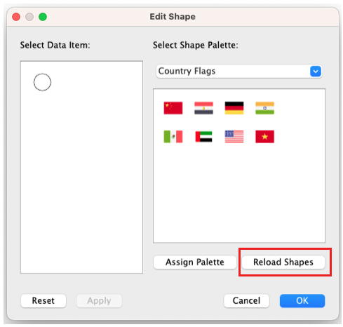
Now you can check in Tableau if your new shapes have been added. Go to your visualisation; change the Mark type to Shapes; navigate to Shapes and select More Shapes. A pop-up menu will appear where you could select your newly-created shape palette. If the custom shapes or icons you added don’t show up, consider selecting the option Reload Shapes or try restarting Tableau.
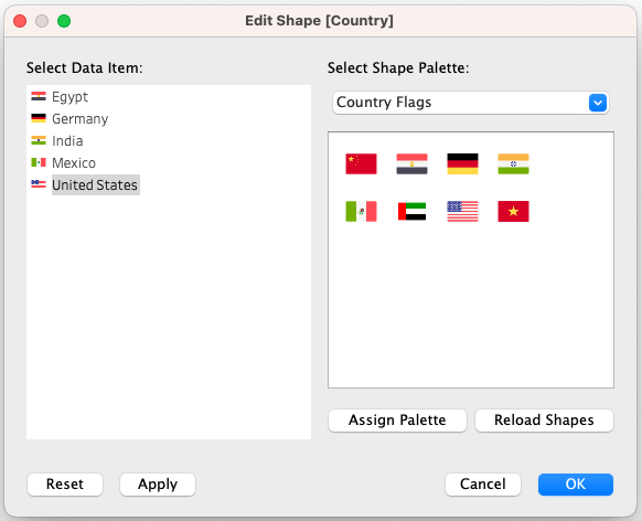
From here, after you’ve selected your palette, you can assign each shape to a specific category. Since I am working with country flags, I have reassigned each country in my visualisation to a custom flag shape.

Step 4:
Use them in a visualisation! Below I made two examples of how I would use these shapes.
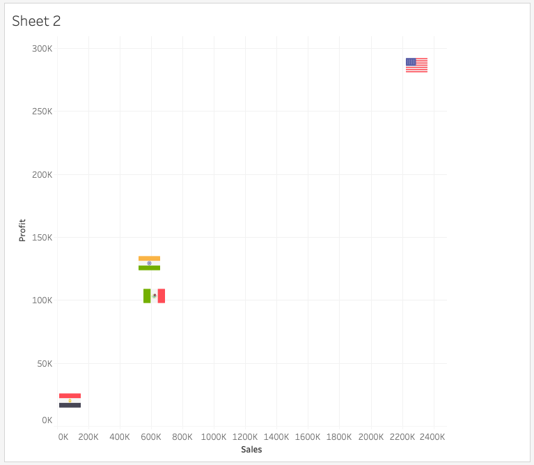
Below I created a scatter plot displaying each country as a flag. Make sure that, when working with custom shapes, they don’t overlap too much. This could end up creating a messy visualisation and perhaps not convey what you want it to.
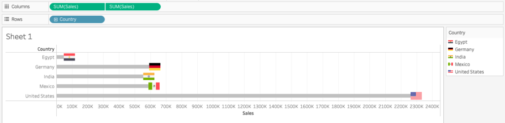
Another example is this dual-axis bar chart below, with the country flags at the end of each bar. You could recreate this by setting one measure to a bar mark type, and another instance of the same measure to a Shapes Mark type – which will be where you would add the flags. Don’t forget to hide one of the axes, since they’re both the same.
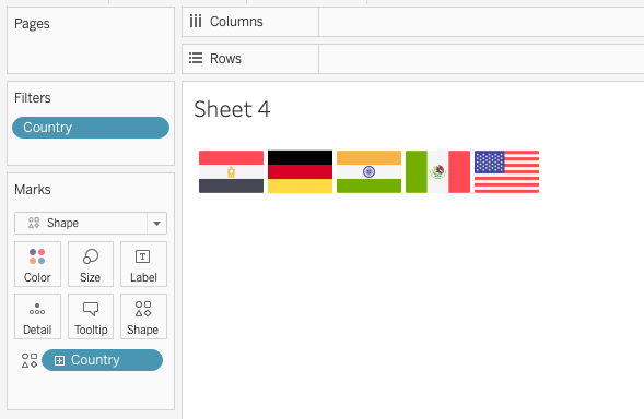
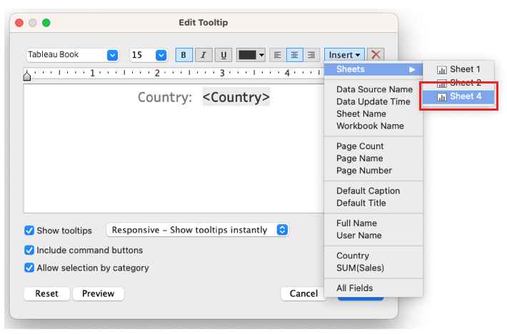
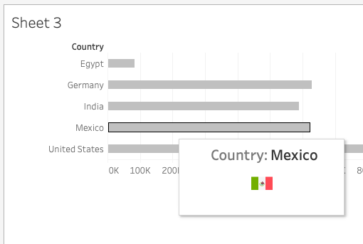
Another fun way of using a custom shape is within a tooltip. For this, you would have to add all the shapes in a new sheet. For example, in the sheet below (Sheet 4) I displayed all the shapes from my Country Flags shape palette. When you want to add them in a tooltip of a visualisation, simply add the sheet in the tooltip from the Insert context menu. You can change the sizing of the custom shapes in the sheet itself if they don’t fit into the tooltip.
Using icons and shapes is highly effective when creating visualisations. Our brain loves pictures. In fact, according to the International Forum of Visual Practitioners, “humans are able to process images 60,000 times faster than text, and 90 per cent of the information transmitted to the brain is visual”. This is why it is much more preferable for us as data visualisers to make use shapes and icons in our visualisations. Read more about this concept here.
Good luck! And be sure to check out more of our blogs about Tableau, Alteryx, Power BI, dbt, Snowflake and much more!