
Two common charting techniques in Tableau are shared and dual axis charts. They are both great when wanting to compare data points; save (dashboard) space and highlight relationships. But they do each come with their own strengths and differences. In this blog post, I will explore the differences between these two chart types and explain in which situations to use them.
Shared Axis
Shared axis charts are charts that share one axis between two measures or dimensions. These charts allow you to compare data points with one common reference point, making it easier to visualise relationships and patterns. Shared axis charts are particularly useful when you want to compare data from different measures or dimensions that have the same scale. This is important, since you don’t want to combine two measures with different units of measurement using one axis.
In order to change a basic chart to a shared axis chart, you would drag the second measure or dimension on the existing axis until two green lines appear. In the example below, I added the measure Profit to the already existing Sales by Quarter chart.
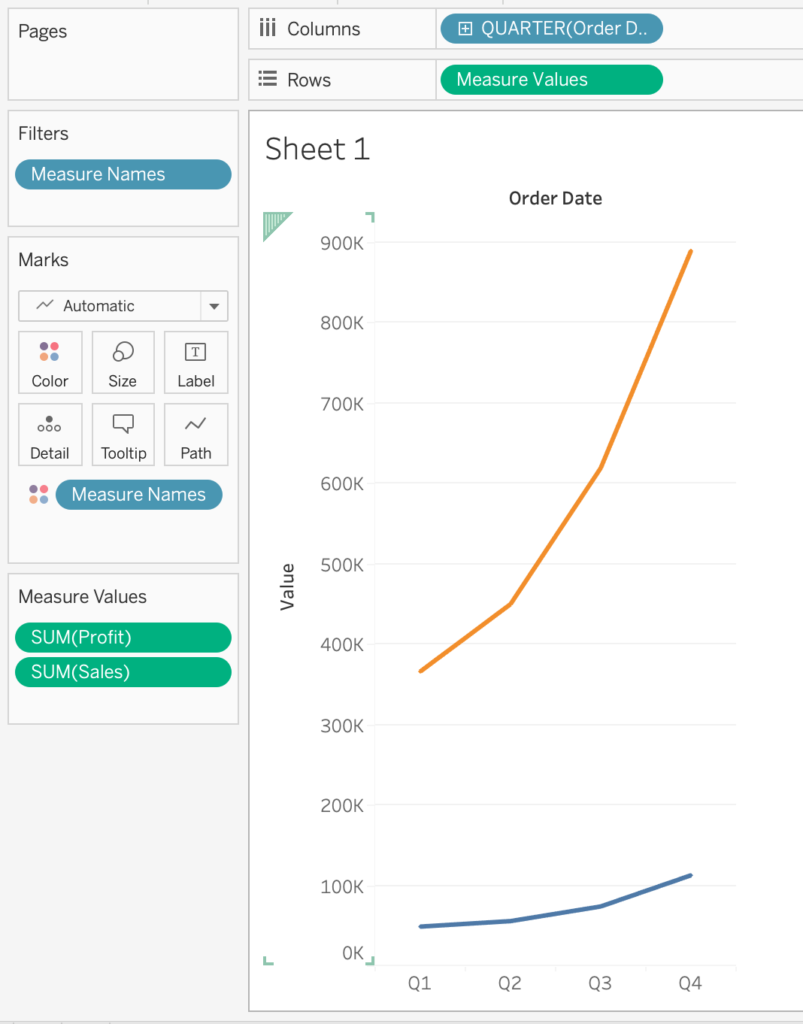
Notice that Tableau added many elements to the canvas; Measure Values has been added to the Rows shelf, as well as Measure Names in the Marks card. This is because Tableau automatically wants to differentiate between the two measures with different colours, as they exist on the same axis.
The Measure Values box has also been created automatically, which allows us to add more values to the shared axis chart if we would like.
Dual Axis
Dual axis charts, on the other hand, combine two separate axes to display two measures or dimensions on different scales on a single chart. This technique is valuable when you want to highlight the relationship or correlation between two variables that have different units of measurement. So a Sales measure (with a unit of dollars) can be compared to Quantity for example.
There are two ways to create a Dual Axis; (1) dragging the second field to the opposite side of the existing axis (where there is no axis yet) until one green line appears, and (2) dragging the second field next to the first field in the rows shelf and clicking ‘Dual Axis’ on the dropdown menu.
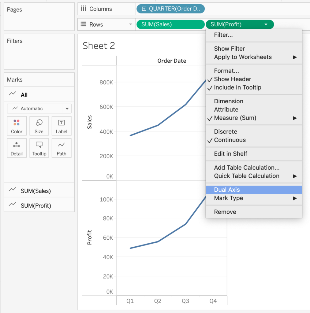
When the dual axis has been created, notice how a marks card is created for each axis. The advantage of this is that you don’t have to use the same type of chart for both measures (opposed to a shared axis chart): one measure can be a bar chart and one measure can be a line chart.
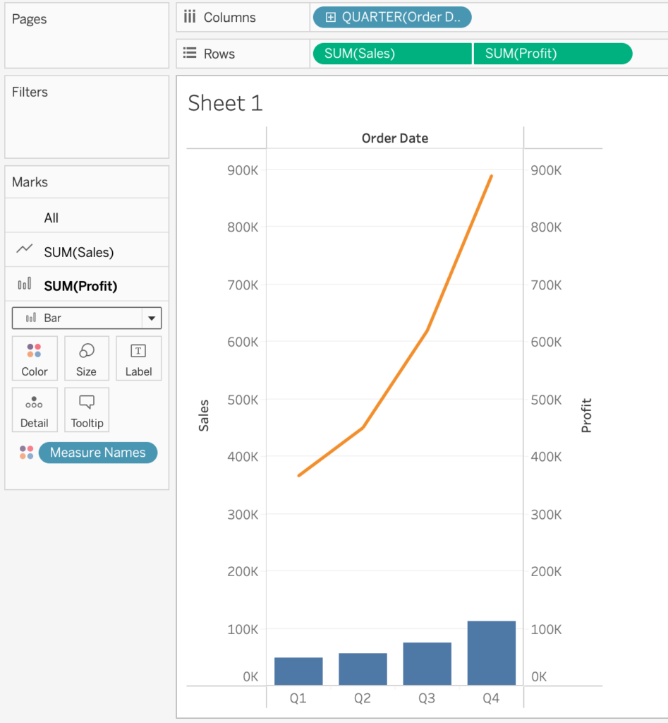
Tip! When creating a Dual Axis chart, in some cases it’s preferable to synchronise the axes. Especially when both contain the same units, such as Profit and Sales, it’s good to synchronise them in order to avoid the chart being misunderstood. Even though the data is true, it can look like an manipulated version of the truth.
Choosing the Right Chart for the Job
The choice between shared and dual axis charts in Tableau should depend on your specific data and the insights you want to convey:
- Use Shared Axis Charts when comparing data with the same scale or unit of measurement. They are ideal for side-by-side comparisons and showing how different dimensions or measures change over a common axis (e.g., time).
- Use Dual Axis Charts when you need to visualise relationships or correlations between variables with different scales. These charts are excellent for highlighting interactions between data points and providing context.
Be sure to check out other blogs on The Information Lab website to gain deeper insights and expand your knowledge of Tableau. Happy visualising!