
Yesterday I was lucky to attend the latest Data+Woman Zurich organized by Annabelle Rincon and Olivia Sliz. In this sweet event, we had the pleasure to be presented with an independent data & information designer known as Julie Brunet or Datacitron. She is the Creative Director of Nightingale, a renowned journal made by the Data Visualization Society.
On the first minutes of the presentation, she introduced us to what she described as a “click-baty” idea of anarchy within dataviz. What did she mean by that? She explained how within the field of data visualization there is a set of guidelines and recommendations to apply to create better visualizations for more readability and understanding.
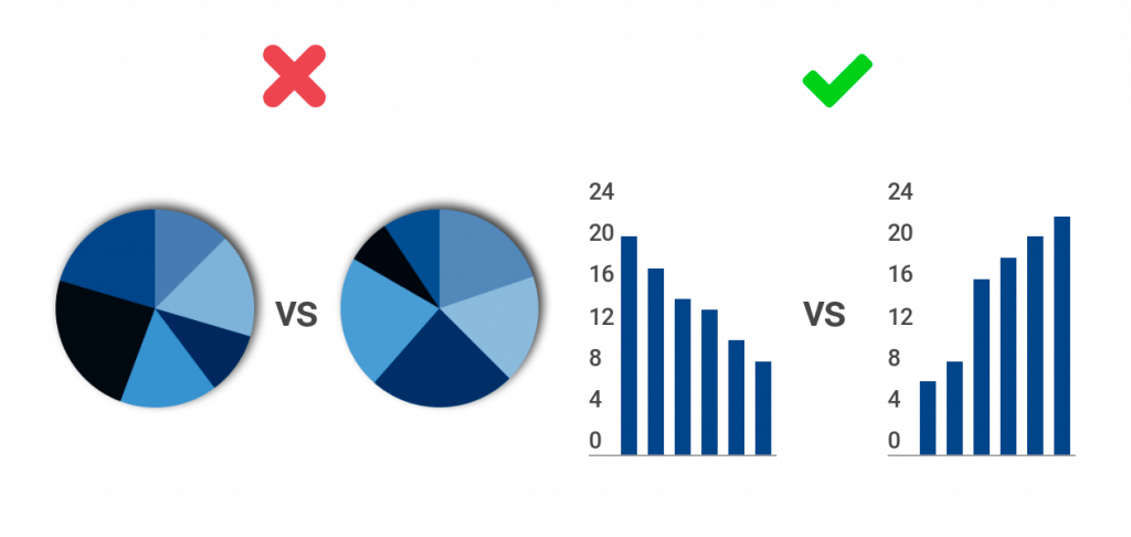
From colors, to positions, to chart types, there is a plethora of useful tips and recommendations that you as a data presenter/designer can follow to achieve a beautiful and useful data story.
Nevertheless, Julie invited us all to break those rules to achieve great and superior designs. What did she mean by this?
Even though it is known that constraints can boost your creativity, strictly following the guidelines usually leads to similar results. The designs then tend to be, for a lack of a better word, boring. Repetitive visualizations that, although readable and effective, will not produce an impact on the user nor grab its attention in the first place. Which is the complete opposite of what you as a data designer should strive to achieve.
Our presenter tried to convey that breaking or deviating from those well-thought-out rules can push your designer mind. It helps to come up with unusual but highly effective stories that create better visualizations.
Design Principles and how to break them
Julie gave a specific example of this by introducing us to the principle called the data-ink ratio by Edward Tufte. This principle was introduced in Edward’s book ‘The Visual Display of Quantitative Information’, published in 1983. Basically, it says that there is a ratio between the ink that is used to convey information (data-ink) compared to the ink used in the complete visualization (total-ink). He asserted that the higher the data-ink, (or conversely, the lower the non-data-ink) the better.
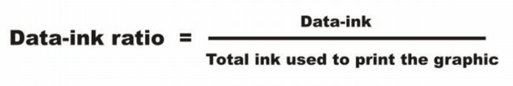
Julie explained that this design principle is powerful at its core because it optimizes the message and the space within the visualization. Both increase the readability of a story. But, she also explained that sometimes removing too much from a visualization or always following the same principles for the sake of clarity can affect the meaning of the message.
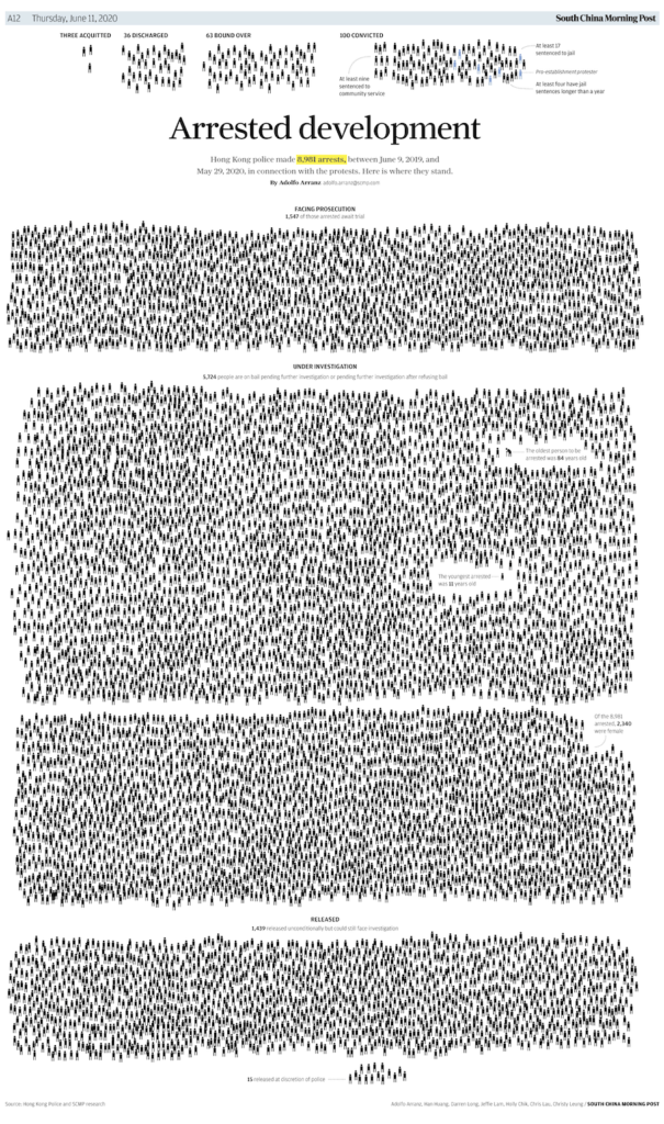
A perfect visualization instance of this can be seen in the following designs of the South China Morning Post articles. Where a simple bar or line chart would have been more than enough to be effective in conveying the data. Nonetheless, in this instance, more area or non-data-ink expressed a further bigger and clearer message.
Arrested development: Hong Kong police made 8,981 arrests
More people than rats: the world’s population surpasses 8 billion people
Anarchy ‘Guideline’
After presenting us with copious examples of how breaking this principle in strategic ways lead to better visualizations. Finally, our speaker presented us, ironically, with a guideline on how to “break the rules” for ourselves. Where she enticed the audience to not be afraid to try the method in a more structured way.
She suggested:
– To not break more than 1 or 2 rules at a time and
– To strategize within your constrictions which things are flexible to change and play with, and which are not
Lastly, I invite everyone reading this to do the same. Explore within your organization which aspects are bendable and malleable to your imagination and creativity. The more you push yourself outside the box, the more you run the risk of ‘failing’ the design principles AND creating more powerful, impactful, meaningful, and better visualization stories.
Likewise, check out other methods to ‘break the rules’ with fellow data visualization designer Dieuwertje at https://www.datylon.com/blog/master-and-break-data-visualization-rules. If you would like to learn more about data and other visualization subjects, go to https://theinformationlab.nl/en/blogs/ for more information. There you can learn further about boosting your creativity and artistry.