
In this series, I will explore how compositions are different from comparisons, and what chart types you can use to visualise a composition. Start at Part 1 here.
We’ve discussed two ways to visualise a part-to-whole relationship so far: Stacked bar charts and proportional stacked bar charts. There is a more common way:
Tableau makes it easy to create a pretty pie chart. That doesn’t mean you should.
Bad pies are bad for you
Pie charts do not have the best reputation. It is very, very easy to make a bad pie chart. What’s worse, even a good pie chart is usually not the best way to show your data. Let’s look at some reasons why.
#1 A pie chart is bad when it contains too many categories
Have a look at the colourful monster on the left, plotting all genres in my dataset:
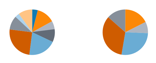
It’s just too much, right? The chart is very difficult to read and interpret. Try to limit the number of categories to 4-5. The chart on the right is much more doable.
#2 Legends are not helpful — they are bad
By default, tableau will present your pie chart with a colour legend. Have a look at the pie chart on the left, below. Notice how your eyes keep moving back and forth from the colours of the slices to the colours on the legend? Is your brain having fun, remembering the colours for the time it takes your eyes to complete their circle?
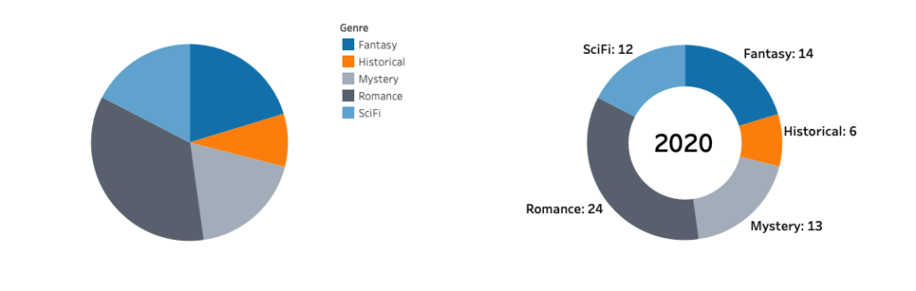
Use comprehensive labels instead. You can even use the centre of the pie for an additional label, such as a title or an important value, resulting in the donut chart on the right.
#3 A pie chart is awful for comparisons
Pie charts make the difference between comparisons and compositions really clear, simply because of how terrible they are at displaying the former compared to the latter. Looking only at the pie chart to the left: Which is the bigger genre? Fantasy, SciFi or Mystery?
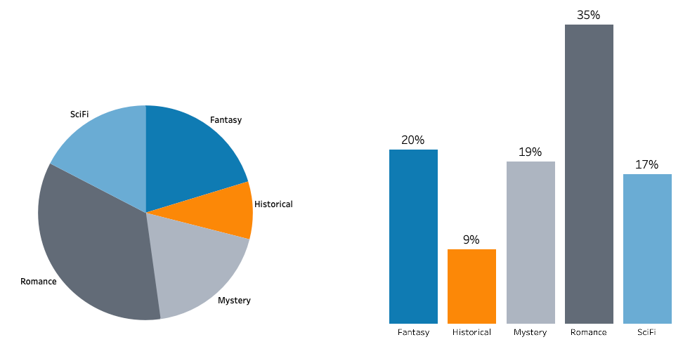
Humans are not great at judging angles, which is exactly what a pie chart uses to represent size. Lengths are much easier to compare, and length happens to be exactly what a bar chart uses to represent size. I bet the question was much easier to answer with a peek at the bar chart to the right.
The pie chart has the advantage when we want to show a composition – looking at the bar chart, it is not immediately obvious the bars total 100%. Then again, we already solved that issue neatly by using a stacked bar chart instead.
#4 A pie chart is awful for trends
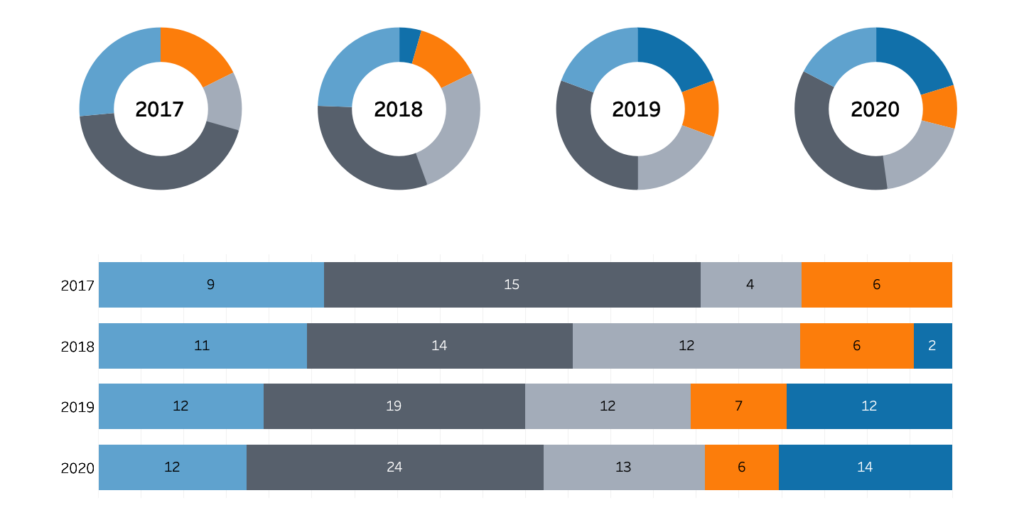
Pie charts are also not great at showing trends, for the same reason they are bad at showing comparisons – without a good sense of the size of the parts, it’s hard to see how those parts changed over time. Have a look at these donuts and our stacked bar charts, representing the same data. Which chart makes it easier to see the evolution of genres over time?
Can I make a good pie chart?
Despite its flaws, some people just love a good pie chart. If you simply must include one, we have gone over some tips to keep in mind:
- Always limit the number of categories to 4-5;
- Use comprehensive labels instead of a colour legend;
- Never use pie charts for comparisons or trends;
- Only use a pie chart when you want part-to-whole to be your only focus;
- Seriously reconsider using literally any other chart type instead.