
Visualisations allow you to ask questions of your data, and the type of question you want to ask will determine the chart type. A ton of questions you might ask about your data will hinge on a comparison between values. Which region was responsible for most sales? What product generated most profit? These questions are answered quickly by gathering and comparing different values in your data.
Visualizing comparisons
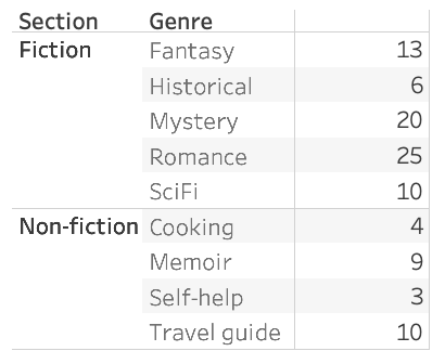
Let’s look at some data from my local library. Here’s a little table showing the number of books by genre and section.
I can already make some quick comparisons without doing too much math. For instance, the biggest genre appears to be Romance novels, and the non-Fiction section on the whole seems to be smaller than the Fiction section. Of course, there’s an even faster way to spot these trends: Visualisations! There are many ways to show a comparison; I prefer the humble bar chart:
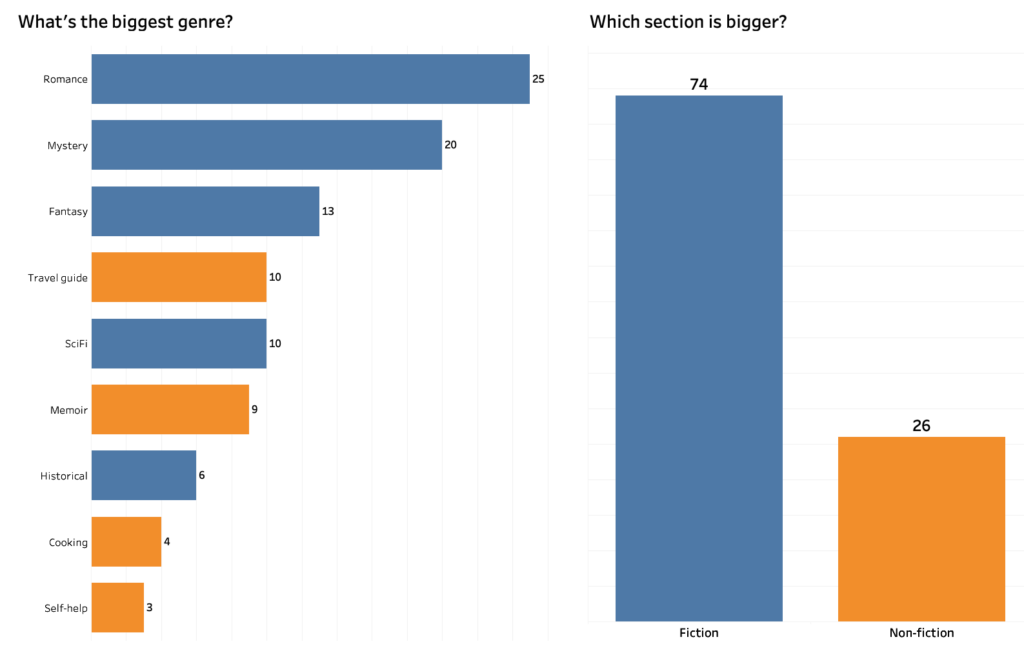
Notice that the questions I asked needed absolute numbers. In my charts, I can clearly see values by category, sort and filter as I please, make comparisons, and answer my questions.
Suppose now I want to ask what genre contributes most to each section, or track the relative growth of each section over time. These questions also involve comparisons, but they are subtly different. I am not comparing different values per se, but comparing the relative contribution of those values to a bigger whole. In other words, I am interested in a composition, or part-to-whole relationship.
Comparing compositions
With compositions, I don’t really care so much about how values compare to other values. Instead, I want to know how the individual parts make up the whole. I could try to answer these questions by looking at my bar charts above, but there are many chart types devoted to compositions that do a much better job. These part-to-whole chart types immediately focus our visual attention on the relative importance of every part to the total value in the data.
In upcoming posts, I will explore some of these chart types, when they are best used, and how to build your own using Tableau.
Continue to Part 2 here.