Recently I was reworking a Tableau dashboard, making some changes in the design. In the old dashboard, I had used a type of calendar heatmap and I wanted to change the way a user could select a year. Previously, the year menu was oriented horizontally above the calendar, but now I wanted the list to be vertically on the side. But after changing the orientation, no matter what I tried, the list of year values wouldn’t sort right, even after using the sort function in every way. Why can’t I sort categories in Tableau?
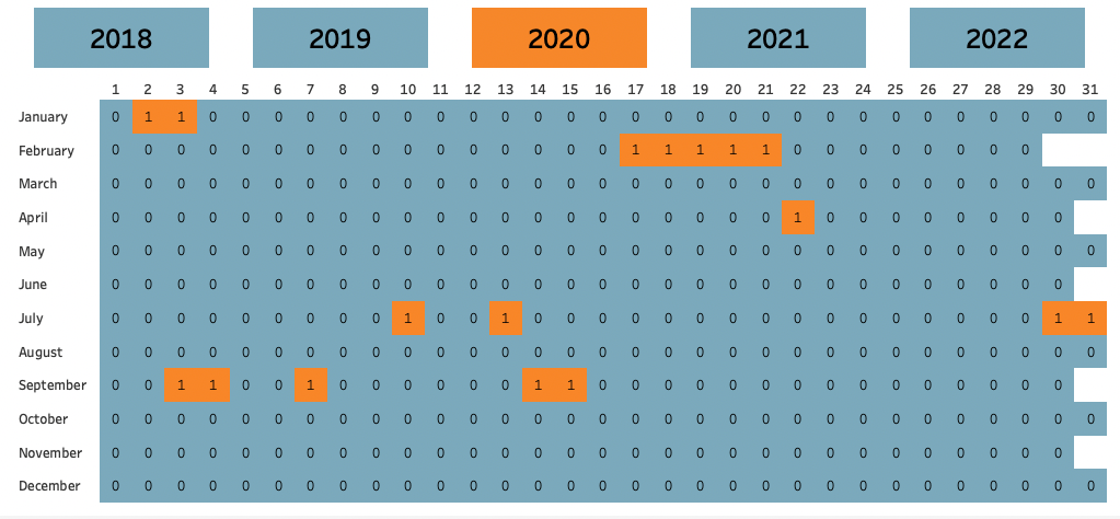
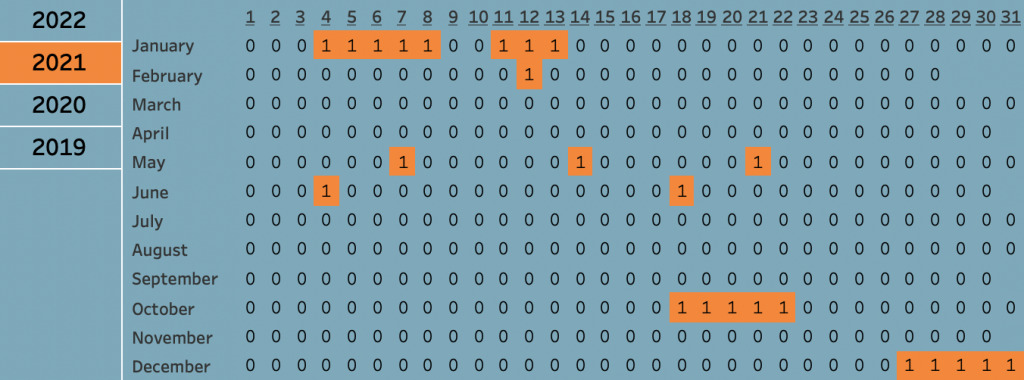
This was more or less the calendar heatmap I used. Now I wanted to change the menu orientation. Luckily, I found a blog written by one of my colleagues, Mario van der Velden, in which he explained how to create a vertical menu that’s both good looking as well as functional – using parameter and highlight actions to create a nice menu. I followed his instructions and ended up with this.
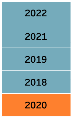
Try to sort the categories
The menu had the right orientation, the right values, even the right layout, but the wrong order. Whichever year I selected, that year would be put at the bottom of the menu, whereas the other years were nicely sorted the way I wanted to. I sorted the field alphabetically, I sorted manually, I sorted by field value, increasing, decreasing. The selected year did not move. I tried changing the data format, I tried dragging the annoying orange block to its place, nothing helped.
So why did my menu sort the items differently? I used the same marks …but not in the same order!
On your marks!
It was even mentioned in the blog! But I had mindlessly dragged the boolean Years = Years parameter field, the one I used to create a manual highlight, on the colour mark without paying attention to the order of the pills. If you want to sort categories in Tableau, you probably need to pay attention on your marks pane as well. As per Tableau’s website: “Tableau first considers the topmost dimension field when ordering marks in the view, and then considers the dimensions beneath it on the Marks card.”
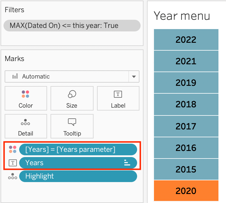
So when creating the visualisation, Tableau first considered the boolean Years = Years parameter field for colour, essentially creating two “groups” (one True and one False). Only then did Tableau consider the Years field on the text mark, using the field’s values to populate the False and True “groups” it had just created. This means that when I tried to sort the Years field chronologically, Tableau did so within the False and True “groups” respectively.
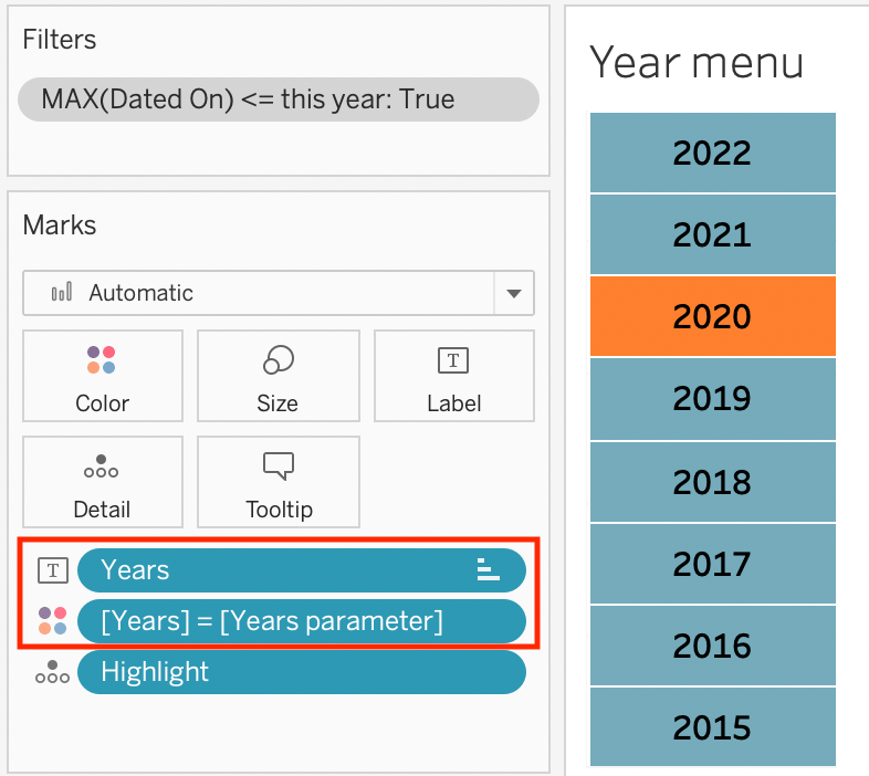
Sort!
The solution could hardly be easier. Simply drag to change the order of the pills in the marks pane, and voilà, I got my years back in order. The year menu now blends in nicely with the calendar heatmap, and the years always keep their position when years are added or subtracted from the list.
Check out our blogs page to view more blogs on Tableau, Alteryx and Snowflake here.
Work together with one of our consultants and maximise the effects of your data.
Contact us, and we’ll help you right away.

