
This blog is the first of a State of Progress series. In this series I create Performance Management tools in Tableau as used throughout my career as Manager, Controller and Consultant.
A short guide to a simple Process Behavior type x-chart for KPI’s.
Today I share my experience with Time Series. About a decade ago I came across the Process Behavior Chart. Named as such by Donald J. Wheeler, who wrote the classic book: Understanding Variation. The Process Behavior Chart is, even in its simplest form, a practical and easy tool to visualize performance over time. It helps determine when performance has changed, distinguishing common cause variation (noise) and special cause variation (signal). In turn, it helps avoid wasting time on fixing issues that do not exist, or helps identify issues that could have been missed.
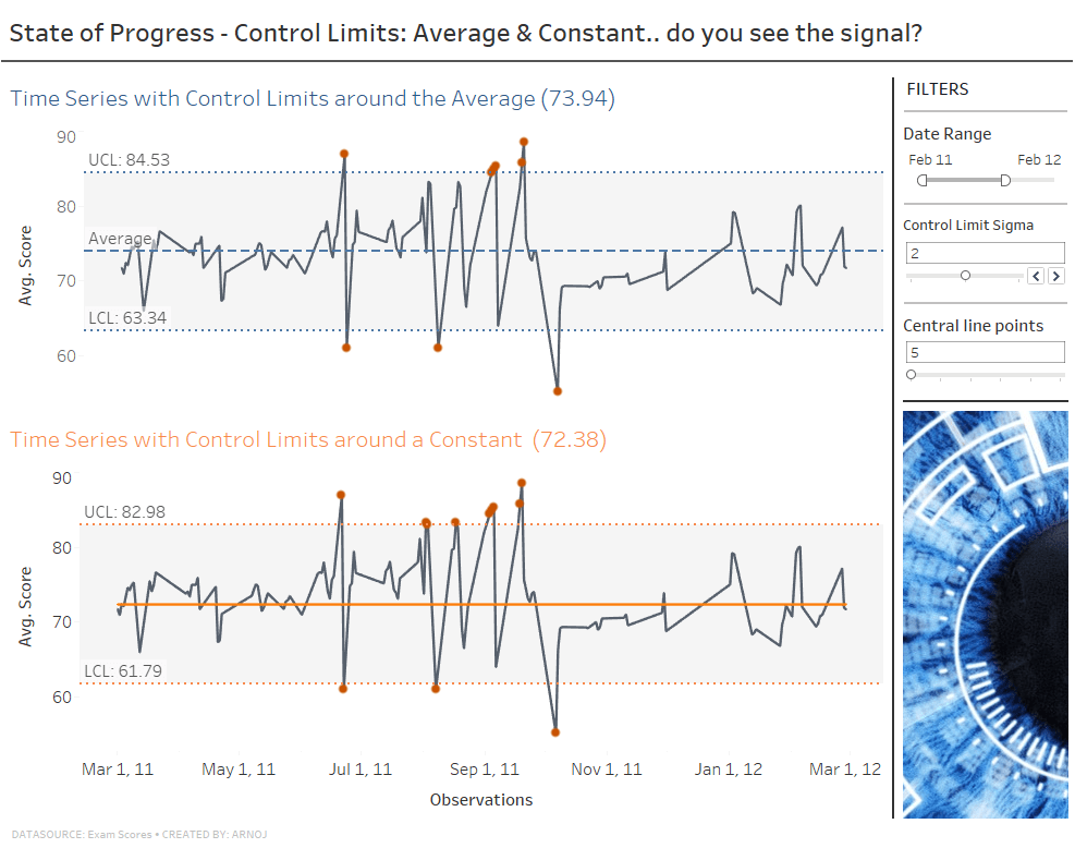
For this example the data set is Exam Scores. For some context let’s imagine the ‘Average Score’ per day is a KPI. Part of a set of quality of education indicators that is monitored at various levels in the educational organization. We will look at the overall average scores across all exams and schools and apply a horizontal central line and control limits. Finally, we will end up with two examples (click image to open new window with the Viz on my public Tableau page):
Let’s get going.
1. Line chart with continuous date (time series)
Start with a line chart. Putting Score, as Average, on the Row Shelf and Date on the Column Shelf with Exact Date results in a Time Series. Add a Filter by selecting the Date Pill on the Columns Shelf. Alternatively create a copy date, reformat to your liking, and add to the Filters Card. In my example I have reformatted a Date copy to Month <May, 2005> format and renamed the Filter Title to Date Range.
Tip: When following this blog to create your own then follow the instructions for the Average Line and Control Limits first. Thereafter create a new Line Chart and make the Constant Line.
2. Reference or central line
As a KPI is most often an outcome of a Business Process I like to fix a constant (horizontal) line from a reference period. Until process improvements are realized we keep the central line a constant. In this example the Constant Line is based on a number of consecutive KPI values from the start of the reference data; our baseline. Often this is between 5 to 20 points.
The average can also be used for the central line and can be used to determine a first Constant Line or get a feel for variation. Alternatively, a goal or target can be used determined through other means, for example management target setting.
i. Average Line
The Average Line can be created in two ways. Firstly, from the Analytics Pane drag add a Reference Line on the Table. This will add a line from the Y-axis until the end of the chart. Click the line to Edit and change the Value Calculation to Average and Format the label and line. Secondly, it can be created by using a Calculated Field and dragging the newly created Measure onto the vertical axis. This will create the line from the first data point, but limits editing options for the line. Create the CF using the calculation as:
WINDOW_AVG(AVG([Score]))You can find more about WINDOW calculations on this page.
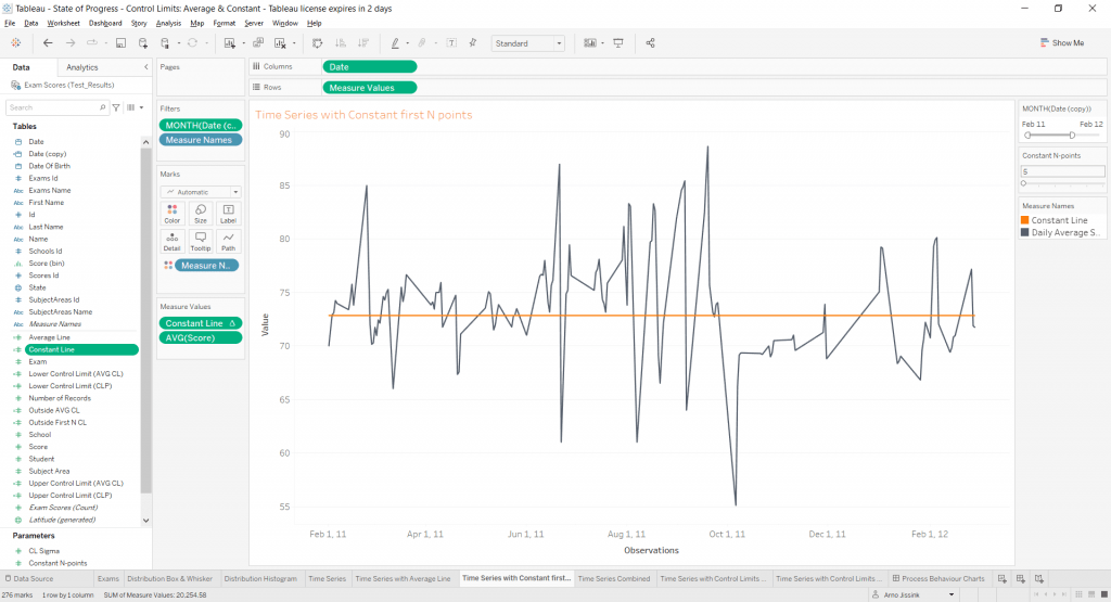
ii. Constant Line
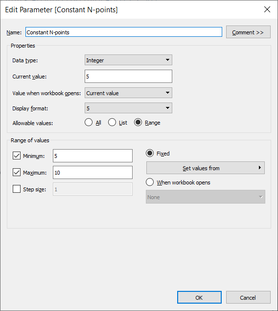
For this line a Parameter and Calculated Field is needed. Let’s call the Parameter “Constant N-points” with Data type Integer, Current Value 5, Allowable Range values from 5 to 10 and step size of 1. It is used to allow user input on the number of consecutive data points for the constant central reference line. Show the Parameter by right clicking on the Parameter that appeared in the Data Pane bottom.
For the CF we use the Parameter to assess against which data points in the Table the constant line is calculated. A (nested) IF THEN ELSE statement will be the basis. Create “Constant Line” as:
IF INDEX() <= [Constant N-points]
   THEN WINDOW_SUM
   (
   IF FIRST() = 0
      THEN WINDOW_AVG
      (
      AVG([Score]) , 0 , [Constant N-points] - 1
      )
      END
   )
ELSE PREVIOUS_VALUE(0)
END
This CF statement tells us that IF the position of a data point is below or equal to our chosen Nth point THEN we take the WINDOW_AVG of the KPI (Expression = Average of Score) from the first data point (index = 0, as index starts at 0) till the last data point (index is Parameter value – 1). It calculates this when the FIRST index is 0 and repeats that for every data point with WINDOW_SUM. ELSE the function PREVIOUS_VALUE is used. In effect it maintains the calculated value. We close the IF statement with the final END. Drag the newly created Measure onto the vertical axis to see the Constant Line. Format it to your liking.
3. Control Limits
Control limits in Tableau can be made using Reference Bands. In this example we will use the standard deviation (or sigma) of 1 to 3 to determine the Band From and To.
First a parameter is needed to input which standard deviation should be used.
Create a Parameter. Let’s call this one “CL Sigma” with Data type Integer, Current Value 2, Allowable Range values from 1 to 3 and step size of 1. Show the Parameter by right clicking on the Parameter that appeared in the Data Pane bottom.
Then we need two Field Calculations for the Upper and Lower limit. In this example I have created two for each Central Line type; being the Average Line and the Constant Line. The Formula for the Control Limits is:
Central Line ± Standard Deviation of the KPI (Average Score) * CL Sigma.
Use a minus (-) for the Lower Limit and plus (+) for the Upper Limit. As a Calculated Field for the Average Line the Statement is:
WINDOW_AVG
   (
   AVG([Score])
   )
±  WINDOW_STDEV
   (
   AVG([Score])
   ) *  [CL Sigma]
WINDOW_AVG returns the average of the expression within the window. No start or end is defined, so all visible data points are used. Similarly the WINDOW_STDEV is used for the Standard Deviation of the KPI, which was the Average Score. It is then multiplied by the Sigma value chosen.
Drag the Control Limits to the Marks Card Detail. This allows us to select these CF for the Reference Band.
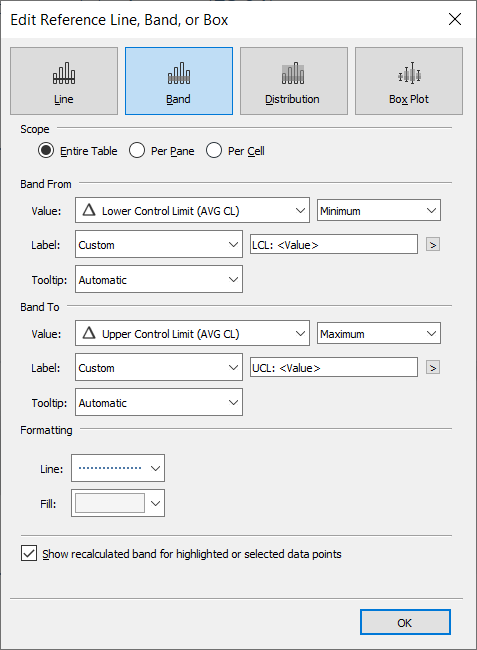
Almost there… In the Analytics Pane drag the Reference Band onto Table and Measure Values. In the pop-up Edit Reference Line, Band or Box select Entire Table as Scope. Band From is the Lower Control Limit, set as minimum and Band To the Upper, as maximum.
Presto! A simple Process Behavior Chart is ready:
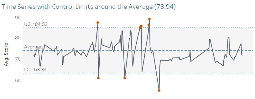
You have a simple Process Behavior x-chart and can start the Performance improvement journey for your chosen KPI.
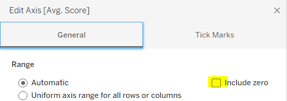
Optionally additional formatting is possible to make the chart cleaner and crisper. A simple example like Editing the Y-axis and unticking Include Zero’s already makes a big difference in the readability of the visualization.
If you are curious how to mark the data points outside of the control limits with a red dot, check out the Visualization on my page at public.tableau.com.
What is to come in the next installments of State of Progress: A Process Behavior Chart or XmR actually has 2 charts. The individual Values Chart (X), as we have now shown, and a Moving Range Chart (MR). In a next blog I will add the MR component and show how the Natural Process Limits for the normal variation range can be calculated. Continuing with XmR we will look into trending KPI’s and recalculating Central Line and Process Limits. Another planned project is the Waterfall Chart or Bridge used by many a financial to explain variation between budget and actual or other value change over time.
I hope this blog I shared can be useful for you! If you have any more questions don’t hesitate to contact us.
In need of further explanations and help? Join our workshops and trainings or hire a consultant!
Images from pixabay.com | screenshots from author