
Rounded bars in Tableau is a subject my colleague Gaia Pometto explained one of her recent blogs where she showed to create rounded bars in Tableau as part of Modern User Interface design (if you haven’t read it yet click here).
Using rounded objects, such as rounded bars or borders, looks great and gives a dashboard a, currently, modern look.
I say currently as perhaps years from now we look back in horror at even thinking of using something as out-dated as rounded shapes.
If you want to start using rounded bars in your dashboards, which I can completely understand as it looks very sleek, I wanted to high-light some considerations.
Rounded Bars in Tableau considerations
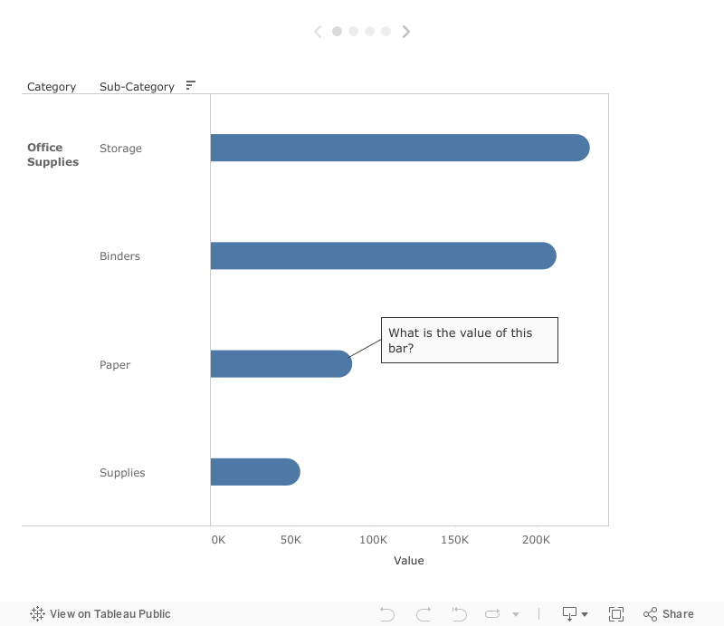
As you have noticed using rounded bars gives us two possible issues:
1) when we keep our axis and let end-users figure out the value they might over-estimate what the bar represents.
2) when we add reference lines, and more particularly use those values to colour our bars, users might see things they would not expect.
So how should we move forward?
The easiest thing is, as shown in Gaia’s dashboard here, don’t show an axis when using rounded bars in Tableau and show the mark values.
And don’t use reference lines when you have added rounded bars, you can always use colouration and add the goal/comparison value in the tooltip.
Hopefully I have aptly shown what to take into account when deciding to use rounded bars in Tableau, and why this happens. Personally I am curious what the next ‘Modern’ User Interface will look like and what tricks we might need to start building that one.
Want learn more about Tableau or Alteryx? Do you want to use these tools to their full potential? Check out our trainings and consultancy services.
Follow me on Tableau Public or LinkedIn for further ideas, blogs and news from The Information Lab Netherlands.