
How many of you take into account possible colour blindness in your end-user?
I catch myself plenty of times not thinking about the possibility and possible impact of not taking into account colour blindness.
We will have a short look into the possible impact and how to use overcome this issue.
Red–green color blindness is the most common form, followed by blue–yellow color blindness and total color blindness. Red–green color blindness affects up to 8% of males and 0.5% of females of Northern European descent.
Source https://en.wikipedia.org/wiki/Color_blindness
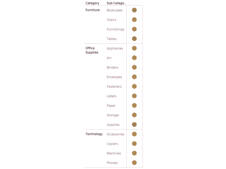
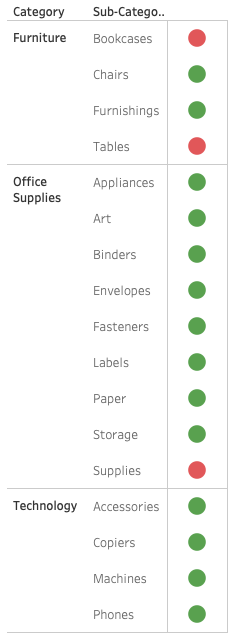
Let’s say we build an overview in which we show, by use of colour, if a certain Sub-Category is doing well (Green) or is not doing well (Red).
For anyone with Red-green colour blindness this might look like so:
Pretty hard to read right?
For those of you who do not have this form of colour blindness, here is the original:
To solve this we can use a different colour scheme, Tableau provides the colour palette called ‘Color Blind’ which is specifically designed to be able to distinguish between them.
It would change our viz to look like so:
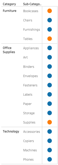
Which for people who have the Red-green colour blindness would result in:
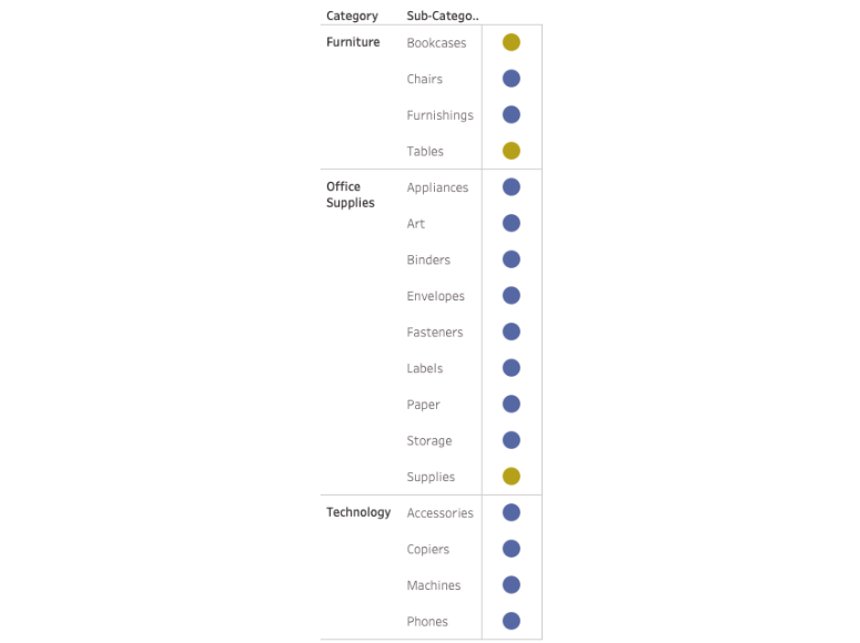
Problem solved right? Well at least for end-users to be able to distinguish between colours, but we could do one step better. We could add more context to our viz and create an even more intuitive visualization.
By adding difference in shape besides colour
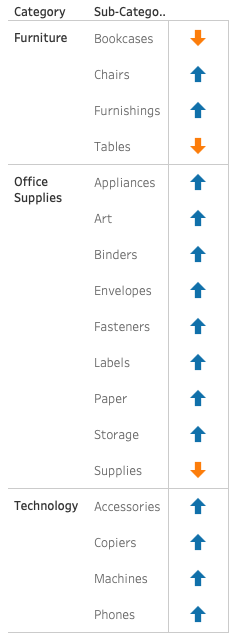
Easy to understand if you do not have a form of colour blindness, and even when you do:

So using a different colour palette and adding shape as a discriminating factor we can take into account end-users who might have a form of colour blindness and still provide the same information.
Curious if your viz stands up to different shapes of colour blindness?
You can find several programs to help you, I personally used:
https://www.color-blindness.com/coblis-color-blindness-simulator/
I hope this blog I shared can be useful for you! If you want to know more about visual best practices you can read “why do we visualise” part one and part two.
Would you like to learn more about dashboard design and visual analytics? We regularly host a dedicated training about this, click here for more info!
Header image from: author. Screenshots from: author.