
TC23, this year's Tableau conference, has been over for a while. Some 8,000 members of the #DataFam gathered in the wonderful world called Las Vegas. A large portion of those thousands of data analysts, vizwizzez and Graph Geeks sat in the Michelob ULTRA Arena during the conference's opening keynote. And after the elaborate and meticulously rehearsed opening, there finally came the part everyone was waiting for: Devs on Stage.
Here are three of the - in my opinion - most interesting features and developments announced in Tableau.
Automatic permission prompt in Tableau Cloud
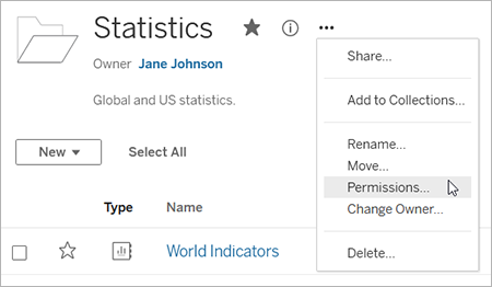
Many of our clients work with Tableau Cloud. So logically, as a consultant, I regularly work in the Cloud environment to create, deliver and publish dashboards and data sources. One of the issues I regularly run into is the overview of permissions. Who has which roles and permissions in a (large) organization is often unclear, especially for external consultants like me. It often happened that I shared a dashboard with an employee of a customer, who did not have the correct permissions to access it.
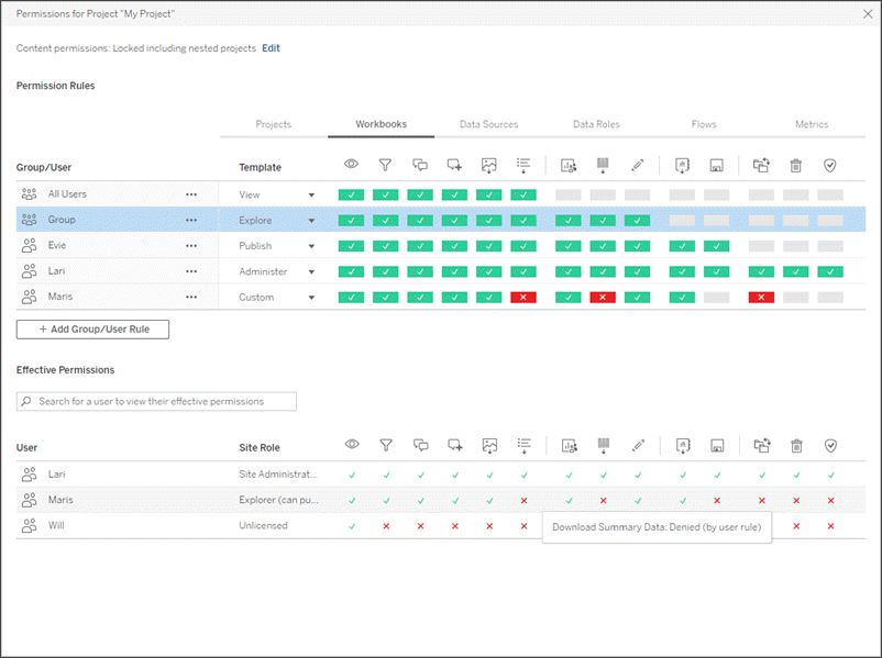
Figuring out which user groups a user is in and what those applicable and sometimes intersecting permissions are within a project folder is a lot of hassle. This is especially true when permissions are defined at the project level. Again, Tableau has listened to the community and that alignment becomes a lot easier. When you share a workbook with someone in the organization, a pop-up screen automatically appears where you can view and change the settings (to the extent you have those permissions, of course). This saves you a lot of time and unnecessary searching.
Better Data Protection in Cloud
Whatever structure your data has and wherever you have it stored, you want your data to be secure in Tableau. In addition to the feature discussed above, which also stems from a security perspective, further improvements have been announced in this area. The first is that Tableau Cloud is now HIPAA Compliant. HIPAA stands for the Health Insurance Portability and Accountability Act, a law that regulates personal data protection in the field of medical care in the US. Tableau Cloud now meets those requirements, which is good news for those doing business in the U.S., as well as within the EU.
The second announcement in this area relates to malicious access restrictions. Tableau would like to welcome everyone to the Cloud, and for anyone still hesitating between Server and Cloud, they have a new argument: IP restrictions. An administrator of the Cloud environment can set restrictions on the IP addresses from which to log in. For example, it is possible to enforce that employees can only log in when they do so from one or more specific IP addresses, such as the secure corporate network.
ersona
A third announcement has to do with Personal Access Tokens (PATs), which allow Tableau Cloud users to achieve long-term authentication. This allows them to work with Tableau's REST API to automate processes without having to incorporate login credentials into the code, or go through the login process manually.
PATs are awarded per person, but also had to be revoked individually each time. Thus, it could easily happen that someone had a PAT when they should no longer have one. The new approach allows administrators to manage PATs through an api, grant or withdraw them based on user group rules, and manually assign an expiration date to a PAT based on need.
New visualization types: sankey charts and radial charts
Tableau likes to keep it simple: connect, drag, drop and a visualization appears. It can be that simple. And anyone who wants to visualize effectively better keep it simple. Still, Tableau leaves users free to think out of the box and come up with their own most creative solutions to enable specific and often quite complex visualizations.
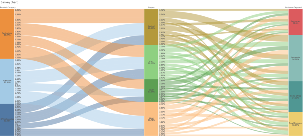
One of the visualizations you had to do a good job on was the Sankey chart. This is a flow visualization that allowed you to visualize the change in the distribution of a measurement value between different dimensions. In a business context, this is not always a useful visualization because it is difficult to read, but it does look impressive. Those who still want to give it a try without putting in too much effort are in luck. Tableau has in fact added the Sankey chart as one of the visualization types out of the box.
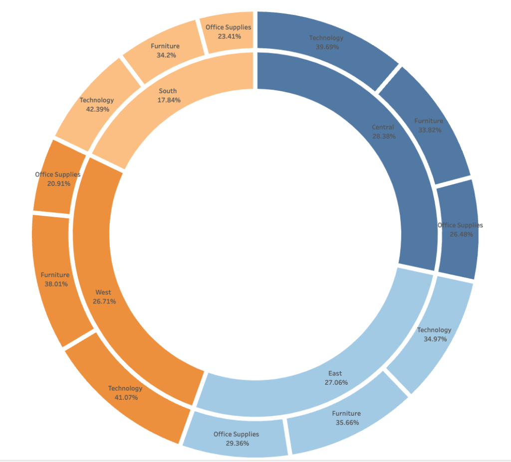
The functionality is already testable in Tableau Public until June 30, after which it should also be released in Tableau Desktop and Cloud this year. Also, the radial chart (a donut chart with multiple layers or rings) is now easy to create - see example. The ability to customize the visualizations is somewhat limited by the shape, but nonetheless this is a welcome addition to Tableau.
And much more!
Of course, there have been many more announcements about new features and changes. See also my colleague Joris van den Berg' s blog about perhaps the most talked about announcements: Tableau Pulse, Tableau GPT and Tableau Gesture. Several new features are also coming for Tableau Prep. Want to read more about Tableau? Then take a look at our page of Tableau blogs.