Often when given a data set, we might want to use it to make predictions about what will occur in the future. The information we have is called “x” and the outcome we care about “y”. One way of doing this is with a linear regression, to establish the relationship between the two. However, the relationship between the x and the y in our data is often non-linear. One way of solving this problem is to modify out x values in such a way that the relationship becomes linear. This is called a transformation. Spline transformations are a type of transformation. In this article, we will examine how they work, and how to use them.
In a typical least-squares regression, we fit a line to our data by minimising the sum of the squared errors between the line and our data. Let’s generate some data as follows;
y = log(x) + sin(x/7)
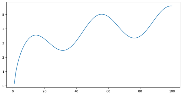
In the example below we have fitted a line to our data (which has some added noise).
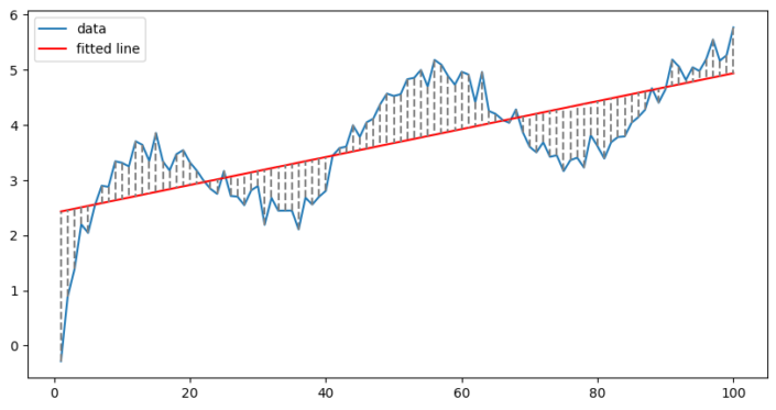
The fit of the line is defined by the equation:
Y = intercept + (coefficient * x)
The errors are the dotted lines, which we aim to minimise. Clearly this doesn’t work very well, our line doesn’t do a good job of following the data, since our data is not linear.
B-splines can be thought of as a way to break our data down into smaller sections, to allow us to fit a line to each discrete section independently. In addition, they allow us to also fit a curve instead of a line to our data, while still using a linear model.
This probably doesn’t do much to clarify what they are, but wikipedia certainly doesn’t do better;
“a B-spline or basis spline is a spline function that has minimal support with respect to a given degree, smoothness, and domain partition. Any spline function of given degree can be expressed as a linear combination of B-splines of that degree. Cardinal B-splines have knots that are equidistant from each other.”
Instead let’s look at an example. The initial values of x (in our example above) range from 1-100. We will transform this single list of x values into 3 separate lists of 100 values using a spline function. The resulting values are all between 0 and 1. We can plot our splines on our original x axis;
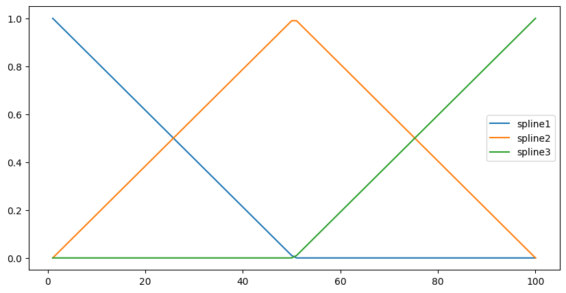
Each spline peaks at a different point. When spline1 is high, spline3 is low etc. The splines also sum to 1 at any given point. If we now try to fit a linear model to our data, using the splines as our x values this is what we get;
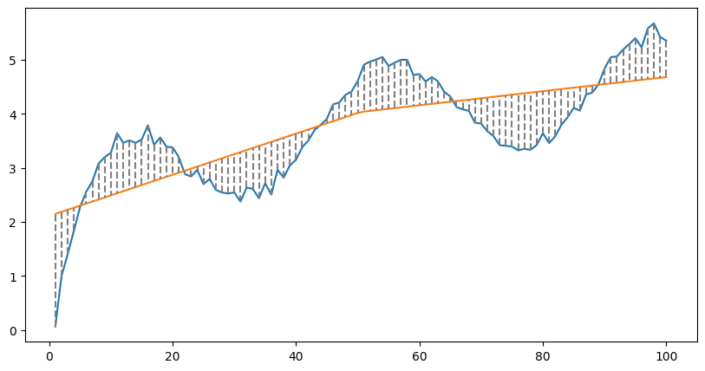
It might be hard to tell the difference, but at the x-value of 50, there is a bend in the line. This time our equation looks like this;
Y = intercept + (coefficient1 * spline1) + (coefficient2 * spline2) + (coefficient3 * spline3)
In effect what is happening is that for different values of x we are using different sets of coefficients. When x is below 50 we use splines 1 and 2, because the value of spline 3 is zero. When x is greater than 50 we use splines 2 and 3. This is what allows us to fit non-linear data using a linear model.
The number of bends in the line is referred to as knots. In the example above we used 3 knots, as there must also be a knot at the beginning and the end. To more closely fit the data, we simply use more knots. Below with 6 knots;
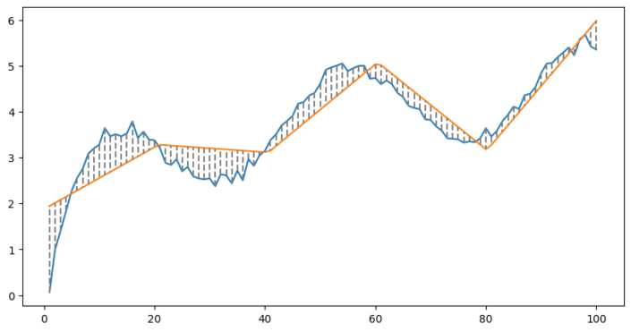
Clearly we are beginning to fit our data. What is happening is that we are splitting our data into chunks and fitting a separate line to each chunk.
We still aren’t fitting the data perfectly. If we want to do that we need to make use of curves. This can be achieved by using splines of degree 2 or higher. Here is a plot of with some splines of degree 2;
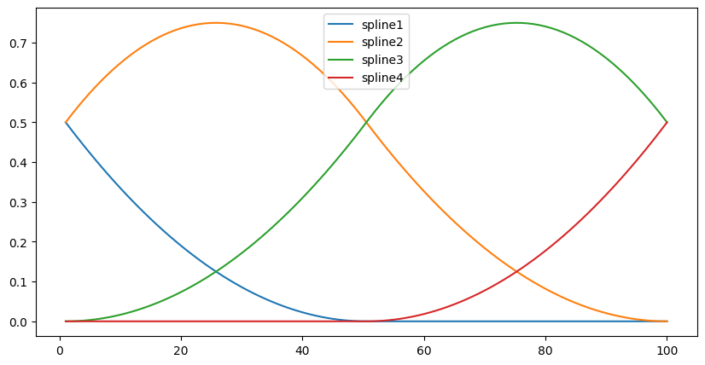
Now the splines are no longer linear, but curved. What happens if we fit a linear model?
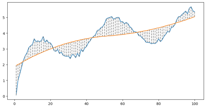
The ‘line’ is no longer straight, but has begun to bend. The fit can be improved by using more knots and splines of a higher degree;
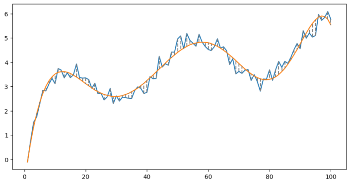
That’s it! We’ve seen how splines allow us to use linear models on non-linear data.
There is still one issue. The more knots we use, and the higher the degree, the better we can fit the data. This can lead to a problem – overfitting. Here is the same data but with much more noise;
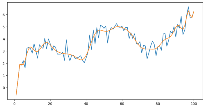
This fit follows the data far too closely, we use too many knots and fit every little change in the data. Most of the variation in the data is just noise, and we don’t want to fit it. When we try to interpolate we will be including the noise in our model, which makes it less accurate. To solve this there are 3 approaches;
Approach 1 is simple, by limiting the amount of knots we can’t overfit the data;
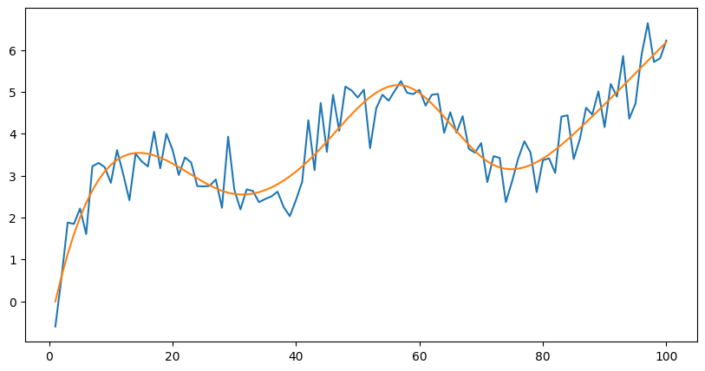
This works well if you are able to visualise your data and can easily tell if you are overfitting. However in many cases this isn’t possible. If the data is multi-dimensional it can’t be plotted on an easily readable graph.
Selection criteria are equations for model assessment (read more about them here).
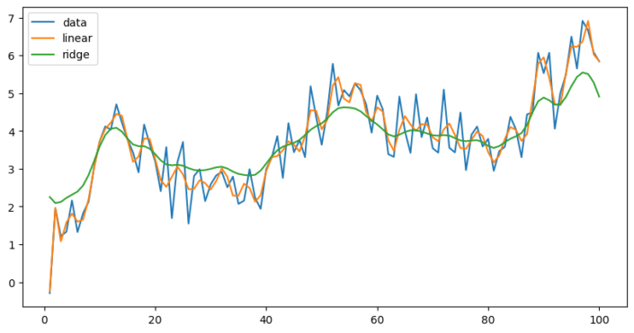
Approach 3, makes use of regularisation, which limits the complexity of the model by introducing a penalty. The graph below is of the same data, but with more noise. Using splines with 50 knots we fit two models, one being a standard linear regression, and the second being a ridge regression. The ridge model makes overfitting less likely.
I hope you enjoyed this introduction. If you find it interesting to see how models work, you might wish to read my blog on exponential smoothing for time series analysis.