
Ons zintuiglijk geheugen helpt ons razendsnel belangrijke informatie te herkennen in de wereld om ons heen. Dat doen we door te scannen op pre-attentieve eigenschappen. In een mini-serie van drie blogs leg ik je uit hoe van deze krachtige tools gebruik kunt maken in datavisualisaties. Met vandaag: hoe zet je vorm effectief in?
Een korte introductie
Even een korte introductie: pre-attentive eigenschappen zijn kenmerken (attributes) van dingen om ons heen die wij registreren in ons brein vóórdat we ons daar echt bewust van zijn (preattentive). Dit doen we in ons zintuiglijk geheugen (sensory memory). Nu hebben de meeste mensen vijf zintuigen (zicht, reuk, smaak gehoor en gevoel), maar we beperken ons hier tot het zicht en dus pre-attentieve visuele eigenschappen.
We kunnen pre-attentieve visuele eigenschappen indelen in grofweg drie hoofdcategorieën: vorm, positie en kleur. Uiteraard kun je heel goed verschillende categorieën met elkaar combineren, maar welke eigenschap op welk moment het meeste effect heeft, hangt af van welke informatie je wil overbrengen. Vandaag bekijken we de verschillende manieren om vorm effectief in te zetten.
Vorm
Vorm is een veelzijdige eigenschap van visuele objecten aangezien deze niet alleen betrekking heeft op de uiterlijke kenmerken, maar omdat deze ook in relatie staat tot de omgeving. Deze eigenschappen worden echter besproken in de blog over de derde categorie pre-attentieve eigenschappen: positie. In de buitenwereld hebben we drie ruimtelijk dimensies waarin een vorm kan bestaan, maar aangezien datavisualisatie meestal op een scherm worden getoond, gaat dat hier niet op. Desalniettemin zijn er verschillende manieren om vorm in te zetten om het oog te sturen:
- Lengte
- Breedte
- Grootte/omvang
- Vorm
Hieronder leg ik bij elk van deze vier punten uit hoe je deze het beste in kunt zetten, en ook wat je vooral níet moet doen.
Lengte
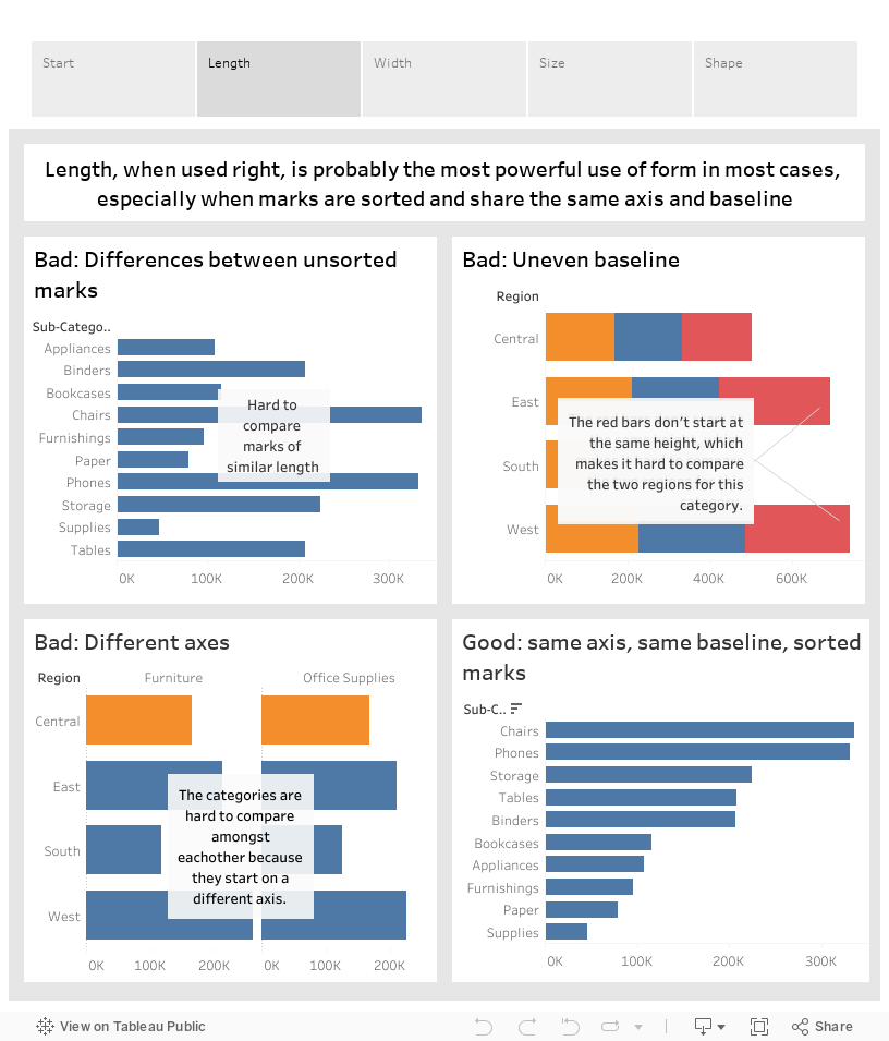
Lengte, of het verschil daarin, is een van de voor het menselijk oog makkelijkst te onderscheiden eigenschappen. Zelfs een klein verschil is nog heel goed waar te nemen. Het is niet voor niets dat de staafdiagram een van de bekendste vormen van datavisualisatie is. Lengte is goed om kwantitatieve waarden met elkaar te vergelijken. Voorwaarde is wel dat de objecten op dezelfde as of lijn staan, en het liefst ook gesorteerd. Anders zijn de lijnen moeilijker te vergelijken, zoals je in de visualisatie onderaan deze pagina ook goed kunt zien.
Breedte
Wanneer heb je het over breedte, wanneer over lengte? Daarover kun je discussiëren. In dit geval bedoel ik met breedte de nadrukkelijk kortste kortste kant van een mark, ongeacht de oriëntatie. Ook breedte wordt ingezet voor kwantitatieve waarden, maar minder vaak dan lengte. Dat komt omdat de verschillen in breedte per (mijn) definitie altijd minder groot zijn dan de verschillen in lengte, waardoor deze vorm niet zo makkelijk in te zetten is.
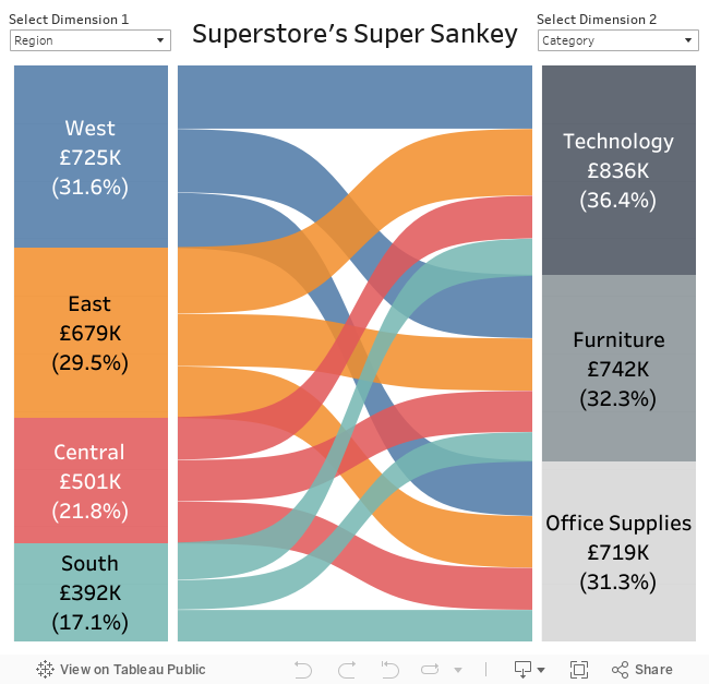
Maar wanneer het aantal marks klein is en de exacte verschillen tussen de lijnen niet belangrijk zijn, kan breedte prima ingezet worden. Een populair voorbeeld hiervan is de Sankey-diagram (door Ian Baldwin), waarin de marks als een rivier meerdere malen vertakken. In het voorbeeld hieronder gebeurt dit maar een keer, maar er zijn ook voorbeelden met verdere vertakkingen. Tot slot kan breedte ook tekstueel worden ingezet door bijvoorbeeld totalen te benadrukken.
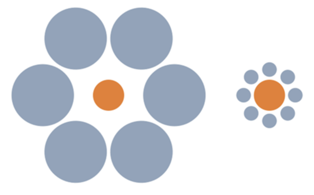
Grootte
Met grootte wordt in de visualisatiepraktijk vaak het oppervlakte van een mark bedoeld. Daarmee is grootte een tweedimensionale eenheid, waarbij lengte en breedte meestal gelijk zijn (vierkanten, cirkels of sterren). Het ligt dus voor de hand dat grootte het best ingezet wordt voor kwantitatieve waarden. Toch laten verschillende objecten zich juist hierdoor niet heel makkelijk vergelijken, aangezien ons idee van de grootte van een object sterk wordt beïnvloed door de omgeving ervan. Het is voor het menselijk oog makkelijker om verschillen over een enkele as of dimensie te zien dan over twee.
Grootte kan op een hoger niveau wel een belangrijke rol spelen. In de vormgeving van een dashboard vallen grote headers en visualisaties meer op dan kleine. Zo trekken de titels en kopjes in een blog sterker je aandacht dan de losse tekst.
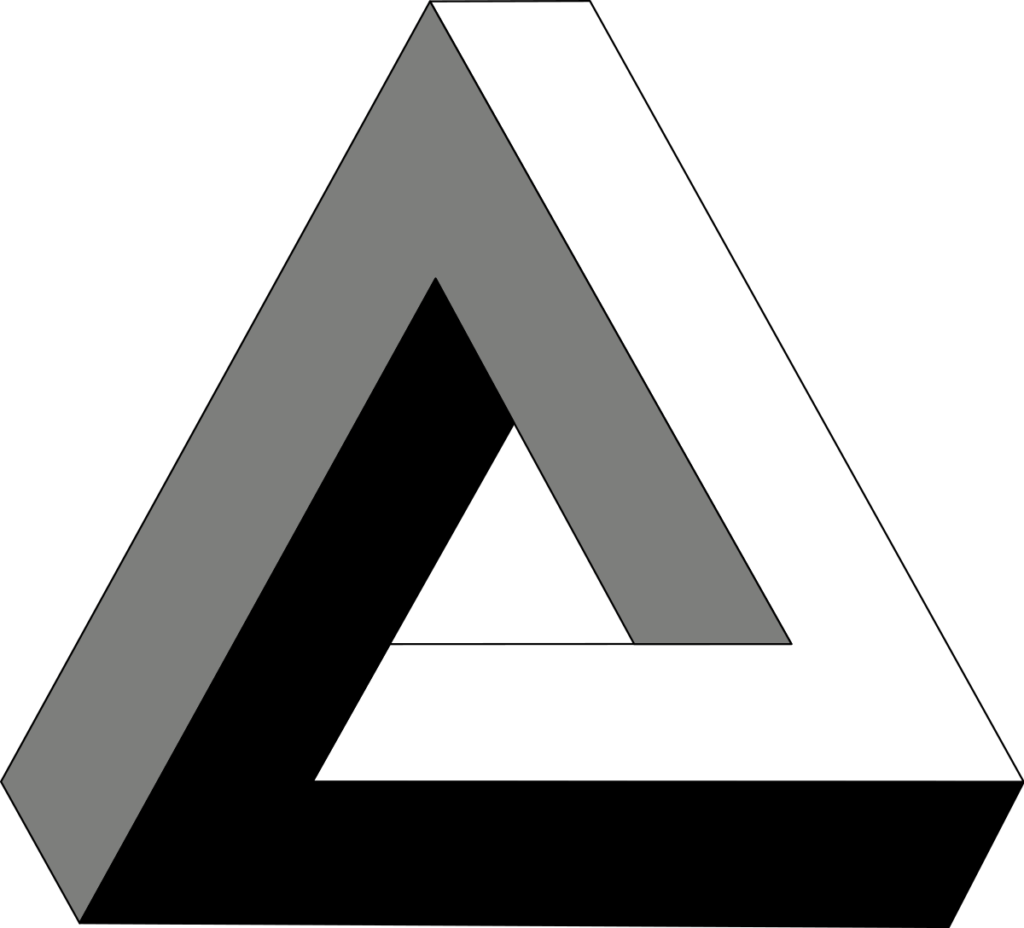
Vorm
Deze blog gaat over vorm in de brede zin van het woord. Maar deze alinea gaat over een specifieke vormen, shapes in het Engels, in plaats van het meer algemene form. Voorbeelden hiervan zijn onder andere een vierkant, cirkel, driehoek of ster, maar in Tableau is het mogelijk om je eigen vormen te gebruiken of zelfs plaatjes te importeren. Vormen worden vooral gebruikt om categorische of kwalitatieve waarden te groeperen of van elkaar te onderscheiden.
Hierbij is het belangrijk om vooral niet teveel vormen te gebruiken. Zoals voor veel visualisatievormen geldt dat we gemiddeld maximaal zeven, maar soms zelfs al minder, individuele objecten in ons kortetermijngeheugen kwijt kunnen. Daarboven raken we het overzicht kwijt en maken we al snel fouten. Indien mogelijk, helpt het gebruik van vormen of afbeeldingen met een directe visuele link met de waarde die ze afbeelden, zoals in het voorbeeld in mijn onderstaande Tableau Public-story.
Een visueel geheugensteuntje
Bovenstaande tips zijn vooral bedoeld om zo je visualisaties zo effectief (en dus simpel) mogelijk vorm te geven. Maar effectief en simpel is natuurlijk niet altijd mooi, leuk of grappig. Voel je dus zeker vrij om je creatieve geest los te laten voor een geweldige infographic. Maar mocht je op zoek zijn naar wat goedbedoeld advies, kun je altijd even onderstaande story erbij pakken. Hierin staan de belangrijkste tips uit deze blog nog eens visueel op een rijtje.
Dit is de derde van een serie blogs over het hoe, wat en waarom van datavisualisaties, en tweede in een minireeks over pre-attentieve eigenschappen, naast kleur en positie. Meer blogs (met links) volgen in de rest van deze maand. Klik hier voor het complete overzicht van al mijn blogs, of bekijk mijn profiel op The Information Lab of op Tableau Public.
Bekijk onze andere blogs over Tableau, Alteryx, and Snowflake.
Werk samen met een van onze consultants en haal alles uit je data.
Neem contact met ons op, en wij helpen je meteen.