Using Tableau Prep to resolve Data Redundancy
The risk of presenting misleading and/or incorrect information in a Dashboard always exists. When using new or ad-hoc data sets this risk increases. Being aware of this risk is never a bad idea. Database Normalization principles can also be applied on single data sets. Using Tableau Prep or Alteryx to reduce Data Redundancy can help transform the to present insightful Dashboards.
My colleague Gaia Pometto wrote an interesting blog about being presented with a data set with redundancy. In her scenario there is no access to other tooling. Subsequently she demonstrates how a Level Of Detail Calculation can remove the impact of columns that intervene with your visualizations when only needing one specific level of detail.
I further explore this simple data set for when a Transformation tool is at your disposal. I use Tableau Prep, but you can ofcourse also use Alteryx.
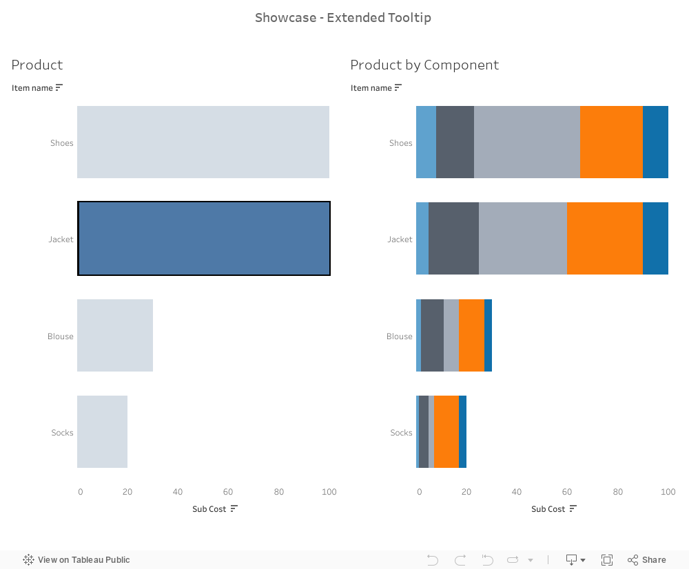
This blog showcases a start to end from Tableau Prep to Dashboard on that same data set, dealing with the data redundancy at attribute level (columns). In addition we will have good looking functional extended tooltip for our users.
Note: the data set is kept simple to showcase a general redundancy risk and possible solutions. More complex data sets can easily result in similar or greater risks when not exploring the data structure.
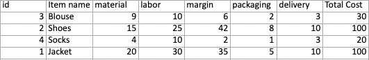
The Data redundancy in question
A simple Viz, what could go wrong… right? We have pulled the Cost with the Item Id and name (product) into a horizontal bar chart.
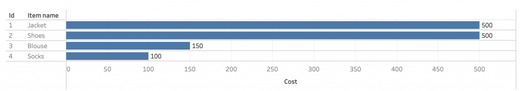
But without paying attention to the data source the viz of the cost per product is presented wrongly.
Let’s have a look at the data set including the Sub Id and Sub Cost.
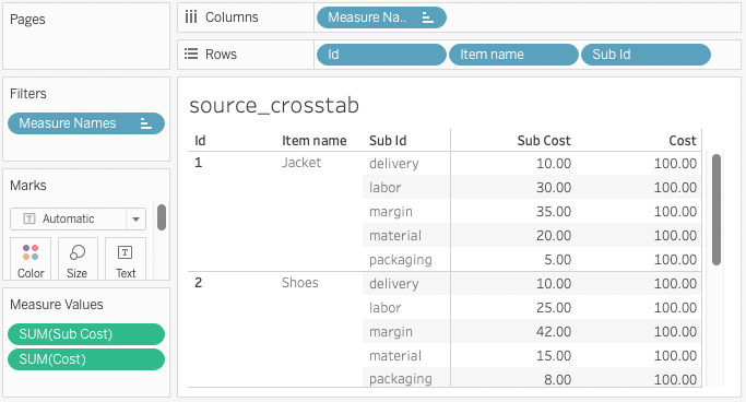
Whether you immediately see where the problem occurs in the Viz above or need a few moments…. data redundancy is the culprit. In this table Cost is a redundant attribute. When aggregated at ID level it adds up five times.
This basic example illustrates where things can go wrong when not familiar with the business behind the data. Imagine the increased risk when dealing with a new complex data set or sets of related data.
Possible Solutions using Tableau Prep
I explore two options to resolve the data redundancy problem with Tableau prep.
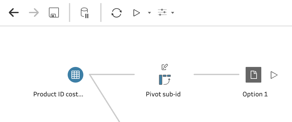
Option 1 – the pivot
Spreadsheet Pivot enthusiasts may be drawn to this solution first as it returns a nice looking data table.
Here I used Tableau Prep to pivot the data with a simple Pivot and save the output to .hyper (Tableau), excel or csv. By pivoting Row Sub Id to Columns the resulting data set has all cost components as separate attributes (see above). Each Product (ID) is now a single row in the data set.
.
In Alteryx option 1 can be resolved with a similar tool, called Cross Tab.
The drawback of this choice is that there is no easy way to add the set of Sub ID’s (cost components) to any graph as an additional Level of Detail. So this leads to the next solution.
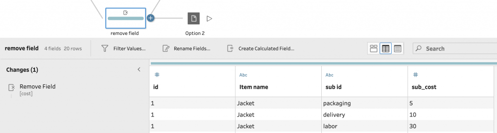
Option 2 – remove data redundancy
We simply delete the Cost attribute and thereby remove the redundancy. Using Tablea Prep I like to use a separate Clean step and remove a field by selecting the Attribute (here cost) and removing (click the three dots “···” next to the field name).
Save the file to a location where you can connect it to Tableau.
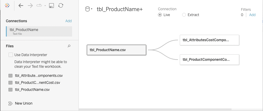
Continuing Normalization one could argue the need to create a separate product table containing ID and Item name. The result would then be 2 Data tables. tbl_Product and tbl_ProductComponentCost. Using Tableau Relationships these can be linked on the unique ID by dragging to the Data Pan canvas and editing the orange relationship line (if needed).
Conclusion is there a right or wrong?
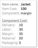
No, but as a stand alone solution option 2 is preferred. However I learned from this simple example that creating a detailed Tooltip is not that simple with option 2. Adding in the data from option 1 allows for easy extensive Tooltip that could please your users. In the picture above you already see the tbl_AttributesCostComponent added on the Data Canvas.
After reading this article you can explore the data set and various solutions in this public Viz I used as a working file and Story book. Or check out the final Viz on my Public. Find the LOD calculation to fix the Total Cost per Product on the stacked bar chart… would you have thought of this?
If you want to read other blogs about software like Tableau and Alteryx, follow a training course or book a consultant please visit The Information Lab NL for more information.
My final Dashboard showcasing two bar charts options with extended tooltip: