In this series, I will explore how compositions are different from comparisons, and what chart types you can use to visualise a composition. You can find Part 1 of the series here.
Last time, we discussed how compositions are a special kind of comparison. Like comparisons, a composition can show differences between several values. Unlike comparisons, a composition also places values in a larger context: their contribution to a greater whole. If we find ourselves caring about that second part, a composition is the way to go.
Showing the whole
To visualise a composition, or part-to-whole relationship, we need two ingredients: the parts, and the whole. Bar charts are great at showing the parts, allowing for easy comparisons between different values, but they lack the second ingredient: they do not visualise the whole. Luckily, there’s a wide variety of chart types to choose from that do. An easy way to bring the whole into a bar chart is to transform it into a stacked bar chart. Let’s see what that does to my simple library data.
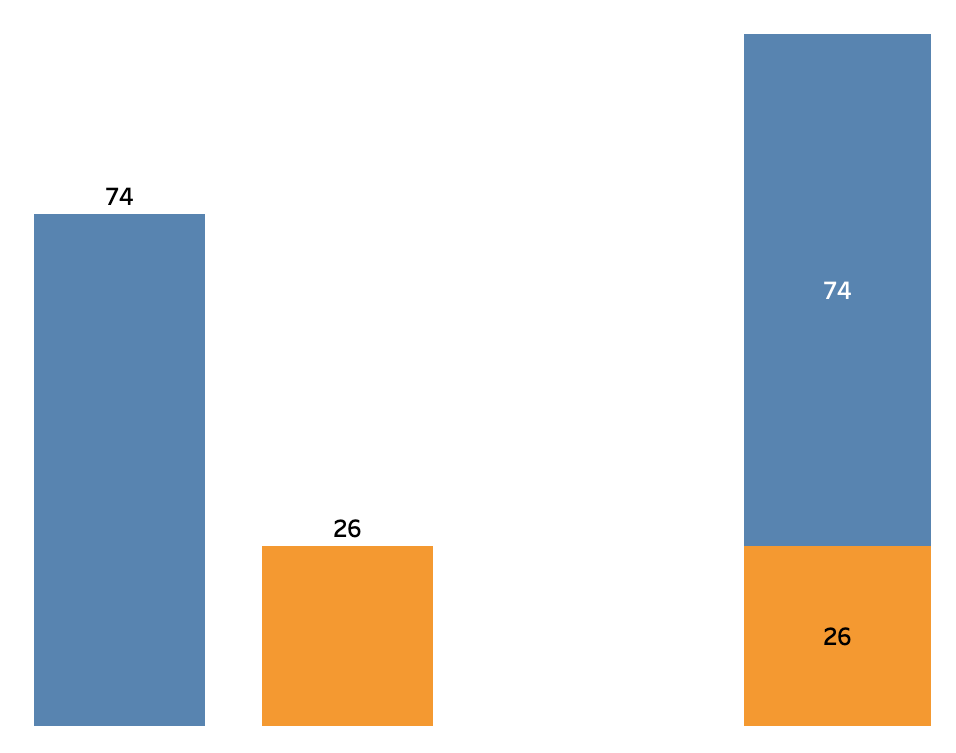
The original bar chart is on the left, the stacked bar chart is on the right. Not too impressive — the dataset is very simple, after all! But there’s a crucial difference between the two. Can you see it?
In the stacked bar chart, the whole is immediately clear. The whole is part of the chart: the total number of books exactly corresponds to the height of the bar. Since the whole is present in the chart, I can use it to check that my inventory comprises only two sections, and that the blue part contributes much more to the total.
Couldn’t I get all that from the simple bar chart? Sure! But my brain had to do some work to get there. The visualisation only showed the parts. To answer the question I had to know that these were the only two parts, and I had to imagine what the whole would be, by mentally stacking the two bars on top of each other. The whole was nowhere to be found on the visualisation itself.
Helping the brain
My brain was doing okay reconstructing the whole there, since the dataset is simple enough. But remember, a good visualisation makes relationships obvious at a glance. This frees up the brain to focus on what really matters – especially when the relationships are more complex.
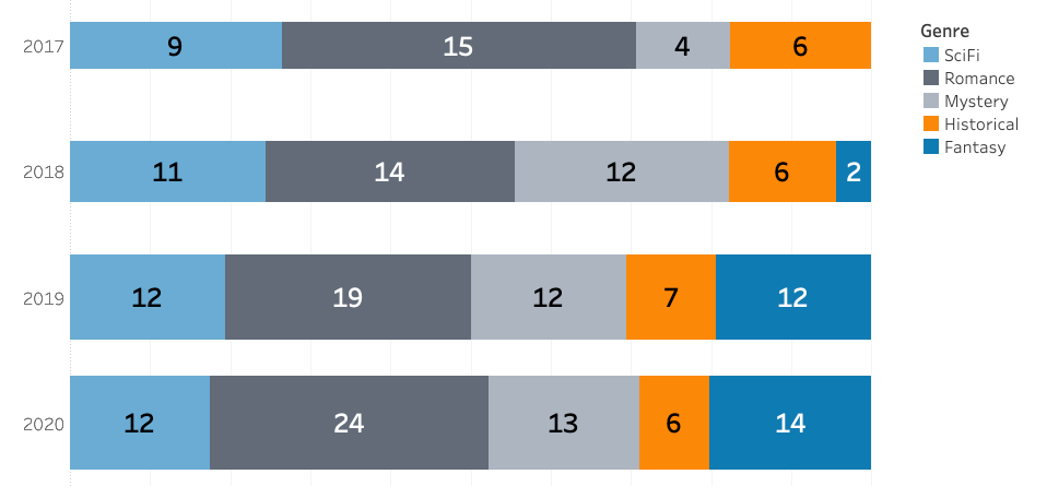
Let’s look at a bigger dataset. I have some bar charts showing the number of books by genre, across a time period of a few years:
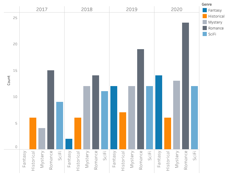
That’s a lot of bars! Even so, a bar chart makes individual comparisons easy. I can tell that in 2019, my inventory had a lot more Romance novels than Historical novels, and that the number of Historical novels does not really differ from year to year. I might even spot some trends: it looks like the bars on the right are higher, so probably the number of books increased over the years.
Does the genre distribution change over the years? Was there a shift in focus away from a certain genre? These questions need two ingredients to answer: the parts, and the whole. That’s our cue to bring the whole into the chart:
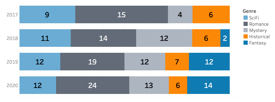
The stacked bar chart shows parts relative to the whole. Now my brain can easily process changes in composition. For example, I can immediately tell that Historical novels make up less and less of my inventory each year, despite the number of Historical novels not really changing.
Could we have gotten that trend out of the simple bar chart? Perhaps. Remember, we concluded that the number of Historical novels remained relatively stable. We also saw that the total number of books increased. But was it obvious at a glance? Did you spot it?
Compositions to come
Compositions, such as a stacked bar chart, make part-to-whole relationships a lot easier to analyse. Next time, we will go over ways to make your own stacked bar charts in Tableau.
By the way, did you catch that we lost the visual information on the total number of books increasing, along the way? There’s a way to bring that back. See how in Part 3.