
Why should I opt for a classroom training? It takes multiple days and costs money. Why should I not use online sources such as free YouTube tutorials? This is a question that me and my colleagues will sometimes be asked by people interested in learning Tableau.
YouTube tutorials can be useful, but you can never know if the quality is good, if the explanations are thorough enough and you can’t deep dive into subjects that maybe interest you. In my experience as a Tableau trainer, in a classroom attendees have the opportunity to not only ask questions to us, the trainers, but also to discuss and exchange ideas, and they can do it also with the other participants, fellow Tableau users. Not less important is the fact that the trainers will always try and adapt the explanation to the speed and understanding of the class, allowing everybody to reach their desired learning goals.
But since more and more often I stumble upon questions about YouTube videos, I’ve recently decided to give it a try and I have watched a few. What struck me the most was the lack of explanations and understanding of core concepts, and this is what prompted me to write this blog where I decided to show two examples of poor explanation and how classroom training would circumvent this.
Example 1: poor explanation
YouTube tutorial
The first example is perhaps somewhat innocent, as this has to do more with poor explanation. During a video the instructor is giving an explanation about the DataPane and at some point they say something along the lines of ‘As we can see Blue is associated with Dimensions and Green is associated with Measures’. The instructor then goes on to explain that is is a bit more complicated and that Blue is used for Discrete fields and Green for Continuous fields. Whilst doing this they hover their mouse over the Dimensions when talking about Blue and they hover with their mouse over Measures when talking about Green. Further on they show what the difference is by changing a Field dragged onto a shelf from Green to Blue (or from Continuous to Discrete). All in all, in the end I believe a viewer will probably know how Blue pills and Green pills will affect the visualisation after this explanation. However, I do think that most viewers will wrongly associate the Blue colour with Dimensions and Green with Measures.
In class training
During a classroom training there will be opportunities to check-in with the classroom and ask questions to see if the basic understanding is correct. And if not, since it is a key concept, we can use a different explanation to get the message across that colour is not associated with Dimensions or Measures.
Example 2: when the trainer makes mistakes
The second example is my favourite as this is by far the worst.
YouTube tutorial
The Explanation – During this tutorial the trainer provides an explanation of Blending. By itself the explanation is on point, although I was glad I already knew about Blending which makes it easier to follow the examples. But after the explanation they move on to provide an exercise, which you can follow along with.
The Example – The first datasource is already created, with a connection to Coffee Chain (a well known example dataset provided by Tableau). Within this datasource they tell us to click on the ‘Add’ button next to Connection to connect to Sample Superstore and create a second Datasource.

This is wrong as this only creates a second connection within the original datasource.
Of course as they have set up their example in advance they have two separate datasources pre-created which allows them to continue with their example, but as a student following along with their steps I am already stuck.
Let’s pretend I too was able to continue following alongside their example.
The next step is to open a new sheet and within that sheet selecting the datasource ‘Sample Superstore’, dragging the field “Profit Ratio” in the Columns shelf and “State” in the Rows shelf, and this creates a bar chart. They click around and change the visualisation from Automatic to a Gantt Bar (for reasons they don’t explain) and decide to turn it back to Automatic. In my experience as a trainer, this is irrelevant during this specific topic and might confuse the students. Although it is not wrong per se.
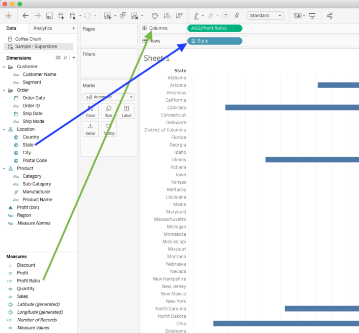
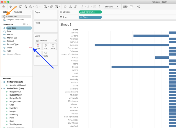
The next step is to select the other datasource, ‘Coffee Chain’. Here they show the linking symbol next to “State”, which indicates a common field. They switch back to the prior Datasource ’Sample Superstore’, and show that State is indeed part of both Datasources.
After doing this, they finish the exercise by saying something similar to: “This now shows the Profit Ratio by State for both Superstore and Coffee Chain”.
I had to go back a few times to ensure I hadn’t missed anything and this was indeed how they’ve explained Blending. Which this is not what Blending is in reality.
What they showed is only a bar chart showing Profit Ratio by State for Superstore. In no way does this viz use two datasources, and this is not how you use Blending.
In class training:
In a class room setting students would be able to ask questions, especially the first step of this last instruction. As students would not be able to recreate this step and therefore the trainer would have to properly explain how to create a second datasource.
I have to admit, however, that even in a classroom setting this particular trainer would struggle with explaining Blending. But even admitting this, I believe that trainers standing in front of a classroom will be of higher quality, be better at explaining concepts and having the interaction with a live audience helps to ensure the students correctly understand the material presented. A live training always gives the opportunity for a trainer to adapt their explanation to the need and type of understanding that works best for the students.
Then, why do I prefer classroom trainings?
In my opinion as Tableau trainer, classroom sessions will always be a better source for knowledge compared to free YouTube tutorials, even aside from the quality of the trainer, or aside from the interaction you can have on a student/trainer level. It will get you out of the office, and will let you gain knowledge unhindered by colleagues who are suddenly standing beside your desk with questions. It will let you ask questions during the training, ensure your understanding is correct and trainings give you the opportunity to talk to other Tableau users and be inspired by their ideas.
So, my advice would be to definitely use classroom training when possible. Gain knowledge, have conversation with others during the training and be able to really take that time out to learn.
I hope this blog I shared can be useful for you! If you have any more questions don’t hesitate to contact us.
In need of further explanations and help? Join our workshops and trainings or hire a consultant!
Header image from: unsplash.com. Screenshots from author.