Filters in Tableau – An introduction
What’s the ordinary Tableau user looking for most desperately – apart from the latest version with nifty tricks? “Filters in Tableau” pops up in the fist results quite often. When one searches a bit, the following results could be found:
Summarizing, the following questions arose/arise:
- How to add a filter in a Tableau dashboard?
- How to connect with certain data source types?
- All other questions (like pivots and ‘Can I use Tableau for free?’).
(For those who originally were looking for information about the tableau vivant see this link. For a free version of Tableau, click here. According to Google, search terms in Dutch with regard to Tableau are mostly related to the spelling and meaning of the aforementioned word. The Dutch quest for a free version is another typical search subject.)
Dashboards and Filters in Tableau
With regard to the aforementioned questions, at this very moment I might be able to elucidate the first shrouded mystery): dashboards and filters.
Step 1: Open a dashboard. The example in the figure below contains a barchart and a map. The filters and legend came along from the source-worksheet.
Step 2: In order to add a filter, first select the section in the dashboard to which you wish to add the filter. Click on the icon ‘Show/Hide Cards’ on the top right of the toolbar (see figure below). In the dropdown menu you can select ‘Filters’ easily. In the worksheet with a map is selected, thus the filters connected to this worksheet appear.
The other option: Common Filters
Since the foregoing section might be a bit meagre, and because there is a connection between worksheet-filters and dashboard-filters, here’s a (somewhat scanty) walkthrough of filters in general.
First it might be useful to realise that filters created in the worksheet are transported to the dashboard in case you create the first dashboard of the workbook. See above for the steps to add filters if you already have made a dashboard.
Select a Header
A quick way to filter inside a worksheet is as follows, but it is rather laborious.
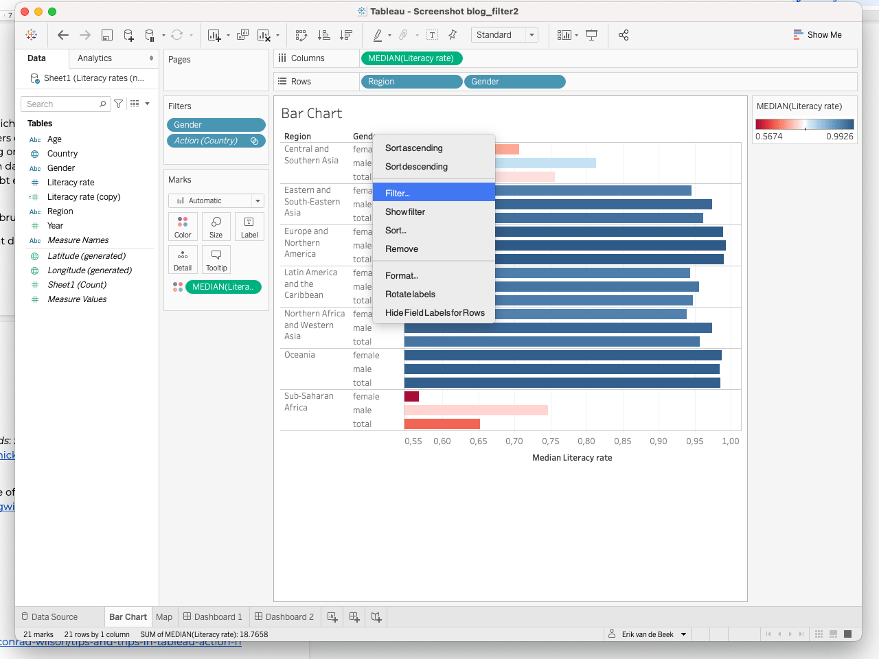 |  |
- Click with the right mouse button on the header of a column inside the worksheet.
- A dropdown menu appears, select ‘ filter’.
- A pop-up appears (see above) which you can use to select and deselect elements.
Filter Shelf
As mentioned above, the header isn’t the best place to filter, there’s a shelf for filtering that’s rather efficient.
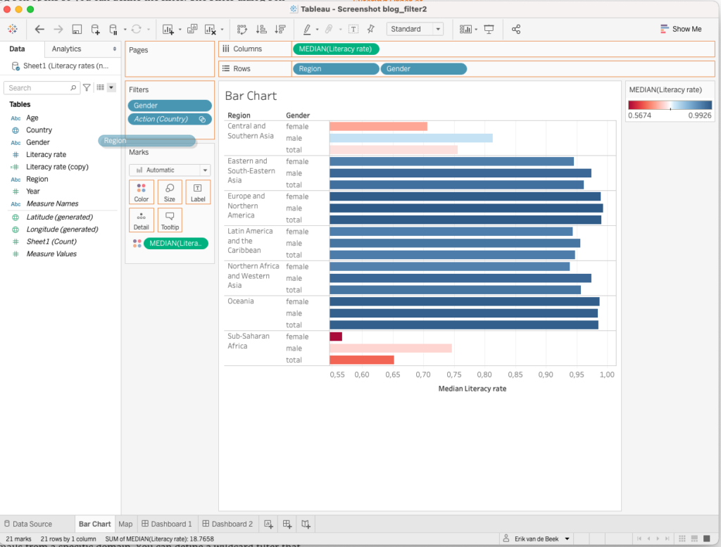 | 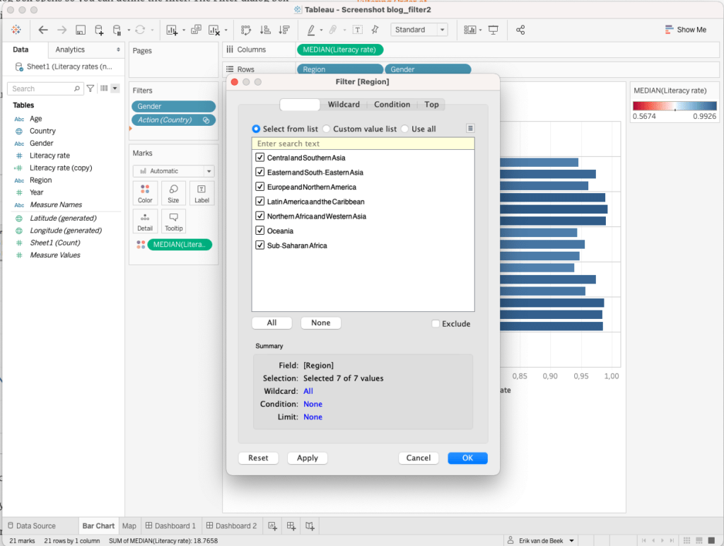 |
- Drag the values or data by which you would like to filter to the Data Pane towards the Filter Shelf . Which pop-up screen will appear depends on the type of field that has been selected: a dimension or a measure. In most cases the dimension contains categorical information and the measure quantitative.
Dimension
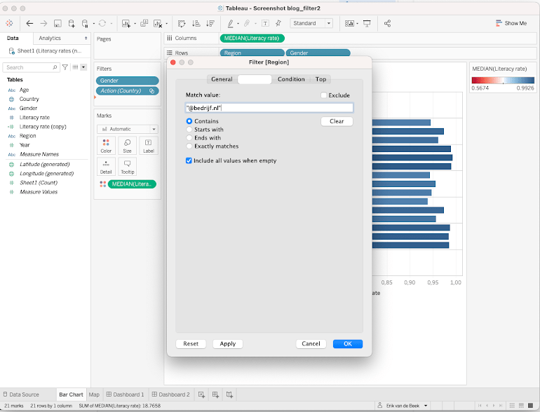
- First the dimension, in figure 6 the dimension Region has been dragged into the Filter Shelf. As a result a pop-up will appear with four tabs:
General: This tab contains a multiple-value list (blocks which can be checked) by which values can be included or excluded.
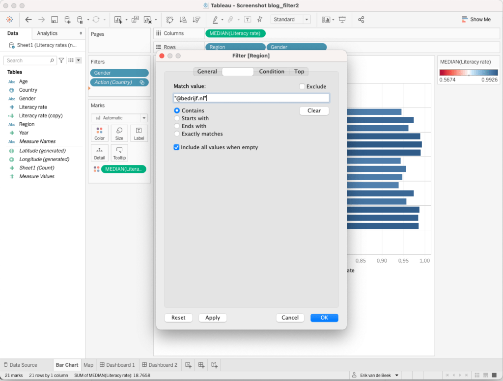
Wildcard: Here it is possible to filter on the content of the dimension, a cell must be exactly like or contain part of the inserted term. An example used by the Tableau support-site is the mail-adres, with “@werk.nl” all addresses ending with this string-value will be selected or deselected.
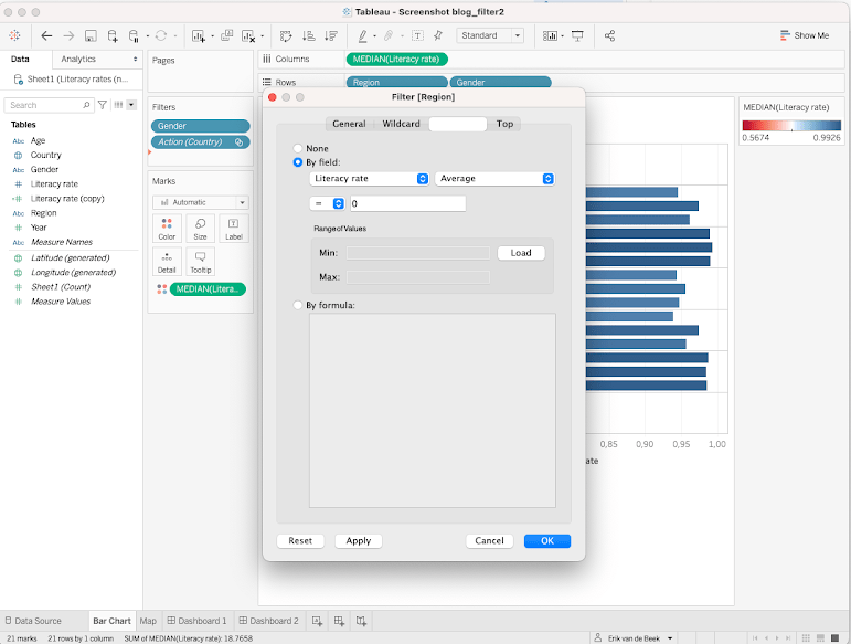
Condition: At this tab it is possible to determine the rules for a filter. It is – for example – possible to show only values equal to or greater than 50 (value ≥ 50) or to add your own formula.
Top: Under this tab the greatest (maximum/top) or lowest (minimal/bottom) values can be filtered. In cases whereby the values change and a formula or option under Condition won’t do the trick, this might be a solution. But be aware that in some cases a calculated field might be better.
Measure
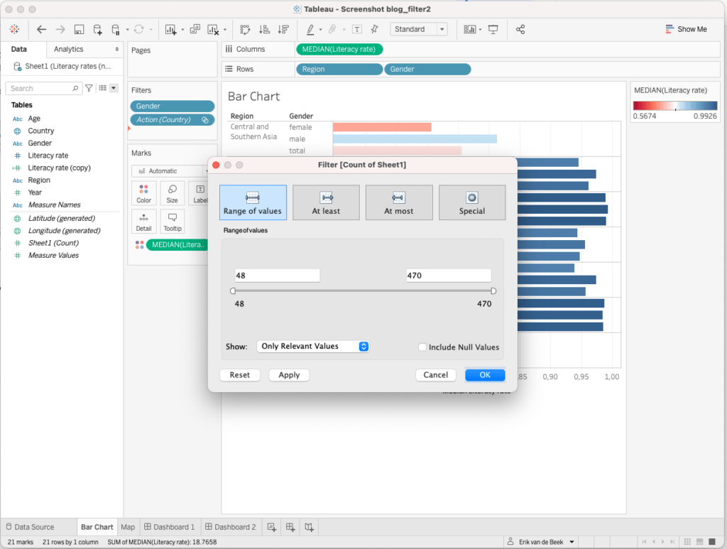
- The figure above shows the pop-up screen in case a measure has been dragged to the Filter shelf. Four option-tiles are visible:
- Range of Values: The greatest and smallest value can be defined with this option.
- At Least: Determines the lower limit.
- At Most: Determines the upper limit.
- Special: With this option special filters can be summoned, for example with regard to Null-values.
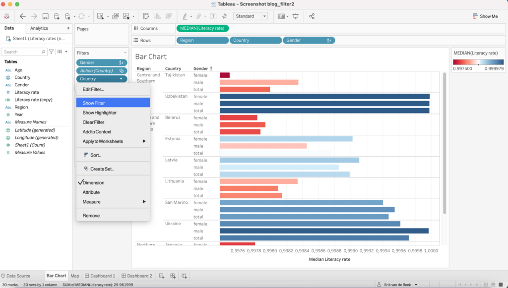
In order to make the filter visible on the outer right part of the worksheet, click on the triangle that appears in the filter capsule when you hover over it with your mouse. A drop-down will appear, select ‘Show Filter’ , the filter will be visible and adjustable. Otherwise: click with your right mouse button in the worksheet and select ‘ Show Filter’. (See figure above).
There is of course more information to be shared about filters, but the particularities of date-filtering and filters combined with calculated fields are left out for other blogs/bloggers.
Credits
(And before I forget: there are also Extract Filters and Data Filters)
The other method: calculated fields, see the following blog .
In order to apply more sophisticated or complex filters, this blog might be helpful.
Sources
For this blog I have made use of the following page from Tableau: https://help.tableau.com
Blogs about Filters in Tableau can, outside of this website, also be found at the Data School.
Do you want to learn more about Tableau, Alteryx or Snowflake? Do you want to use these tools to their full potential? Check out our trainings and consultancy services!


