I rolled into Data Analytics from an IT background and although it’s been a great help overall, sometimes my knowledge of programming gets me into trouble and makes me get tunnel-vision.
An example:
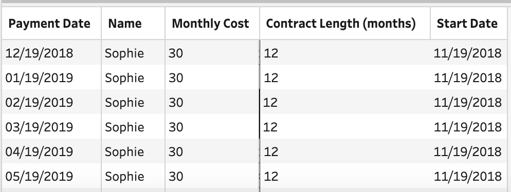
Imagine that we’ve got the following contract data :
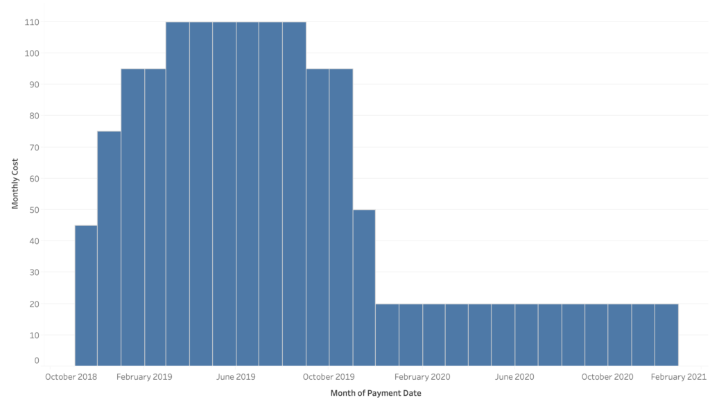
And we’d like to use this data to create a visual with our monthly projected payments comparative to this :

Normally I would’ve created a simple for-loop that uses dateadd() for the number in contract length. The use of loops, however, isn’t supported by Tableau and we’re going to have to make a small detour.
The solution to this problem isn’t exactly pretty or technically advanced but invaluable once you know it :

This amazing excel file will get us around the loop in a few simple steps.
Taking advantage of Prep
Join the contract data to the excel file. The way to do this is to use an inner join with a join clause: [Contract Length] >= [Length].
This clause will keep the join from becoming bigger then it’s supposed to be.
The results when we take a peek into our data :

Now that the join was made, we can start adding the lines into our file in a new field “Payment Date” with a simple Calculated Field:
DATEADD(‘month’,[Length],[Start Date])
After cleaning up the ‘Length’ field this leaves us with:

This output can easily be turned into the bar chart that we first saw in the example.
The above problem (and solution) was provided by a Preppin’ Data challenge which you can find here: https://preppindata.blogspot.com/2019/02/2019-week-3.html
Be sure to check out the (currently) 55 other challenges posted here!
In need of further explanations or help? Check out our trainings page and find the one that suits your needs best. You can also hire me as a consultant!


