History of Visual Analytics
Welcome to this blog series on Visual Analytics! Over the coming weeks, I’ll guide you through the fascinating journey of visual analytics—covering its history, the cognitive processes our brains use to interpret visual cues, and how these insights can enhance storytelling with data. At The Information Lab, we strive to harness these principles to tell compelling stories with data. Let’s begin this first episode by exploring the history of visual analytics.
Humans have been creating visuals to communicate meaning since ancient times. From the earliest cave paintings, visuals have served as a powerful tool for storytelling and helping people navigate the world around them. Today, it’s nearly impossible to go through life without encountering visuals, whether in digital media, signage, or data presentations.
Pioneers of Visual Analytics
To highlight the pioneers in the field of visual analytics, let’s start with William Playfair, widely regarded as the “father of visual analytics.” Playfair introduced several foundational chart types that are still in use today, including the bar chart, line chart, and pie chart. He was also the first to systematically document his graphs, establishing conventions that would shape the field of data visualization.
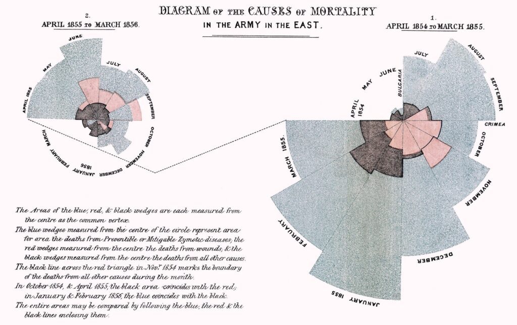
The first person who in using visuals drove change in policy was Florence Nightingale. During the Crimean War (1855–1856), she created a groundbreaking visualization showing the causes of death among soldiers. Her graph revealed that the majority of deaths were not due to battlefield wounds but to diseases caused by poor sanitation in field hospitals. When she presented this visual to the English Parliament, it spurred the formation of a sanitary commission, which ultimately reduced disease-related deaths in future conflicts. (see visualization below)

One of the best visualizations in history
To conclude this historical overview, one of the most celebrated visualizations ever created is Charles Minard’s 1869 graph illustrating Napoleon’s disastrous Russian campaign (1812–1813). Minard masterfully combined six variables—geographical location, army size, temperature, direction of movement, time, and troop losses—into a single, highly readable graphic. The visualization vividly conveys the tragic decline of Napoleon’s army, from its massive size at the start to its decimated state upon return. (see visualization below)
Remarkably, all these innovators created their visualizations without the benefit of a formalized science of visual communication. In the next episode, we’ll delve into what happens in the brain when we encounter visual stimuli and explore how these insights shape the science of Visual Analytics. So stay tuned for our next blog.
At the Information Lab we can provide training in your Visualization Journey. The trainings we provide are in all aspects of working with data and visualizing it using different tools. If you need more information please contact us through info@theinformationlab.nl or our contact form


