It has been a little over a month since I attended this year’s Tableau Conference in sunny San Diego. It was my first time experiencing the conference in all its glory and glamour. I attended a handful of breakout sessions and hands-on trainings, which was immensely helpful to not only my design skills, but also my understanding of Tableau in a broader sense.
My favourite sessions were 8 Ways to Elevate Your Text Tables by Eric Balash and Cait Sojka and How to Do Cool Stuff in Tableau by Ken and Kevin Flerlage (+ their aftershow: Cool Stuff Deep Dive). After attending both their sessions, I learnt some valuable (design) tips and tricks that I have already started using in my own dashboards. These are my favourite ones:
KPI’s – The Short Version
Creating KPI labels in a visualisation can be a tedious process. Usually it takes a few calculations to get the right numbers and symbols you want to see.
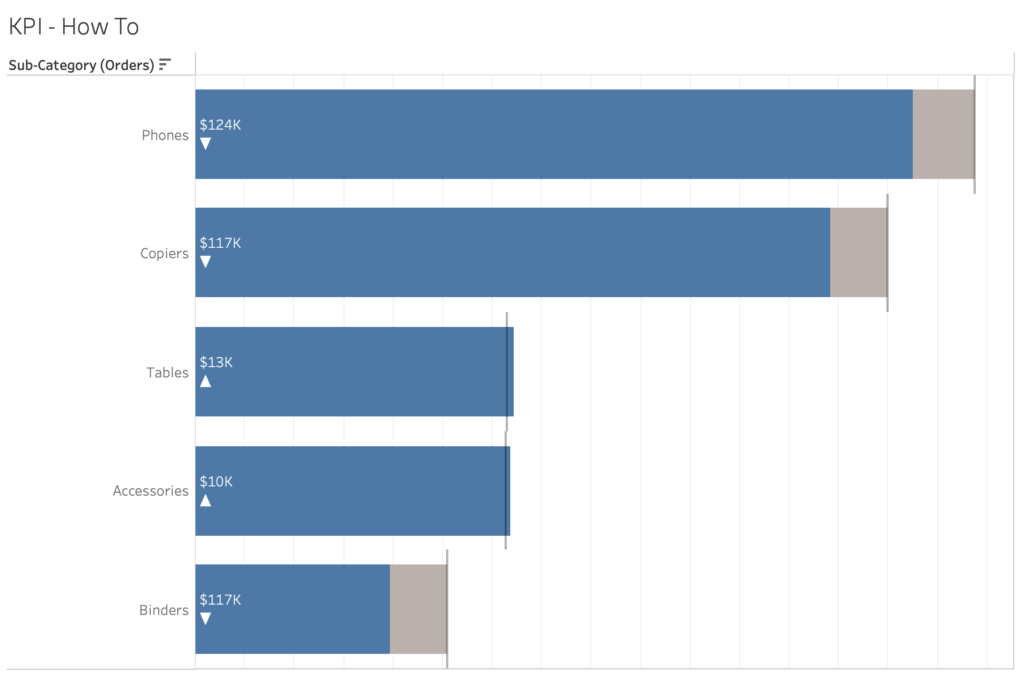
For example, to get a bar chart such as the chart above, you would need to add multiple calculations to Label in the Marks card – a calculation calculating the difference between the Actual Sales and Annual Sales Targets; a calculation turning that number into an absolute value; and a calculation for the arrows:
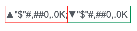
But Ken and Kevin Flerlage showed that there is an easier way to achieve this, without all the necessary steps, which is by simply making changes to the Number Format of the field you are using for your up and down arrows.
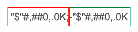
To explain this trick in more detail, the default format of the Sales Target field is “$”#,##0,.0K;-“$”#,##0,.0K. The first half (until the semi-colon) represents the positive number, and the second half represents the negative number (therefore the “-” sign at the beginning).
By adding the up arrow before the first half and the down arrow before the second half, and deleting the “-” sign to make the number an absolute, the arrows automatically turn into an absolute number with the correct arrows.
Sizing Two Dashboard Elements
The next trick is something I have struggled with in my own dashboards. When adding two (e.g. KPI) sheets to a dashboard, it can be difficult to adjust them to exactly the same size.
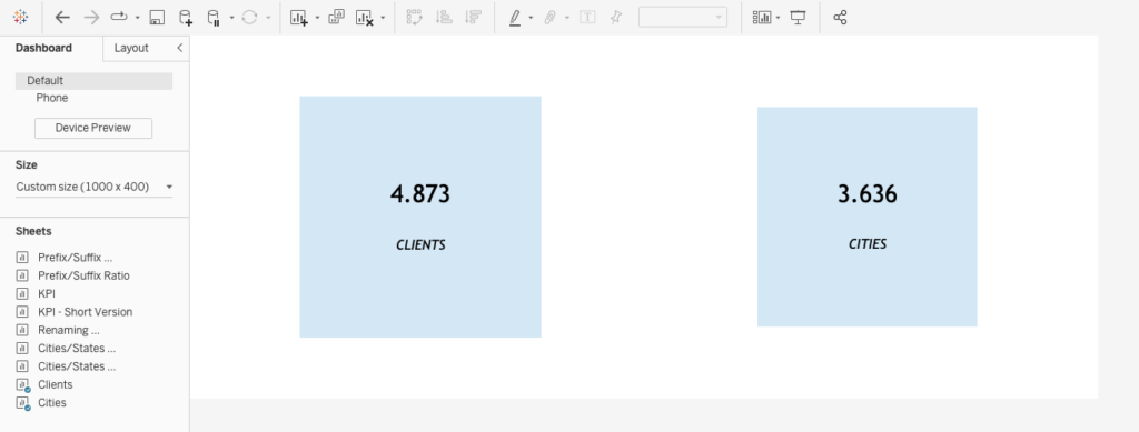
You can use Size on the Mark’s card and try changing the size of the two squares in the sheets by making an estimate, but there’s a much easier way to do this without guessing. By uploading this dashboard to Tableau Public, editing it in the WebEditor, there is an option to change the size of these sheets precisely.
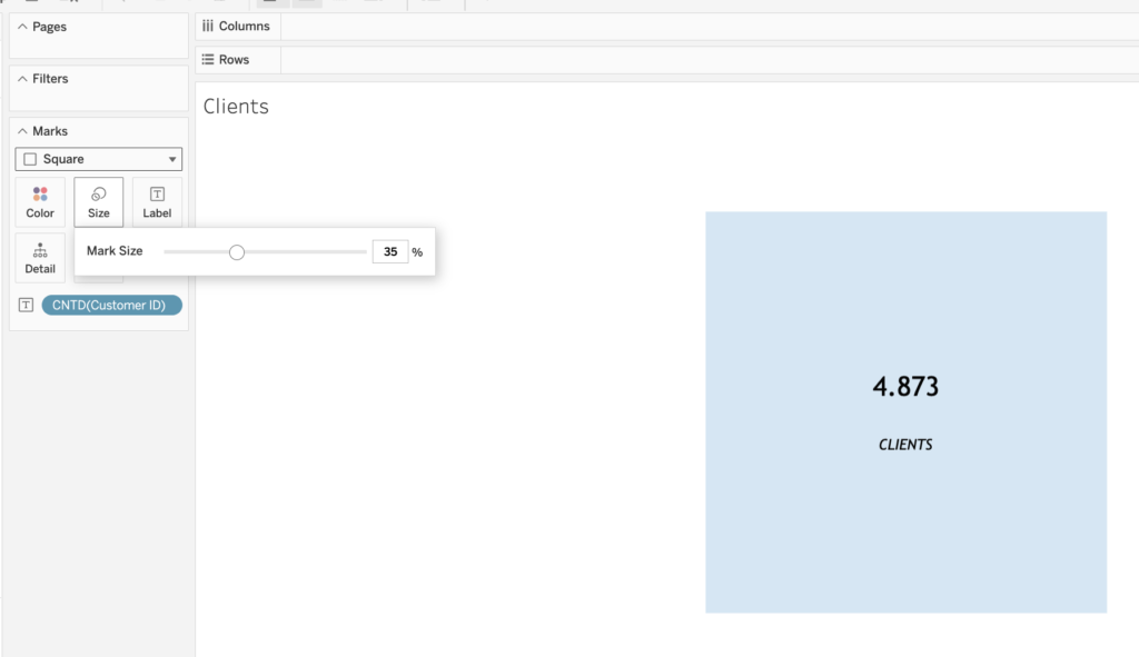
Do that for both sheets, and that’s how you can make both squares in the sheets the same size!
Renaming a Dimension
When creating a crosstab in Tableau, sometimes you want to change the headers of the different fields in the view. With measures, this is a matter of editing the alias of the field. But what if we want to do the same thing to dimensions? There is no ‘Edit Alias’ option for these types of fields. There are multiple ways to go about this. You can rename the dimension, which is sometimes not a favourable option considering traceability. You can also duplicate the dimension and give it a new name there, but that might lead to a lot of mess in your data pane. A quick and easy way I learned is to double click on the field in the visualisation, edit the field in line by adding // to it, and writing the desired name of your dimension. So if the name of your dimension is originally Segment and you want to change it to Customer Segment, you would double click on the Segment field, and edit it in line to:
//Customer Segment
[Segment]
This would change the title of the Segment field without having to duplicate it or renaming the field completely.
Single-row Drill down
The last trick I learnt is from the 8 Ways to Elevate Your Text Tables session. When creating a view with a very large table, there is a way to decrease the size of the crosstab with a drill down calculation. In the following example I created a table using the Superstore dataset, which will give users the ability to click on a Category value, and expand out to the related Sub-Category value.
The calculation shown in the screen recording above returns the related sub-category when a category is chosen in the parameter control, otherwise it returns a blank space. You can also use a parameter action in stead of a parameter control, which would allow the user to click directly on a category value to expand the related sub-categories.
Those were the tricks! Be sure to check out two of my favourite sessions of this year’s TC – 8 Ways to Elevate Your Text Tables by Eric Balash and Cait Sojka and How to Do Cool Stuff in Tableau by Ken and Kevin Flerlage (+ their aftershow: Cool Stuff Deep Dive).