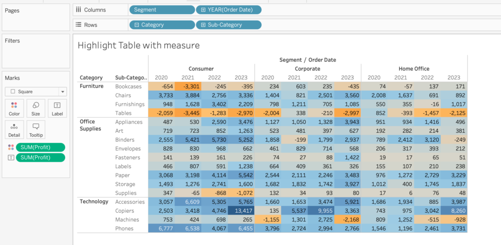
Adding a splash color to highlight data on a table can greatly amplify cognition. Tables are one of the most common ways to visualize data still. (Even though it is not a very visual method). They are ineffective in terms of understanding, but effective in viewing specific values. Tables without the color pre-attentive attribute will take us, humans, more time to process the image to find out the specific value that we are looking for. As a workaround, we can add the element of color to work with the values on the table. Highlight tables also help with understanding the ranges within the values in the table as a result. Below is an example of a regular Highlight Table made in Tableau.

As can be seen, the highlight table is made with a measure, which gives it a diverging color palette based on the values. A table like this helps us immediately see the highs and the lows very quickly.
Highlight table with Conditional Statement
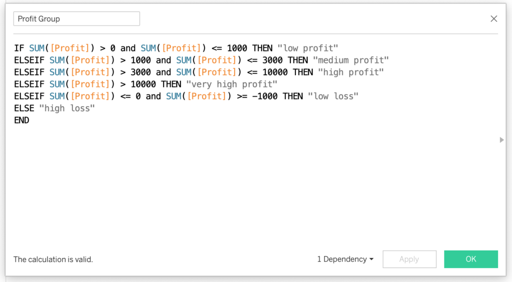
However, if we wanted to create a conditional statement such as grouping profit values as “low profit”, “medium profit” etc., and visualize that by color in a highlight table, things get a little more complicated. But not that much. Let’s take a look at this conditional statement example:

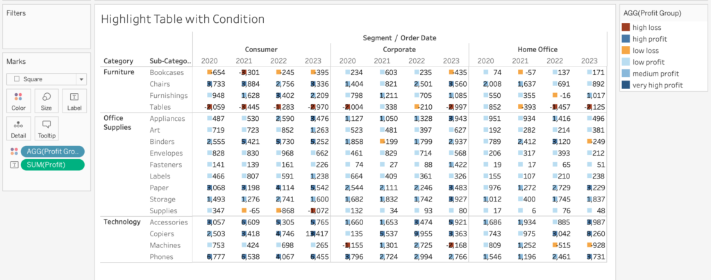
What I would like to do now is to replace the SUM([Profit]) in the highlight table example with this new calculated field. However, the cells do not color anymore, we only get colored squares within the cells next to the text.

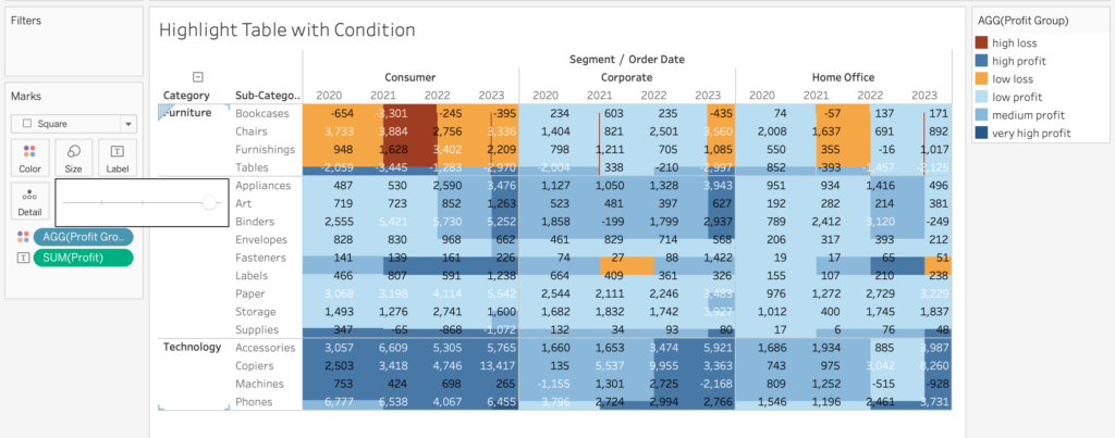
This look is not wrong, it is just one of the steps we take. Out goal is to pretty much want the square to fill up within the cells. Playing with the Size card does make the squares bigger or smaller. But unfortunately, the size does not get contained within the cells. At first.

What we need to do after this stage is to create dummy fields that act as headers, and create borders. As a result, we can contain the size of the colored dimension within the cells. In order to do this, On the columns and rows, we enter an empty cell with the writing: “”.
That is pretty much it. After doing this, the format of our view changes a little bit. We can experiment with the formatting options to get the desired format afterward by hiding headers and changing the levels of the row and column dividers.
Final Remarks
And there you go. You have created a highlight table with a dimension instead of a measure. Remember that this is not only limited to conditional statements like the example given before. This method works for all dimensions.
Thank you for reading this blog. Also check out our other blogs page to view more blogs on Tableau, Alteryx, and Snowflake.
Work together with one of our consultants and maximize the effects of your data.
Contact us, and we’ll help you right away.


