
Network graphs are a specific visualization that helps you to analyze interactions and connections between entities. Although network graphs are a powerful chart type they have their limitations. Depending on which kind of network chart you are using and the tool you are using to generate it, your visualization will be bound to have certain restrictions.
In this blog, I will explain to you the limitations of a network graph in Tableau using the tool developed by fellow data visualization expert Tristan Guillevin (https://tools.ladataviz.com/network#).
Limitations
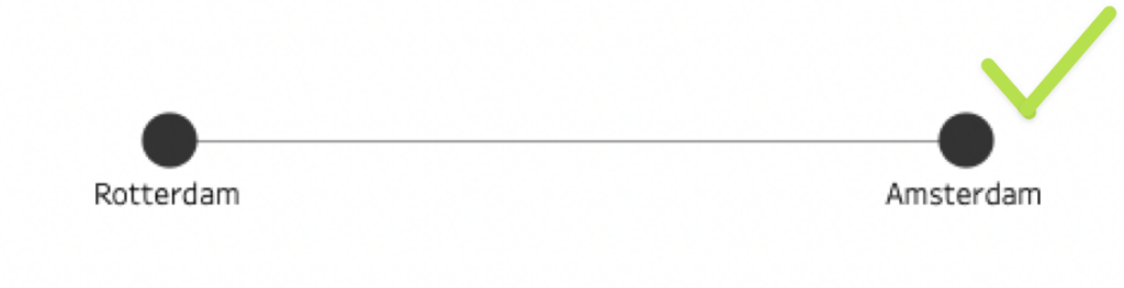
Links between nodes are straight lines
Every link between 2 nodes will always be represented with a straight line connecting the center of 2 nodes.
In Tableau besides the existing line types (linear, step, and jump), there is no straightforward way to change the link lines within the network. There is no possibility to change the lines to be dash, waved or curved.
Representation of different links as 1
The tools will allow entering as many links as desired between 2 nodes, but only 1 will be represented. What does this mean? The tool will create as many lines/links as you wish between 2 nodes, but all of them will be straight lines stacked onto each other. This will visually translate to only 1 line.
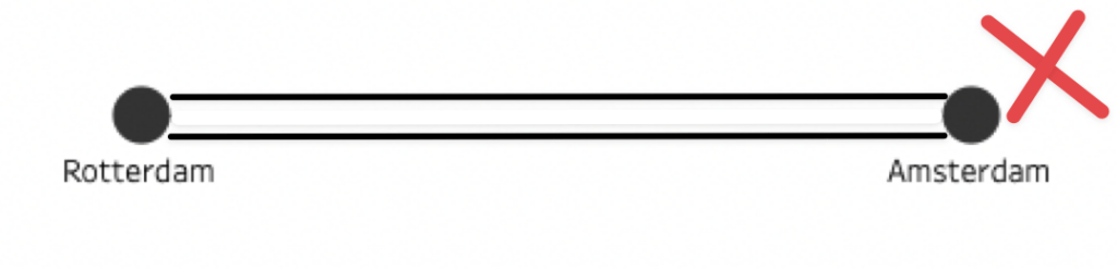
So, no matter the number of times you link 2 nodes, it will always appear as if 1 line is connecting them.
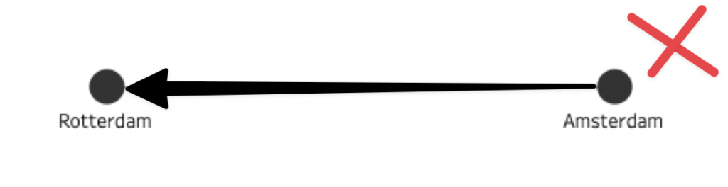
So, for example, imagine a train station network graph. The stations will be the nodes and the links are the trains. If there is a train from Amsterdam to Rotterdam and, additionally, there is a train from Rotterdam to Amsterdam. You can input both routes or trains into your data, both lines will be computed, but you will only be able to see it as 1 link.{ "source": "Amsterdam", "target": "Rotterdam" }
{ "source": "Rotterdam", "target": "Amsterdam" }
Interesting remark
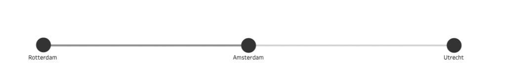
The interest in having several links joining the same nodes can come from detailing in Tableau. You can use transparency on the color of your links to represent how many times some nodes were connected. In the example below, we could see how a darker line means that there are more trains passing between Amsterdam and Rotterdam than from Amsterdam to Utrecht.
Lack of direction
This specific network graph is undirected or bidirectional. What does that mean? That in this chart is not clear which node is the source and which node is the target, we just know they are connected.
Hence, no matter the source or the target, the link will always be represented in the same way.
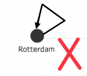
Nodes cannot connect themselves
Although the tool lets you select any node as the source and target of every link, it is not advised to select the same node as both (source and target). Why? Because the tool will not compute anything. As we mentioned before, the link representation will always be computed as a straight line connecting the 2 nodes centers.
Creating a link with the same node as the source and target will create a visual representation of a single node."nodes": [
{ "id": "Rotterdam" }
]
"links": [
{ "source": "Rotterdam", "target": "Rotterdam" }
]
The position of nodes and links cannot be adjusted specifically
Another limitation of this tool is the exact position of your nodes. Placing your elements in a specific position is not possible. Nodes can be adjusted by energy and forces, but not by specific user placement. If your goal is to create a clear and ordered hierarchy network this is not the tool for you.
Why are these limitations relevant?
In certain scenarios, some network charts are used for different purposes where these limitations will impact your visualization. An example of this is the case of an adjacency matrix. This matrix is used to calculate the correlation between each pair of individuals/nodes.
As in the image below is seen, in this chart you can:
- Represent 2 links between the same pair of nodes
- Nodes can connect themselves
- The network graph is directional
- Lines can be curved
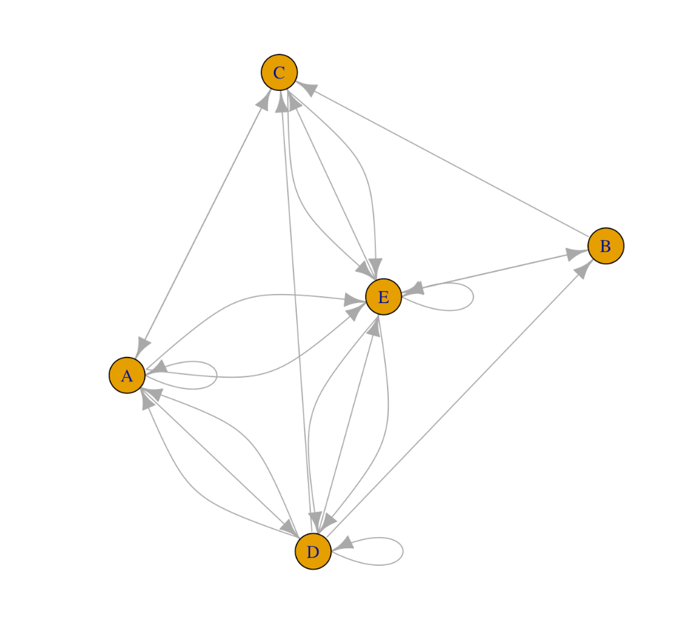
If this is the kind of network that you need to create, the network graph created by this specific tool will not be adequate. In this case, I will advise searching for other tools, software, or ways to create this.
Conclusion
Consider these limitations when prepping the data and when deciding the final design of your network graph. Analyze and understand what you want to achieve and examine if this tool will allow you to achieve exactly that.
Although this is a powerful tool within our reach, it also has its limitations which are important to consider when approaching our story telling design. However, I invite you to see these limitations as opportunities to explore alternative ways of visualizing and analyzing data.
Limitations can prompt us to think creatively and outside of the box, leading to new insights and perspectives. Without the directionality constraint, we may be able to identify bidirectional relationships between nodes that were not apparent. This can lead to new insights and a deeper understanding of the relationships between nodes. By embracing the limitations of the tool and experimenting with different approaches to visualizing data, we can expand our analytical toolkit and discover new ways to extract insights from complex datasets.
Please don’t hesitate and always welcome experimentation in your designs!
For more data-related topics, creative insights and relevant visualization news visit our website https://theinformationlab.nl/