With the release of Tableau version 2022.3, we are greeted again with some new features. One of these new features is the Data Guide. It is one of those additions to Tableau that help bridge the knowledge gap between the creator and the user of dashboards. It is essentially a guide for using dashboards or views. In this blog, I will be introducing and exploring the different capabilities of the data guide.
What is the Data Guide?
As I have mentioned briefly before, it is essentially a guide for your dashboards where users can get the next layer of insights and supporting information about the sheets in the dashboard. If you have used Explain Data before, it will look quite familiar. The data guide is an improvement of Explain Data that came out in version 2019.3 as well as some additions.
Explain Data was implemented to help users find outliers, notable data changes, and other key explanations about selected marks in a view. Aside from resurfacing those functionalities, the Data Guide provides end users with more contextual information about the dashboard with descriptions and links to resources. This addition greatly helps the user get more familiar with the ins and outs of the dashboard faster.
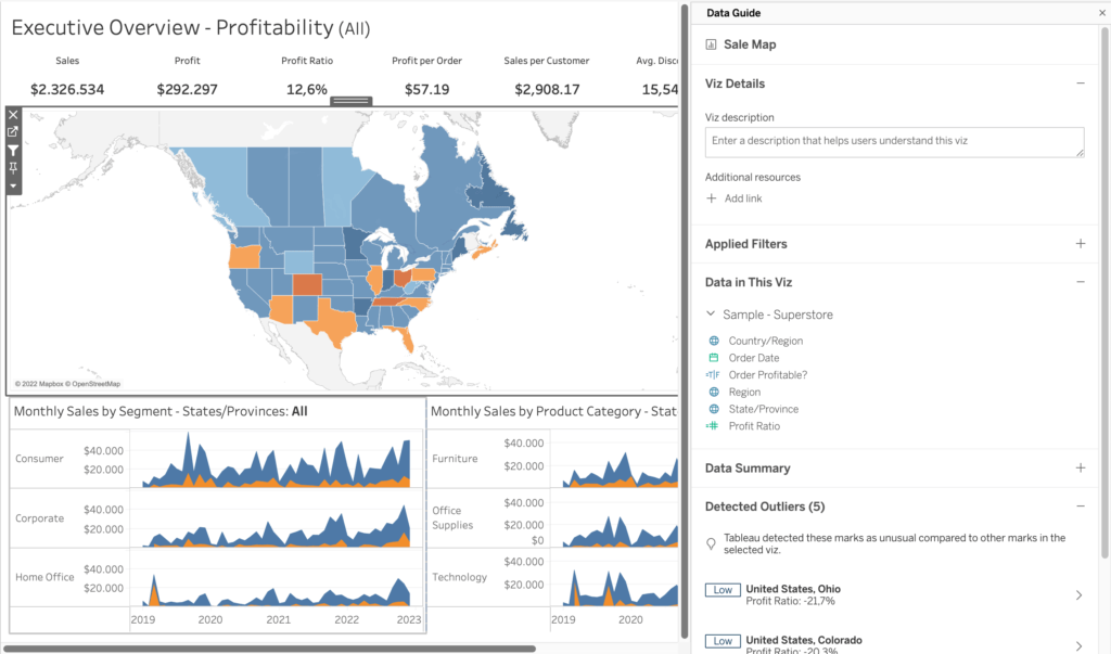
Data Guide acts as a collapsable pane in the Tableau environment. It is important to note that the guide changes depending on the level of detail of the view. Clicking through marks will unlock more specific generated insights than having the guide overview that is shown below:

How to Use the Data Guide and What Does it Show Me?
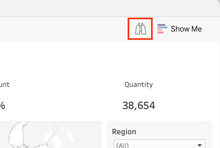
First of all, the data guide button is situated right next to the “Show Me” button in the top right corner of the interface. Clicking this will open up the new pane on the right.

The Data Guide works on different levels of detail. At a dashboard level, at the viz level, and at a selected mark within a viz level.
Dashboard Level
At the dashboard level of detail, we can reveal more information on name, author, and last published date. Descriptions and extra links to resources, lists of data sources used, and detected outlier information from Explain Data.
Viz Level
We can access the viz level of detail by clicking through the different sheets that are in the dashboard. Aside from seeing specific descriptions, resource links, and outlier information specific for vizzes this way, we can also see a short summary of the data and the applied filters for the viz.
Mark Level
And lastly, for the mark-level of detail in the data guide, we see what we were familiar with from the Explain Data functionalities. As for the information we are greeted with, we can get further explanations from a specific mark. Aside from seeing a summary. No descriptions or links to resources here.
As for the explanations, Tableau analyses that particular marks used measures and give an extra layer to “explain” any underlying reasons why that mark is showing the data it is showing. The way Tableau communicates its findings is through generated text as well as generated views to explain the mark further. The explanation is computed by analyzing a number of fields in the data pane. In the example below, we explore why Texas has a low-profit ratio:
This functionality existed in Explain Data before, but now it has been embedded into the Data Guide. To know more about the Explain Data functionality, visit this link to know more.
Final Remarks
The Data Guide is a simple tool to use but can bring quite some benefits. Especially when it comes to understanding and interpreting a dashboard from a user’s perspective. They will be able to navigate faster and make further insights and understand the data in more detail.
Thank you for reading this blog. Feel free to check out our other blogs page to view more blogs on Tableau, Alteryx, and Snowflake here.
Work together with one of our consultants and maximize the effects of your data.
Contact us, and we’ll help you right away.


