
While doing a customer case this week I stumbled across a view where I wanted to implement a certain style of “buttons” which are really useful in mobile apps, but that I didn’t know how to implement in Tableau. In this blog, I will show you how to add clickable buttons on your dashboard. You can also view and download the dashboard I created here.
With some really needed guidance and a lot of trial and error I came up with this:
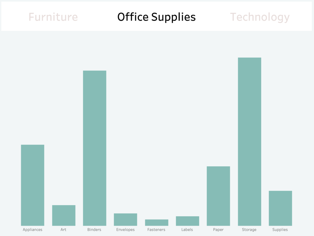
A view with 2 or more “upper buttons” that will filter the view results. Depending on the button clicked, the button will be highlighted and the resulting view will be filtered accordingly.
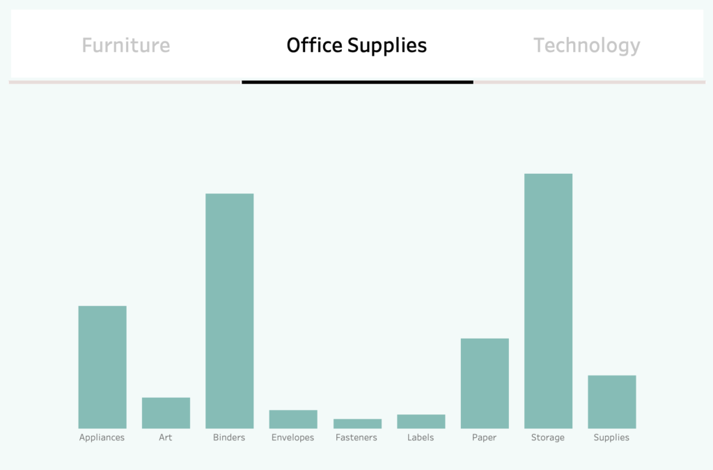
These kinds of button selections are really useful (especially when the list is made out of 2 options) because the underlining and the color spotlight draw a clear conclusion about the option currently selected by the user.
How do you create this on Tableau? Let’s start!
Prepare calculations and parameters
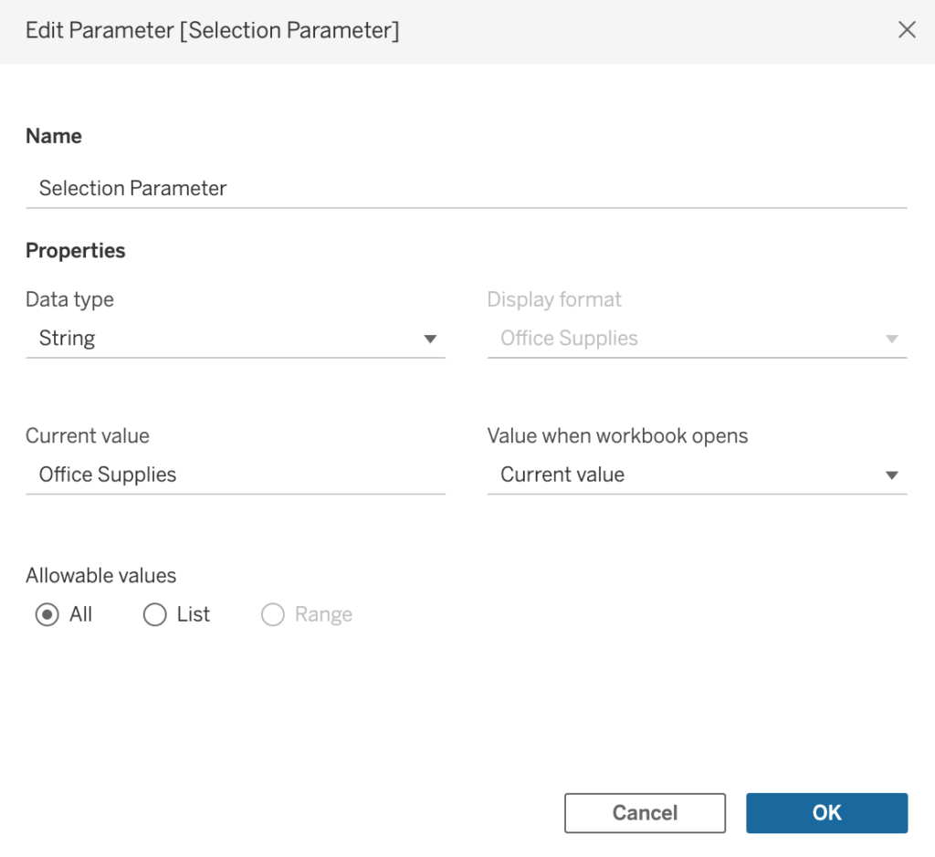
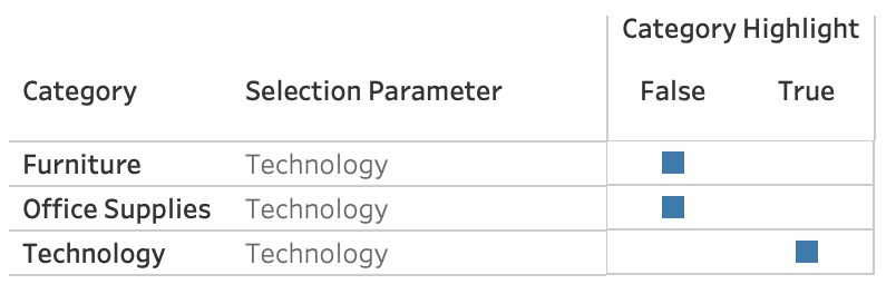
Firstly, let’s create a parameter that will help us with the selection. This parameter called [Selection Parameter] has nothing relevant but the data type, which is the same as my [Category] data type, which is the dimension I want to filter.
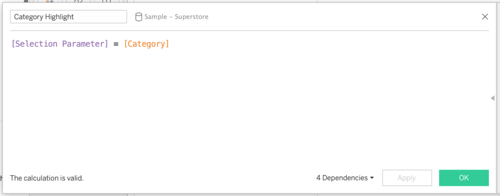
Then we create a boolean calculated field named [Category Highlight] that will tell which [Category] has been selected.
Create worksheets
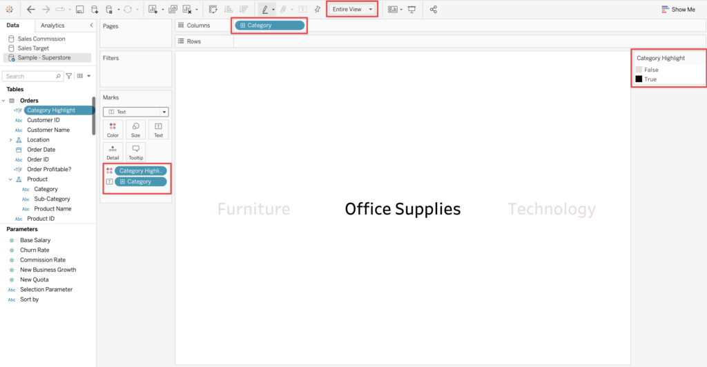
Once you have created the calculation, you create a worksheet with the following:
- [Category] on Columns and Text
- [Category Highlight] on Color
- Entire View selected
- Select colors on [Category Highlight] that are contrasting
Be sure to modify your text to the desired font alignment, size, and weight.
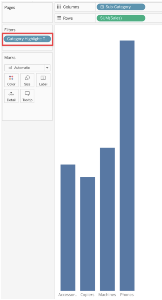
Subsequently, you apply this selection filtering into a relevant worksheet (in this case the Sub-Categories are filtered by Category based on the ‘Product’ hierarchy) by applying the [Category Highlight] into the filter and selecting True.
Once you have your 2 worksheets, you can put them in your dashboard and you can already have an initial view of your selection filter “buttons”
Create dashboard actions
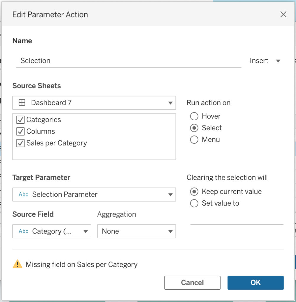
For the data to be filtered you should add a dashboard parameter action (Dashboard -> Actions -> Add Action -> Change Parameter) with the following:
- Source Field: [Category]
- Target Parameter: [Selection Parameter]
What this means is that: if the [Category] field is selected, the [Category] value will be placed in your [Selection Parameter] parameter. Once your parameter has a value, your [Category Highlight] function will contain a boolean list that will let you know which actual [Category] is selected, which you can use in your view filters.
Finish with the underlining
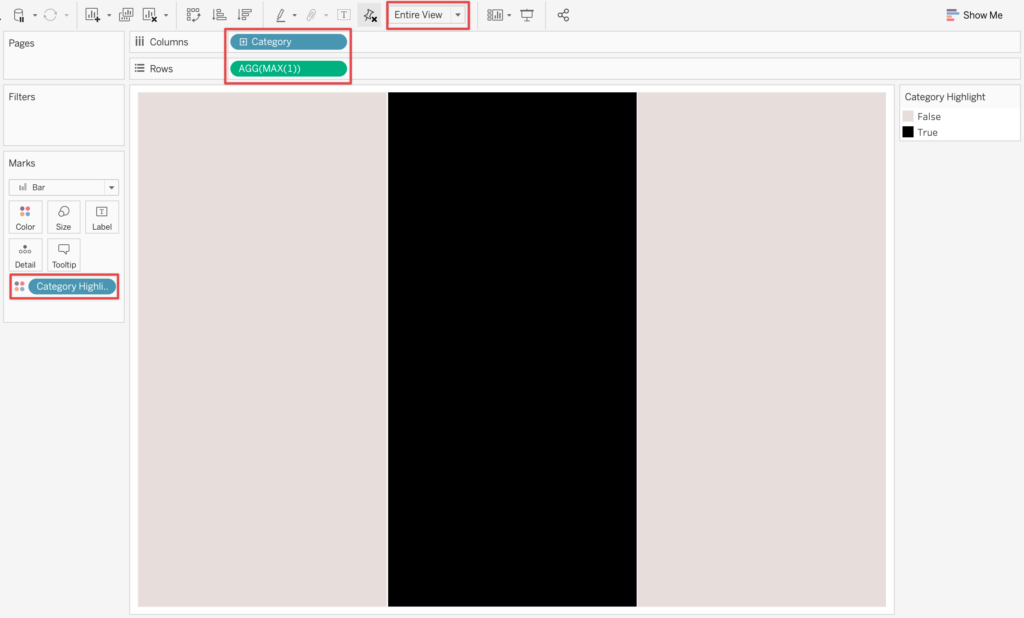
To make the underlining of the buttons we will create a worksheet with the following:
- [Category] on Columns
- Calculation: MAX(1) on Rows
- [Category Highlight] on Colors
- Entire View selected
- Size max
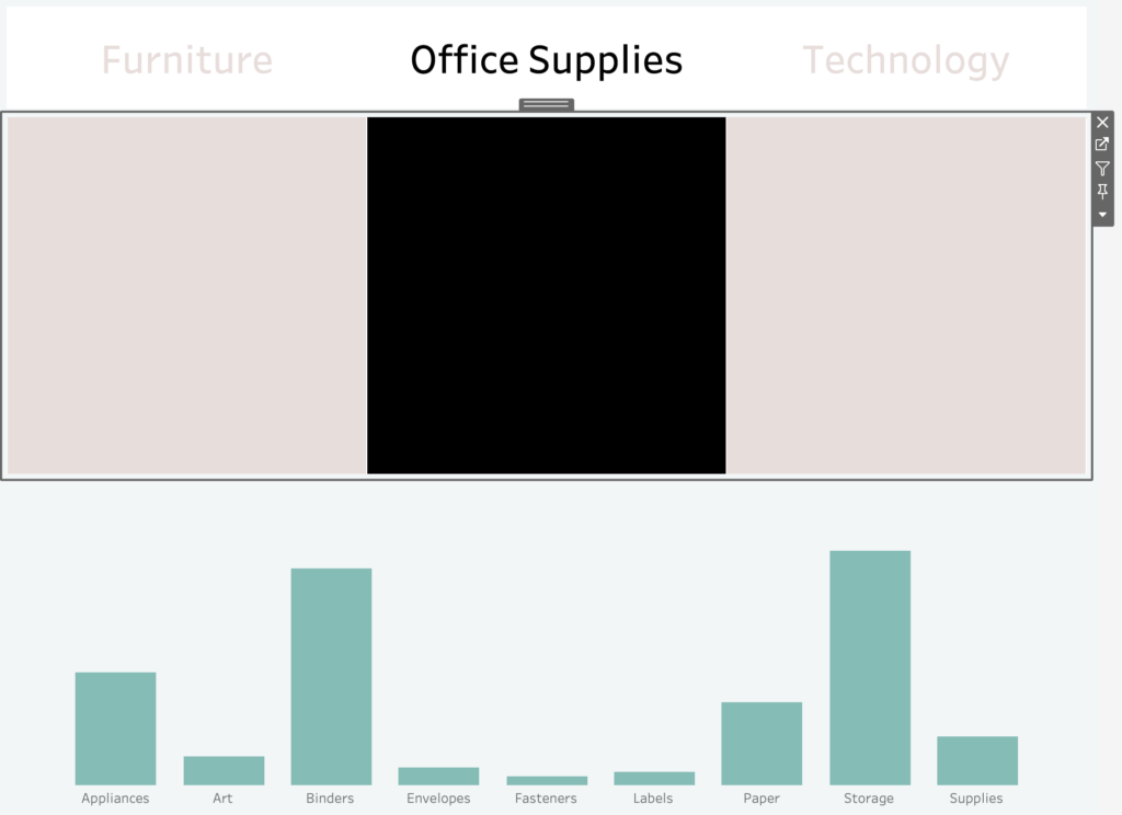
Now add this worksheet to the existing dashboard below the [Category] buttons.
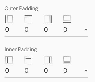
For this worksheet, we will need to remove the inner and outer padding.
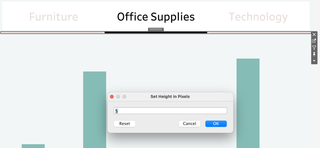
Then, edit its height to a really low number, like 5 pixels. As a result, the graph becomes an underlining for the [Category] buttons.
That’s how to add clickable buttons on your dashboard. For more content, please see the links below.
Check out our blogs page to view more blogs on Tableau, Alteryx, and Snowflake.
Work together with one of our consultants and maximize the effects of your data.
Contact us and we’ll help you right away.