
It’s quite funny that different variations of proportion charts are named after all sorts of desserts like Donuts, Lollipop, Pies, Plum Pudding etc. Although I am quite aware of the slight resemblence to certain dessrts, it is still strange. Square charts, aka waffle charts are a variant of pie charts and are assumed to show a better representaion of proprtion.
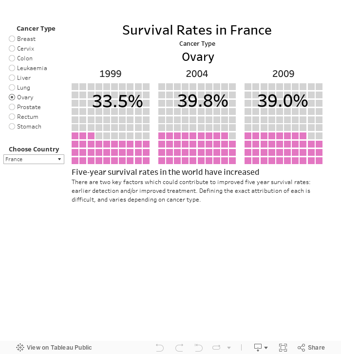
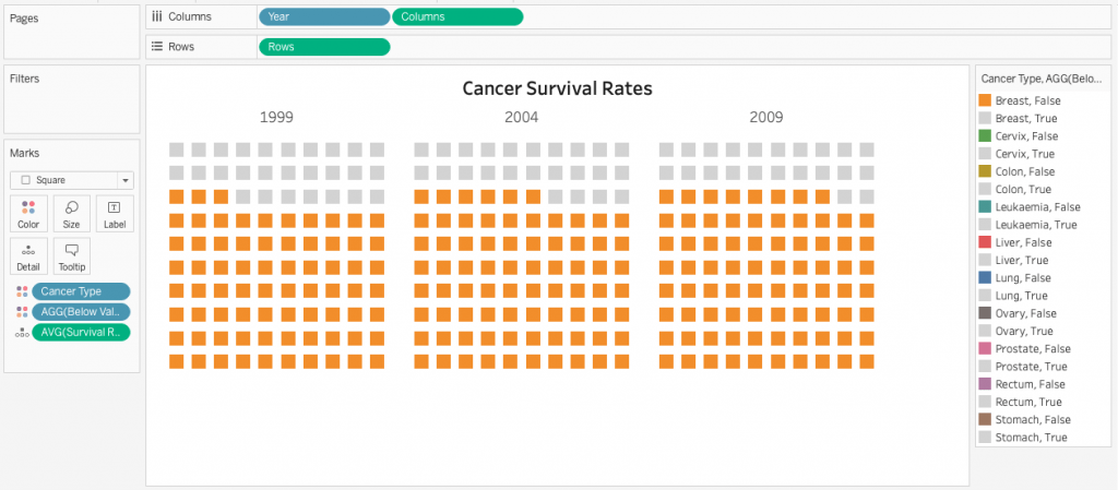
Similar to basic circular pie charts, square pie charts take each percentage out of a total 100%. They are usually arranged in a 10 by 10 layout, where each cell represents 1%. The squares are colored according to the proportions we are aiming to visualize, similarly to how you would color different slices of a pie chart. In the interactive dashboard below, Cancer survival rates are shown in a delicious waffle layout.
Making waffle charts is maybe a little bit tedious, but fairly simple!
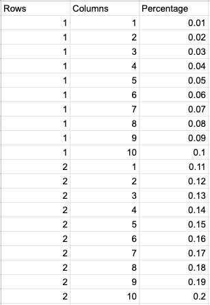
For the purpose of waffle charts we will use a template to help us with the task. Below, We can see a part of the template. As you you might have figured out, we are creating a 10X10 layout of percentages of 100%. Rows, Columns and Percentages should be continued in the same manner up to 100 percent.
The full template will be used to densify the initial data we want to visualise. Data densification will be done by cross joining the template with the data. The cross join will densify the data – creating 100 records for each initial record.
For the purpose of this viz, we will use data about cancer taken from ‘Our World in Data’, a great site hosting research and data on global problems and global changes.
The data summarizes 5 year survival rates in 1999-2009 for different cancer types across the world.
Cross – Join
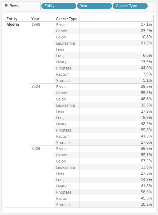
A cross join will combine each row from the first table with each row from the second table. Below, we can see Algeria’s records of cancer type and year. Our purpose is to multiply each record with each record of the template (aka Cartesian product of rows). After cross joining Algeria’s data with the full Waffle template, we are expecting 3000 records instead of the current 30 (30 * 100).
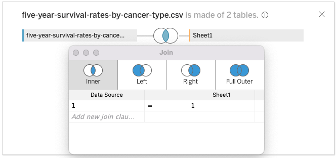
Cross joining is acomplished simply by an inner join based on the condition 1 = 1 as seen in the image below.
After cross joining the template, we now have 100 records per initial original record, from 1 to 100 (10 x 10 percentage Grid). All we have to do is color the right ones!
Let’s create a calculated field to check that out – we would like to distinguish between grid records that are higher or equal to survival rate (measured percentage).
AVG([Survival Rate]) <= AVG([Percentage]) has a boolean (True/False) result and shows us exactly what we need.
Waffle Chart: Viz Construction
- Drag [Rows] to the rows shelf and [Columns] to the columns shelf. Set to continuous
- Drag [Year] and drop it infront of [Columns] as a discrete dimension.
- Add [Cancer Type] and drop it on Color
- Add the boolean calculated field to Detail,
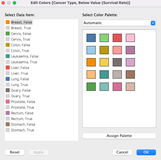
then right click the icon on the left and change it to Color.
Now we have 2 combined measures on color. - Edit colors: True sqares with Gray while all others are colored to your choice (
- Add [Survival Rate] to Detail and set the measure to Average
- Other Cosmetics: Adjust the size of your squares, Drop grid and zero lines.
- Drop the row and columns dividers
- Adjust tooltip and add anotations
Our Waffels chart is ready! You can find and download it here.
I hope you enjoyed this and found it helpful!
As always, Visit our site The Information Lab NL to see more blog posts, training and consultancy services regarding Tableau, Alteryx and Snowflake.