The sunburst chart might not be one of the most common chart types that people might know about. But it is certainly a useful chart when it comes to viewing hierarchical data. In this blog, I will be describing what a sunburst chart is. Then I will move onto creating one in Tableau from scratch.
What is a Sunburst Chart?
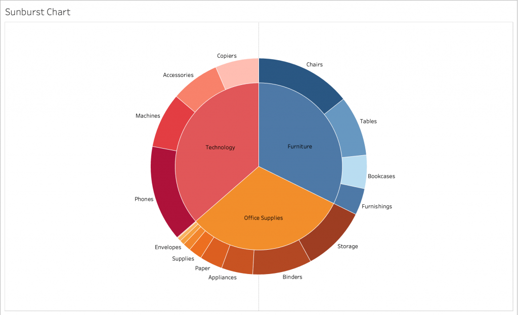
As mentioned briefly before, a sunburst chart is used to visualise hierarchical data. The chart closely resembles a tree map and a pie chart, hence its other names such as a radial tree map or a nested pie chart. It shows how a particular category is broken down into its sequential segments. The data that we are working with needs to have a hierarchical nature in its fields in question for the visualisation to work. This can be the relationship between category and sub-category. Keep in mind that just like the pie chart, you should not use too many categories or the view will be very cluttered. Below is an example image of a sunburst chart created in Tableau:

Each field in the hierarchy represents a ring in the sunburst chart. In the examples case, there is two levels to the hierarchy. The parent field will be the closest to the middle while the child fields expand outwards. In the above example, the shade difference of the outer ring represents the size of the whole for the segments. Even-though this is not a necessary step for sunburst charts, it visually helps separate the differences. It is however necessary to separate the categories with colour. If you would like to know more about the sunburst chart, check out this page.
Creating the Sunburst Chart in Tableau
In this section, I will be going step-by-step in creating the sunburst chart in Tableau. As my demonstration, I will be using the Sample – Superstore dataset.
Since the chart needs to have a hierarchical nature, I think the relationship between category and sub-category is appropriate for this one. I would also like to see the division of sales represented by colour intensity and size. Creating this chart is not a very straightforward task like creating a bar or line chart. We need to use some specific techniques to create one.
Step 1: Create the Pie Chart
As my first step, I will select my mark type as Pie and add my “Category” field onto the Colour Marks Card and my “SUM(Sales)” onto the Angle card. Creating a simple pie chart.
Step 2: Duplicate the Pie Charts
We successfully created a pie chart. As the next step, we will need to have two of them stacked on top of each other with one bigger than the other. At first we will create two ad-hoc fields on the columns shelf with the values “0” for each. This will create two different x-axis with the pie charts in the middle.
Step 3: Stack the Charts, Add the Child Category to one, Adjust the Sizing
As mentioned before, we will be stacking these charts on top of each other. But first, we need to establish that one of the charts has to display the “Sub-Category” field. For that pie chart, we need to have “Category” as well as “Sub-Category” in the colours shelf and that is done with a little trick. Doing this allows the sub-category colours to be aligned with the respective category colours of the other pie chart. Make the chart Dual Axis and align that the chart with only “Category” comes above. After than, adjust the sizing of the chart so that the one with sub-categories is larger.
Step 4: Do sorting, Adjust Colours, Add Labels
Now that we have our basic sunburst chart, all we have left to do is to sort the outer region by sum of sales in ascending order. That will make the chart look less cluttered and make it easier to distinguish between the sub-categories. Next, we will need to adjust the colours of the sub-category chart a little bit where they correspond with the colours of the categories. After that is done, we can move onto further formatting by adding labels.
And there we have it, we have created a basic sunburst chart in Tableau. Now it is time for you to experiment with other datasets, adding further hierarchy and other formatting options.
Visit our site The Information Lab NL to see more blog posts, training and consultancy services regarding Tableau, Alteryx and Snowflake.


