
This blog will shortly explain what a Pareto Chart is, how to interpret it as well as showing the necessary steps to take in Tableau Desktop to create one yourself with an example use case.
What is a Pareto Chart?
At its core, a Pareto chart is a dual axis chart consisting of bars and a line. In addition, the chart’s main use in analytics is to highlight members that might have the largest impact on the key performance indicators. Such as identifying the most profitable customers to a business. The benefit that comes with using a Pareto chart is that it makes it easier to find areas of improvement.
As mentioned previously, the Pareto chart consists of two components. The bars in the chart, representing the members of a given dimension with their quantities. And the line in the chart representing the cumulative total in percentage format. However, the Pareto chart does not always need to have a dual axis of bars and a line to be a Pareto chart. They can also be depicted with only bars as well. But, a cumulative sum pattern needs to be shown some way or another.
It is important to note that the Pareto chart helps point out the Pareto principle (or the 80/20 rule). In which suggests that in many cases, the majority of the results will come from a vital few of the causes. The chart will be able to point out to what extent those vital few contribute to the majority in question.
Making a Pareto Chart in Tableau
For demonstration purposes, we will be using the Sample – Superstore dataset that comes with Tableau Desktop. Before starting to make the Pareto chart, we need to define our scope. Let’s say I have a bunch of products and I want to find out which of these products are the most profitable for resale.
Create the Bar Chart with the Dimension and Measure in Question
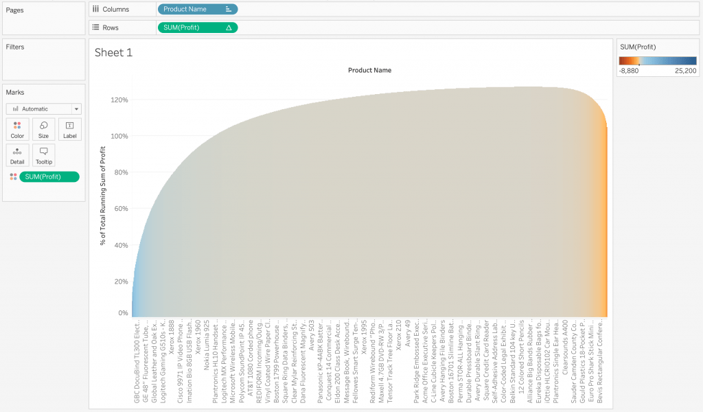
The first step in creating the Pareto chart is to start with the bar chart. For this, we will have our products with their profit, sorted in a descending order. Create this bar chart with dragging “Product Name” to columns and “SUM(Profit)” to rows. Don’t forget to sort the chart by pressing the sort by descending order button in the toolbar.
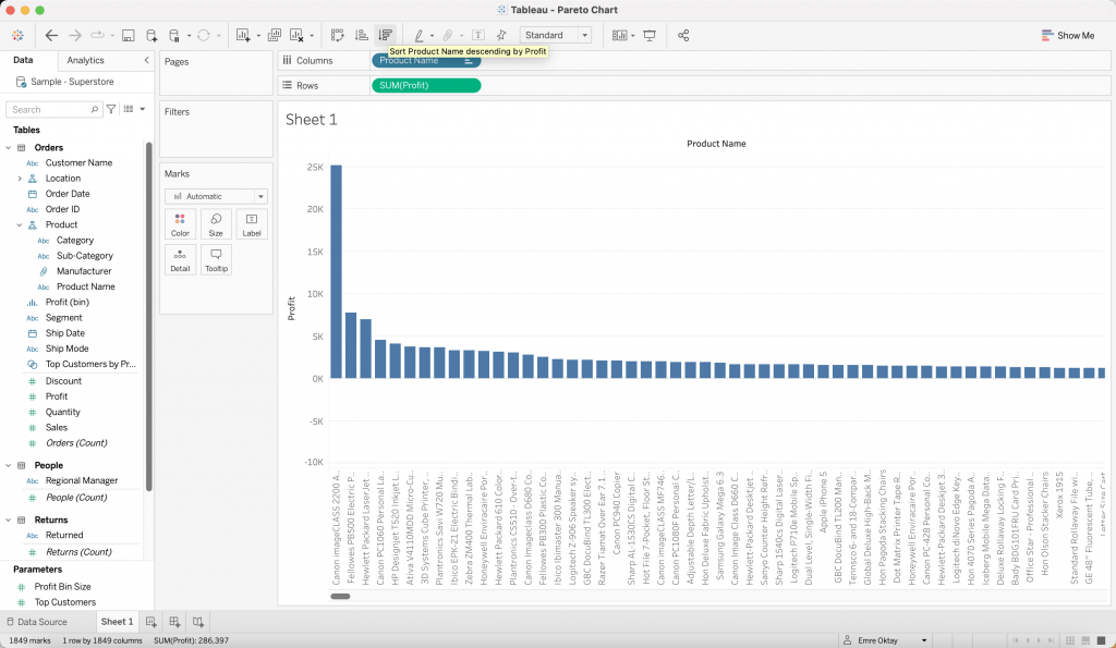
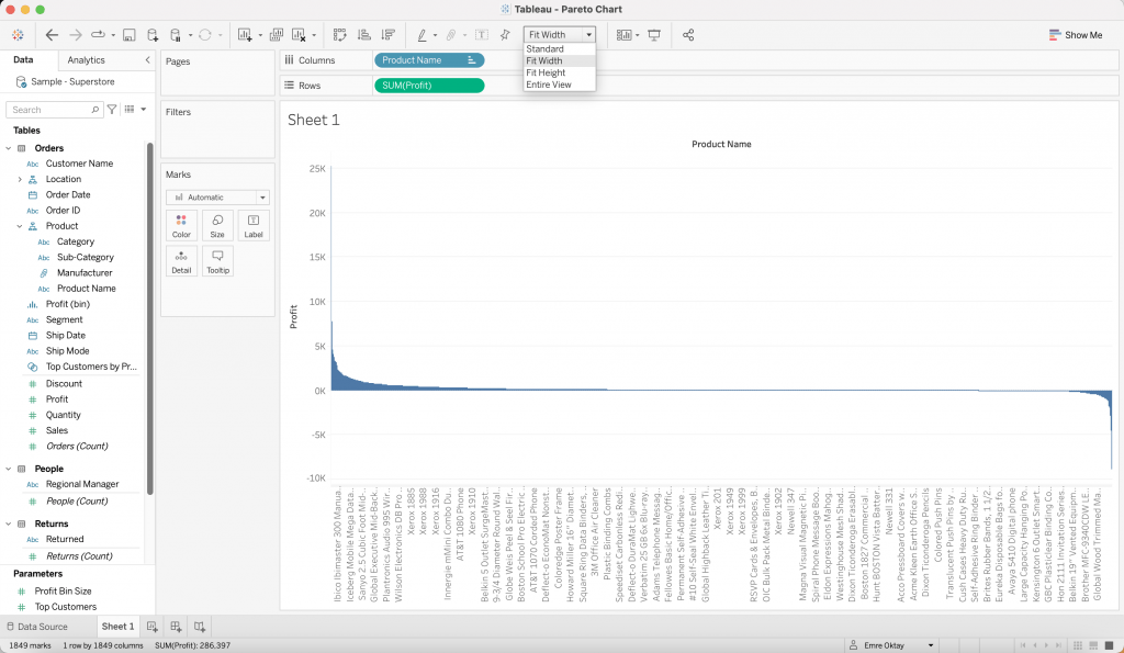
After doing so, charge the size of the view to “Fit Width” rather than “Standard” to observe the overall shape of the data.
Apply the Necessary Table Calculations
Next up, we need to add some table calculations. First, right click “SUM(Profit)” on the rows shelf and click “Add Table Calculation…”. In the pop up window, have the configuration shown below:
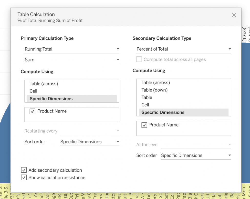
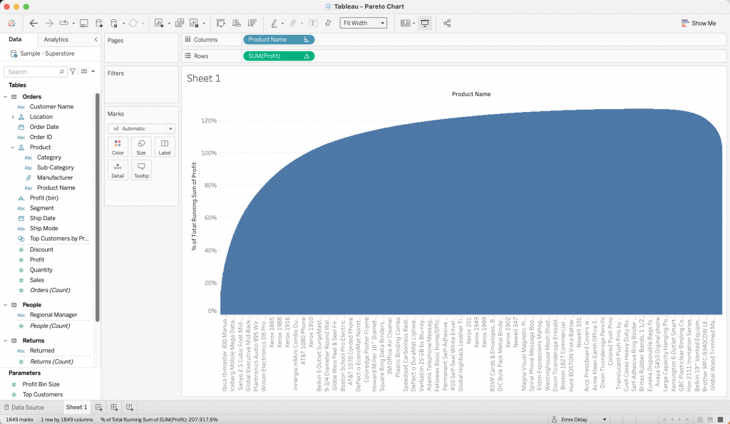
First we want to add a “Running Total” of the profits for all the products. This results in the cumulative sum of all profits from each product. Secondly, we would like to view the y-axis in percentage form. Therefore, we need to add a secondary calculation of “Percent of Total” to view the axis in percentage form. Once this is accomplished, your view should look something like this:
Interpretation
Looking at this, the means of interpreting the view can be a little confusing. I would break the view down into three parts as such:
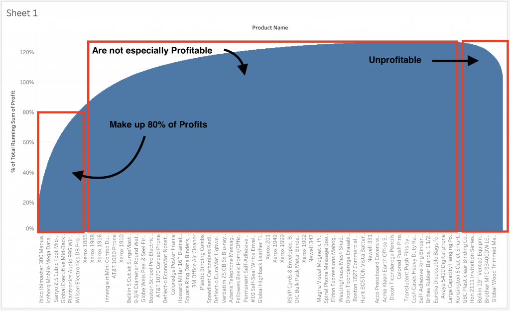
All the way on the left, the chart has successfully identified the most profitable bunch of products. It can be seen that around 10±20% of the products make up 80% of the profits. Looking all the way at to the right side, we can observe a decrease in height of the bars. This depicts the products that are unprofitable. And the middle section which is the majority, highlights the products that are not necessarily profitable.
Formatting
At this point, we did build our Pareto chart outlining which products make up 80% of the profits and which portion makes up the unprofitable products. All that can be done extra is some formatting to the chart to make it easier to interpret and make it look better in general.
First I would like to add colour to the chart by dragging SUM(Profit) from the Data Pane to the colour mark. To view the differences, I will click the colour mark > Edit Colours… then check “Use Full Colour Range”. My view should look like this:
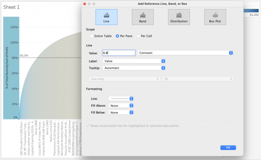
Next, to highlight the 80% line, the best method I can do is to add a reference line to the view. For this, right click the y-axis on the view and select “Add Reference Line”. Plot in the configuration below and you should have a line showing the 80% line on the y-axis.
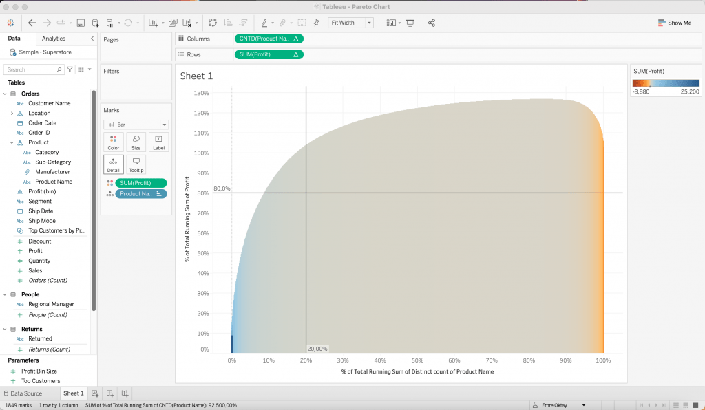
The x-axis on my view is looking very messy in my opinion with all the product names. It would be better if we could show that axis in percentage form as well and have the product names in the detail. This way I can see how much percent of products make up how much of the profit in detail. To begin to do this, follow the steps below:
- CMD (or CTRL) + drag “Product Name” into the Detail card.
- Right-click “Product Name” pill on the Columns shelf and convert to Measure > Count (Distinct)
- The view will change, don’t be alarmed. You will need to add a table calculation on it. Apply the exact configuration of the table calculations that were done before. (Running Total and Percent of Total.)
- Next, change the mark type from Automatic to Bar from the Marks card.
- Adjust the size slider from the Size card to something smaller to adjust the width of the bars.
- Right-click the x-axis and add a reference line. Follow the same steps as before for adding the reference line. This time, instead of 0.80, set it to 0.20.
If all steps are taken correctly, your view should look like this:
Now you can use this chart to view the largest contributors to profit be able to dig deeper into your data within your dashboard.
Visit our site The Information Lab NL to see more blog posts, training and consultancy services regarding Tableau, Alteryx and Snowflake.