
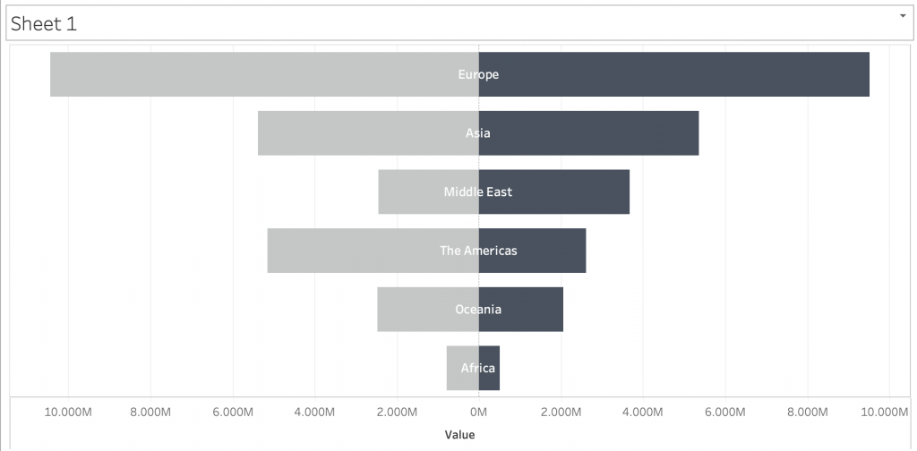
In today’s blog post, I will be showing you how to create a diverging bar chart in tableau. There are some other aliases for this specific chart type, such as bikini chart, but I will be referring to it as a diverging bar chart. What I mean by a diverging bar chart is pretty much a comparative chart like aside-by-side bar chart. However instead of the bars being side-by-side, they are opposite each other where the Y-axis is place in the middle of the chart. Below is the final look of the chart that I will be creating step by step:
Without further ado, let’s begin creating a diverging bar chart in Tableau. For this demonstration I will be using the “World Indicators” sample data from Tableau.
Creating the View
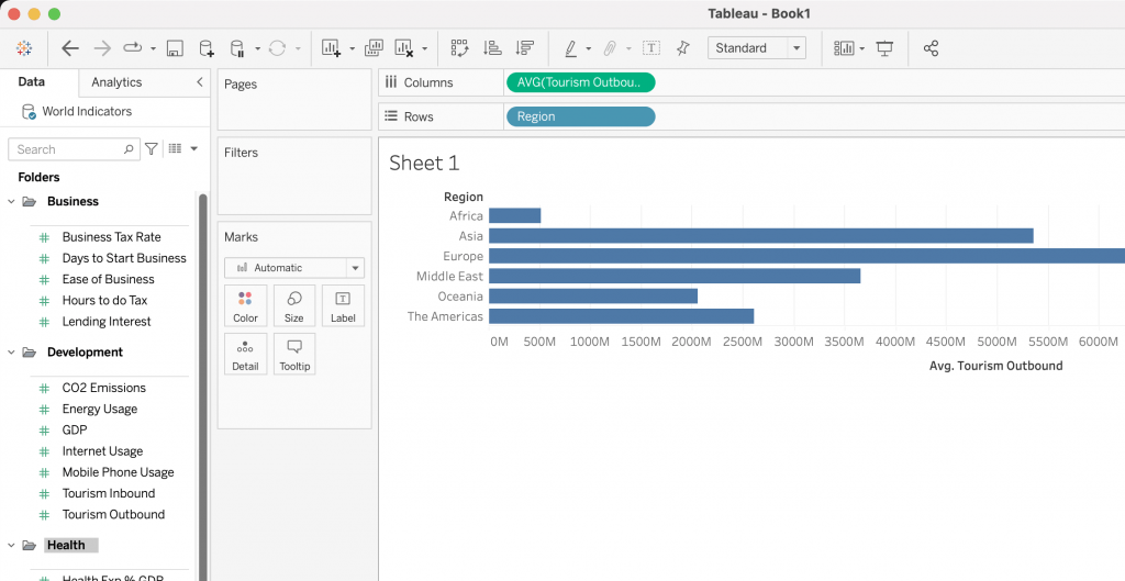
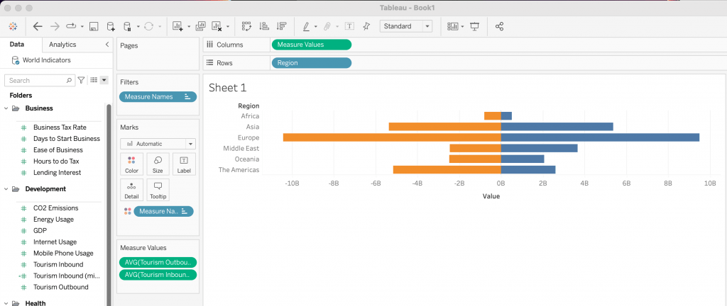
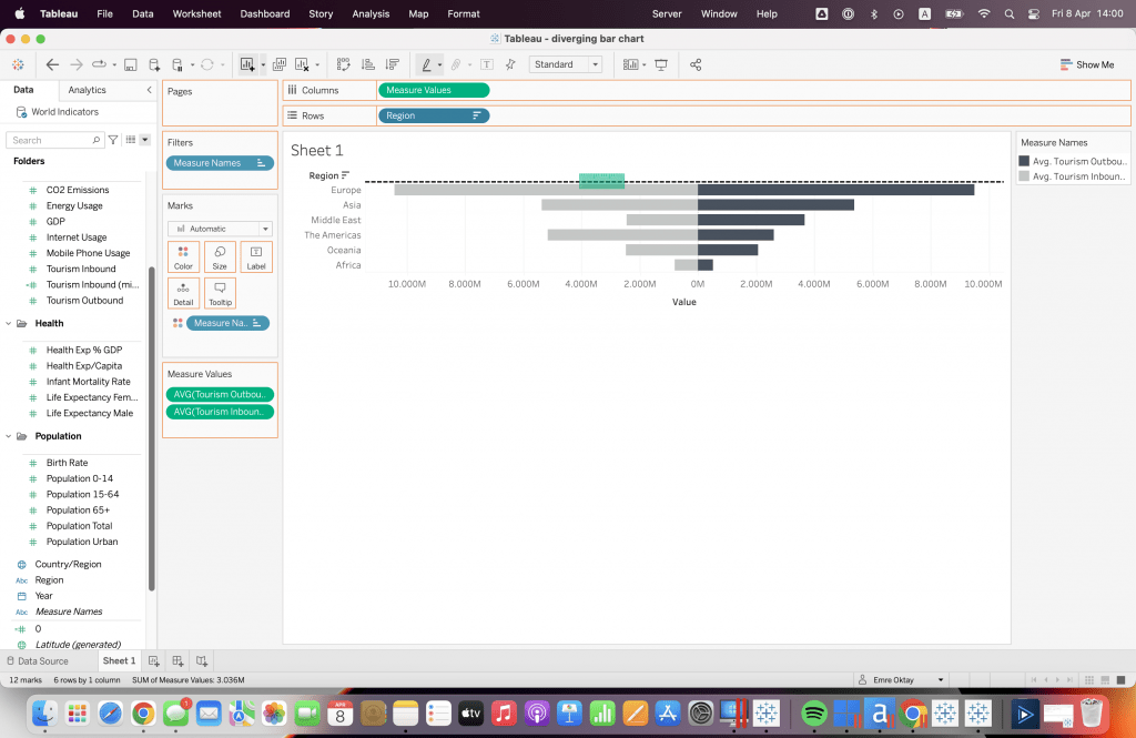
Let’s say I want to compare average incoming and outgoing tourists per region. First I would place “Region” on Rows. Then place “Tourists Outbound” on Columns and change the measure to Average.
Next step is to use the “Tourists Inbound” field. However, it does need to be altered for it to behave exactly how we want it to. For this, we need to create a new calculated field. Create the following calculated field for “Tourism Inbound“:
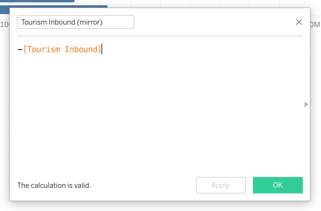
By placing an “-“, we inverse all values associated with that field. After creating the calculated field, grab it and drag it to the view below the x-axis to create a shared axis view like this: (NOTE: you should see two green horizontal bars)
Once that is done, new pills and cards will appear in the view. Make sure in the “Measure Values” card, change the measure of “Tourism Inbound (mirror)” to Average. Next, drag the “Measure Names” in the Rows shelf to Colour in the Marks Card. If done properly, your view should look like this:
Formatting the View
At this point, a diverging bar chart is already created. At least the idea of it. However, there needs to be some formatting that needs to be applied for the chart to look appealing and informative. From looking at this graph, I would like to change and fix the following:
- Change the colours.
- Format the numbers
- Format the axis.
- Add Region names in the bars.
Adjusting Colour and Text Formatting
Even-though orange and blue are very standard default colours for Tableau. I would like to change it to say grey and black. For this, I click the colour marks card, press edit colours, assign the Grey colour palette and select my colours for each field and press OK.
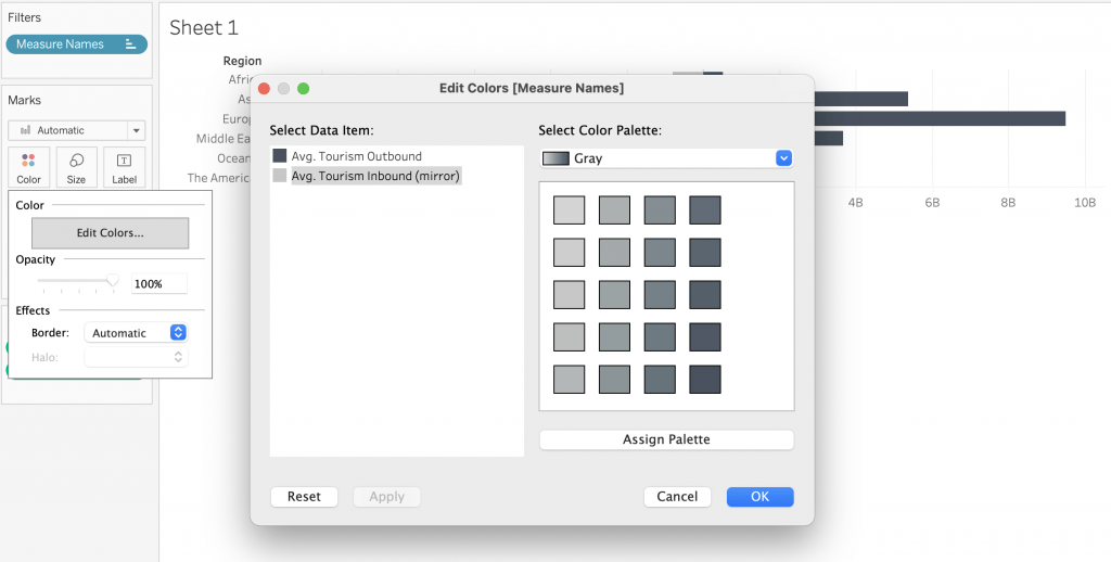
I believe this palette is better to have because I want to also have the Region names on the bars. And this palette is better for readability.
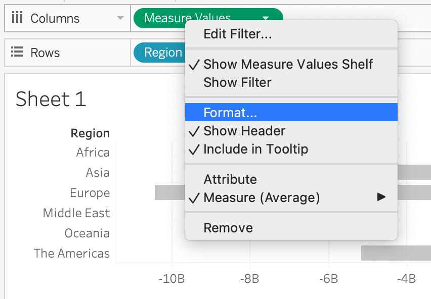
Next, I would like to fix the numbers on the X-axis. If you notice, there are negative values due to the calculated field we created earlier. For changing the number format in the x-axis, right click the “Measure Values” pill on Columns and click Format.
Then change the format to a Custom format from Numbers from Scale subheading. Change the format to: ,##0,,M;-#,##0,,M
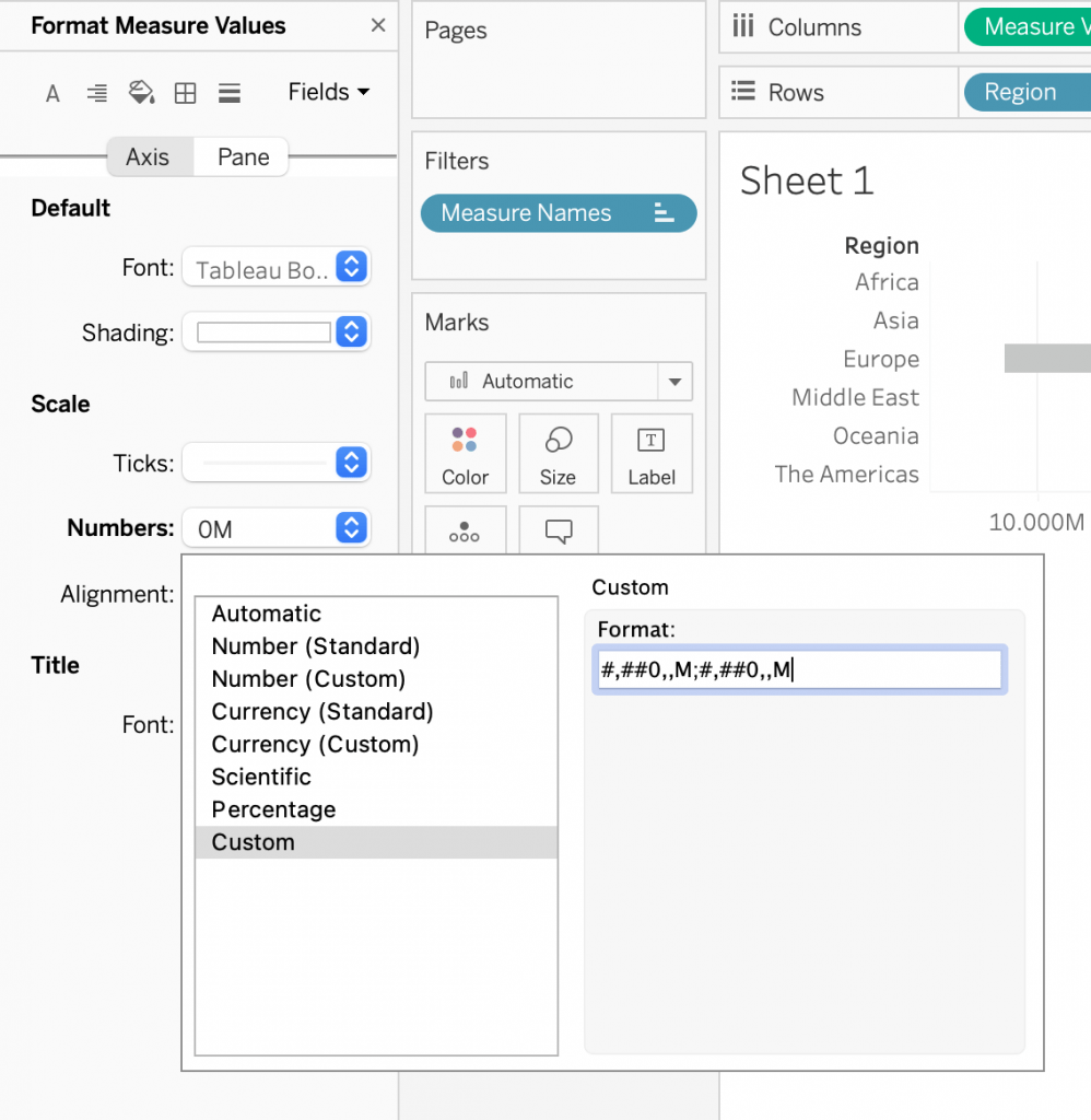
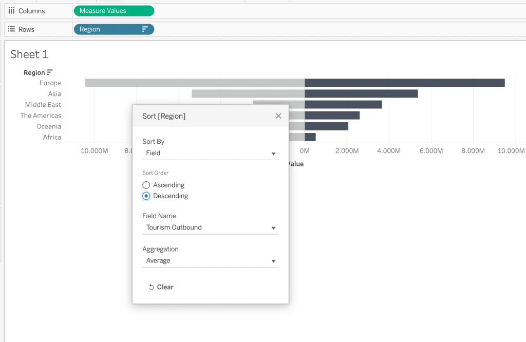
Your numbers should now also show in millions and positive values in both directions. This also automatically changes the value displayed in the tooltip. Before we move on, we should also sort our values to give it a more funnel type look. For this, right click Region on the Rows shelf, click Sort, select Field from Sort By, select Descending, and Tourism Outbound for the Field Name with the average for Aggregation.
Adding Region Names
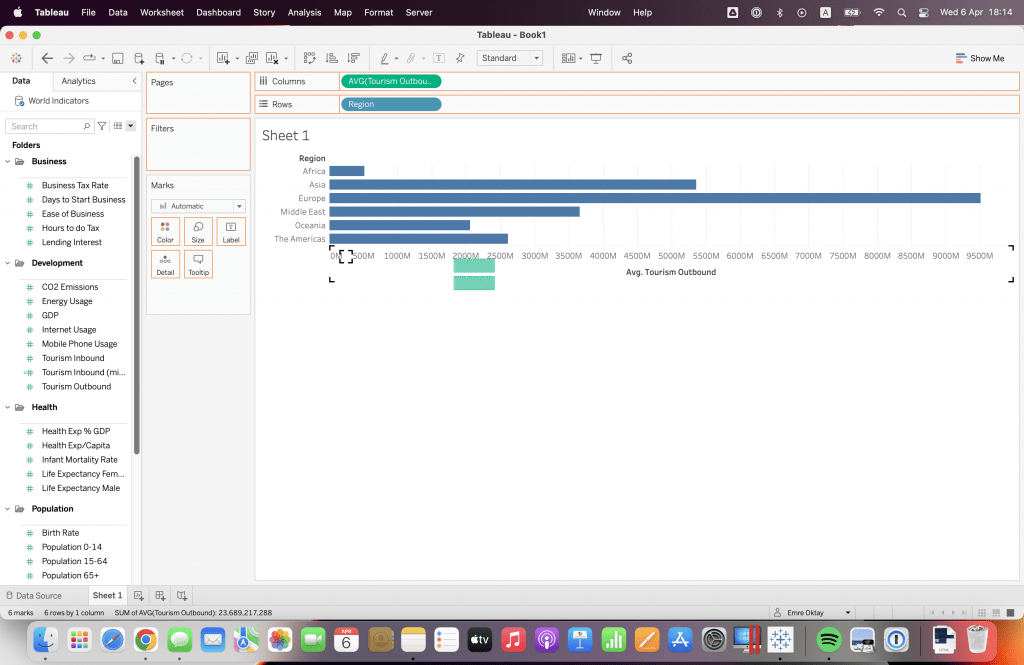
For formatting the view, the last thing I would like to add is the Region names on the bars. To start, we need to create a calculated field that only computes the average of 0: AVG(0).
The next thing we have to do is to drag and drop it at the top of our view when one green horizontal bar is shown below. This will result in a dual-axis chart and the default chart type will be switched to scatter plot.
When that is done, change the chart type to Gantt Bar for “AGG(0)” in the marks card and set the opacity to 0 from the colour card. This should result in the points that you see to be flattened and disappear.
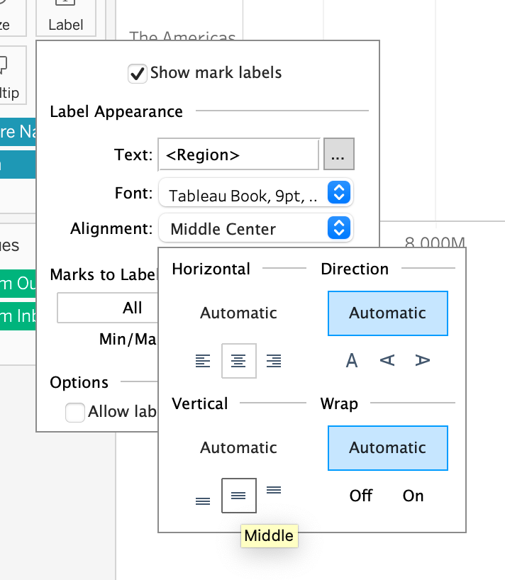
To have the names appear in the middle of the bars, CTRL (or command) + Drag the Region pill to Label in AGG(0) category in marks card. Click the Label Mark. Next, change the alignment to Center and Middle.
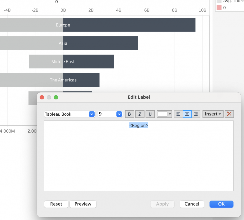
Finally, click the three dots next to the Text box for editing, and change the colour of the text to white. This way, each region is displayed in the middle of the bars with white text so it is readable. You can also adjust the size or make the text bold to increase readability.
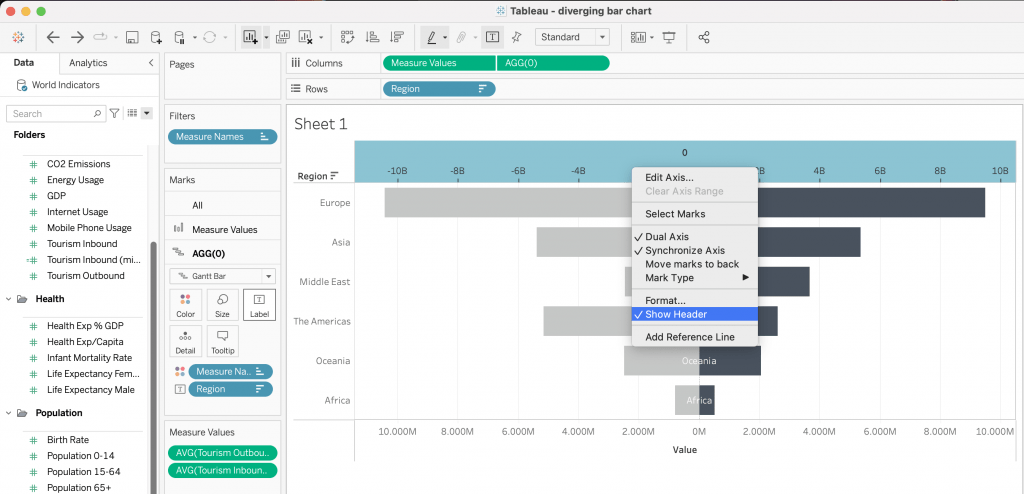
Hiding Headers
As a finishing touch, hide the headers at the top by right clicking the axis with “0” and unchecking Show Header. Also do the same to the Y-axis by right clicking on one of the Regions and unchecking Show Header again.
After completing that, your chart should look something like this:
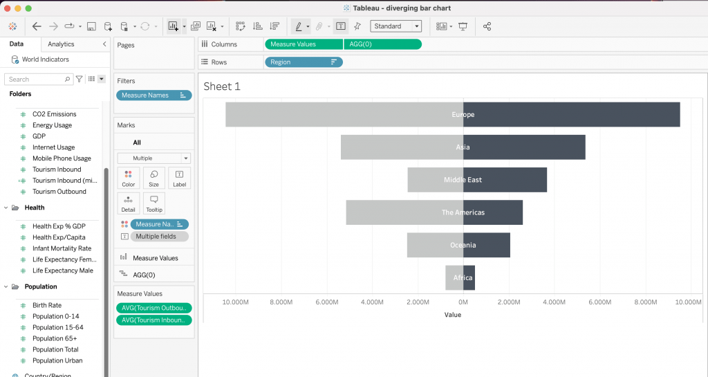
Now that the chart is nicely formatted, it is ready to be used in a dashboard. Remember, a diverging bar chart is quite a useful chart type when it comes to comparing two values across two categories. It is also a chart that can save you valuable space compared to a side-to-side bar chart.
Visit our site The Information Lab NL to see more blog posts, our training and consultancy services regarding Tableau, Alteryx and Snowflake.