
For effective dashboard design, important figures that you want to communicate need to pop up immediately. Visualisations are a great way in general to grab attention of the user, it if is done well of course. Sometimes all you would want to communicate is just a single number. For this, pretty charts or other visualisations may not be necessary. Just having that number in a large format and place it properly on a dashboard is enough to grab the attention of the user. Below is an example of what I am talking about:
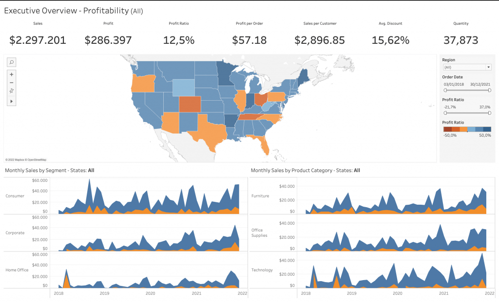
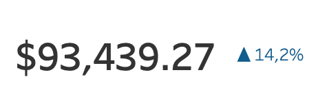
This is a sample Superstore Dashboard that comes with Tableau. The numbers at the top immediately grab the attention of the viewer. However, in this blog post, I will go though a way to create these big numbers with a percentage increase or decrease indicator to the side of the big numbers. The result will look like this:
For the demonstration, I will be using the Sample – Superstore data. I will create a large number that shows last years profit with a comparison to last years in percentage form. Let’s begin with the first step:
Create the Necessary Calculated Fields
To begin creating this numbers and the percentage indicator, we need to make some calculated fields first. As mentioned before, I want the last years sum of profit and an indication of how much it went up or down from last years profit. For this I need to create 5 calculated fields:
- Current Year =
YEAR([Order Date])= {FIXED: MAX(YEAR([Order Date]))} - Previous Year =
YEAR([Order Date])= {FIXED: MAX(YEAR([Order Date]))} – 1 - Profit of Current Year =
IFNULL(If [Current Year] THEN [Profit] END,0) - Profit of Previous Year =
IFNULL(If [Previous Year] THEN [Profit] END,0) - % Change =
(SUM([Profit of Current Year])-SUM([Profit of Previous Year]))/SUM([Profit of Previous Year])
Change Number Formats
To view the profit correctly, change the number format to currency. Also, apply a custom format for the percentage change as follows:
- Change number format “Profit of Current Year” and “Profit of Previous Year” to Currency (Standard) with the currency of your choice. I chose $.
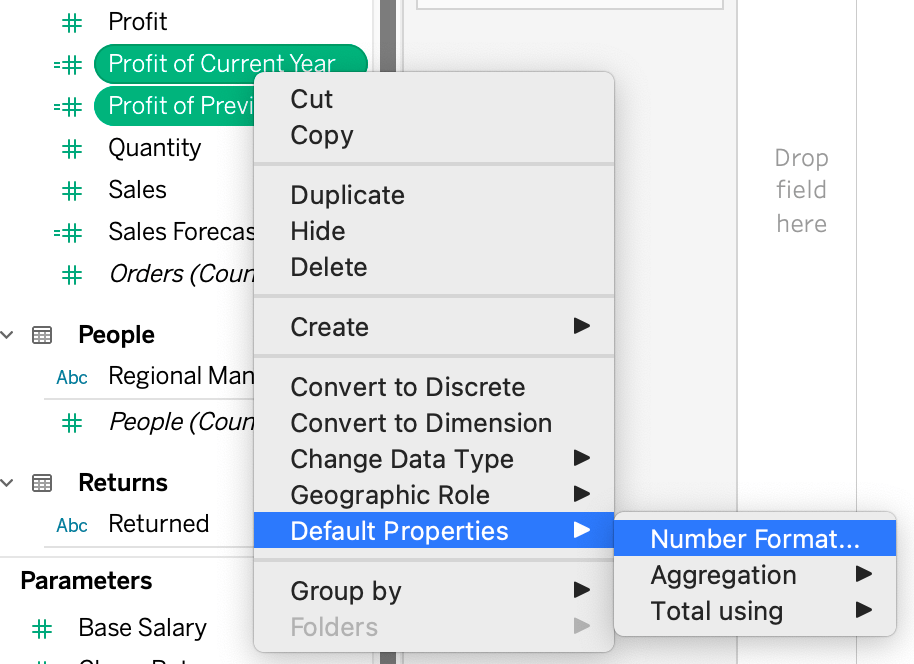
2. Now change the number format of “% Change”. For this one. Select “Custom” and endter the following format: ▲ #,###.0%;▼ -#,###.0%
Bring the Calculated Fields in the View and Format
Once you complete the previous steps, it is time to bring these calculated fields into the view and format the size and colour:
- Bring “Profit of Current Year” to Rows and change the aggregation to discrete.
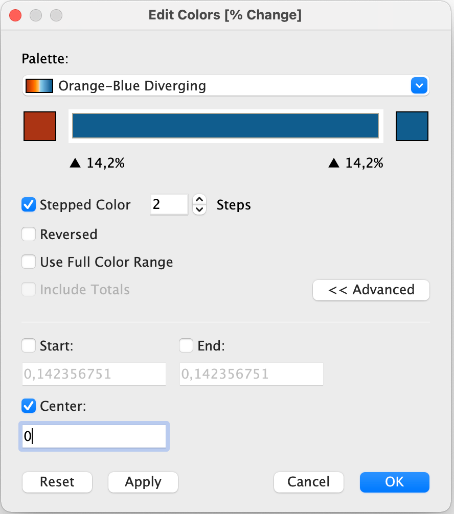
- Bring “% Change” to Text and Colour. Afterwards, click “Edit Colour” and have the following configuration:
After this, adjust the size of the main number as you wish by right clicking SUM(Profit of Current Year) and selecting Format and selecting size from Default header. Such as 20. Make sure you hide label names and title as well. Finally, select Format from the top menu, navigate to “Borders” and select None in the Row Divider Header. If you complete these steps correctly, your view should look like this:
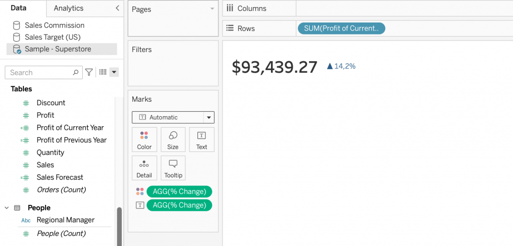
And there you go, you have created a view with a large number and comparison indicator. The percentage indicator turns orange with the arrow pointing downwards once current years profits are lower than the previous years. With these steps, you can duplicate the calculated fields and generate numbers for other measures like Sales (in case of superstore data) or with months or weeks.
Visit our site The Information Lab NL to see more blog posts, our training and consultancy services regarding Tableau, Alteryx and Snowflake.