
I will share the easiest way to create a small multiples map in Tableau. I will do this in a step-by-step guide. The secret is to have nicely structured data. Once this is the case, creating the maps is a piece of cake! Finish your maps with some nice formatting and you have created a beautiful dashboard.
But first: what is a small multiples map and when should you use it? A small multiple is a series of similar – in our case – maps. These maps use the same extent and scale. Using all these small maps allows users to analyse trends. A small multiple map might not always be the easiest to interpret, but it sure looks nice. Let’s see how we can create one.
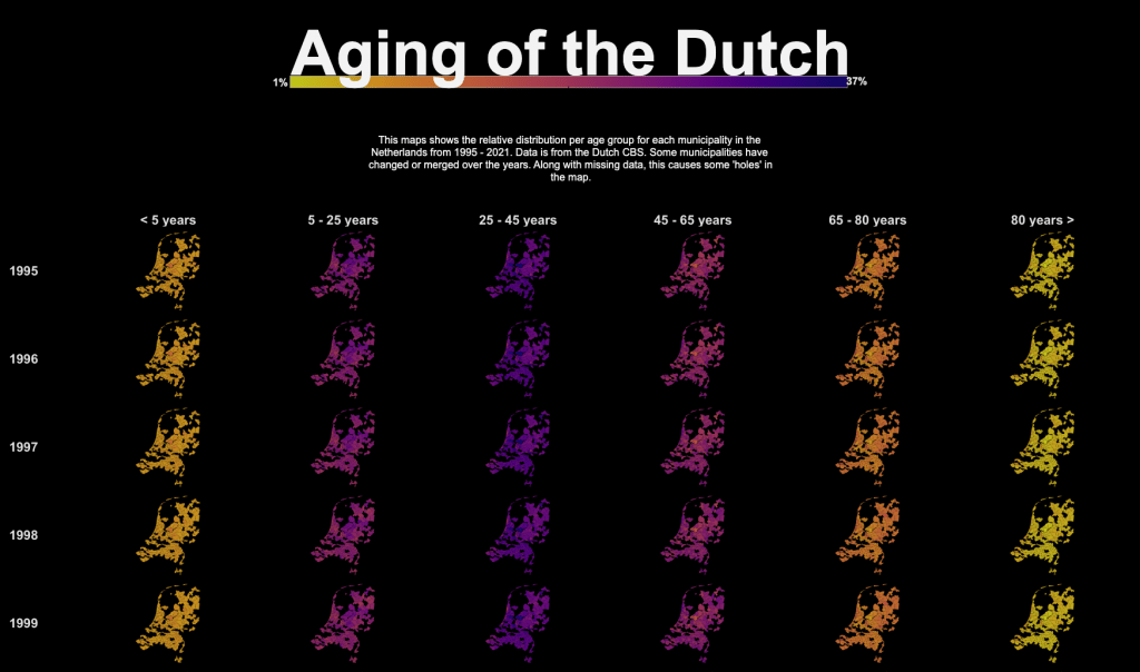
1. Prepare your data
In my example, I used CBS data from 1995 – 2021 about relative age groups in Dutch municipalities. This data was structured with an age group in each column. However, what we need for creating a simple small multiples map, is a very long table. This means we have to pivot the table to create more rows instead of columns.
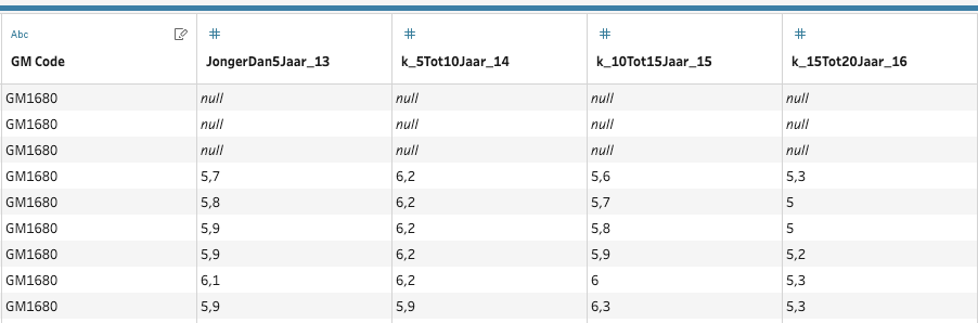
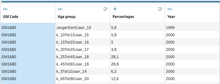
I use the pivot function in Tableau Prep for this. This works super smooth. The result is a long table. Each row contains the percentage for 1 year, 1 age group and 1 municipality. After Tableau Prep, this is what the table looks like. Do you notice the difference? I then join this new table to the municipalities shape from the CBS.
2. Create a single map
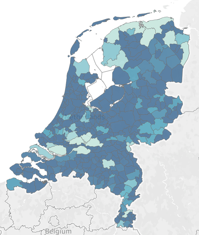
Tableau will have a hard time with drawing 100 small maps. Therefore, I always start with one map. Simply start by creating a map in Tableau like you normally would. Drag the Geometry column onto your worksheet. Also, make sure you are adding the right level of detail. Now we want to color the map based on our percentages column. To do this, drag Percentages to color. Your map should now look like something like this:
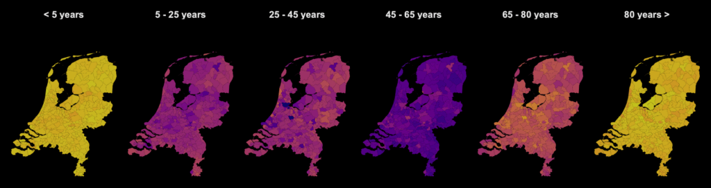
3. Create a small multiples map
Now we have one map, we want to duplicate it for each year and each age group. This way we will end up with multiple smaller maps. To achieve this, we have to add fields to the rows and columns shelves. First, drag the age groups to columns. Secondly, drag the year column to rows. You will see that the initial map is duplicated. Note that if Tableau is taking a long time to load, consider using a filter to only show 5 years of data. This will speed up Tableau, thereby making the visualising part a lot quicker.
4. Format your maps
Now you have your small multiple maps, it is time to format everything. I chose the following options:
- Remove all grid lines (Format > Borders, set everything to none).
- Dark background layer (Map > Map Layers > Dark). I also chose to disable all layers. This leaves only the dark background.
- Pick a color scheme. I chose Plasma 20 diverging by Jonathan Drummey. To get these colors check here.
- Disable the polygon borders. By default, Tableau draws a black border around your polygons. Because I think these borders are distracting, I removed them. In your marks pane, click color > border > none.
- Create a dashboard. Next step is to bring your sheet to a dashboard.
- Add a nice title, description and color legend and that’s it!
- Have a look at the final dashboard here.
Want to learn more different map types? Keep an eye out for my blogs. I will also regularly post map related dashboards to my Tableau Public profile. Lastly, we are now also offering a full day of GIS Tableau training!