For this step-by-step guide, I will go through the actions I have taken to prepare and visualize the data through a Tableau Dashboard. Along the way, I will share insights from the sheets I will create and finally, I will show the final dashboard.
The dataset used for this blog post is called “New York City Airbnb Open Data” on Kaggle (Here is the link). The dataset includes listing activities and metrics for Airbnb in New York, USA for 2019.
First to see how much cleaning I can do to this dataset, I will dive into Tableau Prep Builder and see what I got…
Data Exploration
After importing the dataset, this is what I am faced with in terms of fields:
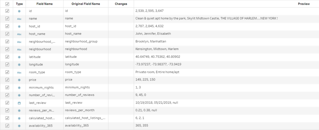
As it can be observed, I have information on the hosts, geographical information and metrics such as price, number of reviews and other related fields.
Next, I will add a clean step to my flow to get better descriptions of my fields. From this, I can see that this dataset is already looking clean but there is room for further preparation. For example some null values can be observed. In the “last_review” and “reviews_per_month” columns, null values take ~20% of the total values. So I should filter them.
Quick tip:
- Right click the null bar of the “last_review” in the Profile Pane.
- Click Exclude.
Also in the same field, the date ranges from 2011 to 2020, 65% of the data is between 2019 and 2020 therefore, I will filter out the dates before 2019. Aside from that, I also noticed some potential outliers across fields, however I will leave them in.
Now that I am done with my preparation, I can put an output block on my flow and save the updated version to be used in Tableau Desktop for the data analysis.
Data Analysis
I am lucky enough that our dataset contains a good range of data types. I have:
- Date field = I can create line plot to see changes in activity
- Latitude / Longitude = I can create a maps.
- Borough names = Tableau has the ability to recognize certain area descriptions (more predominantly in the US), can be used within the map).
- Room Type, Price, Number of Reviews = I can categorize, do ranking.
Line Plot
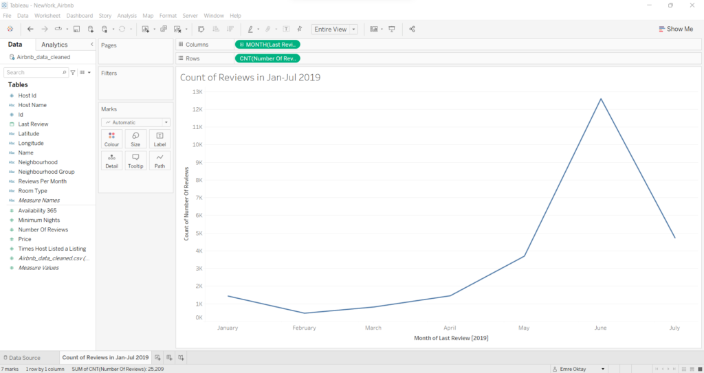
First I am going to get started working with the date data. I want to see the changes in the number of reviews for all listings over the months within 2019. For this, I will plot a line graph as follows:
QUICK OBSERVATION:
As it can be observed, there is a sharp increase in reviews from May (~3000) to June (~12000) with a sharp decrease by July (~4700). This can be due to the summer season coming up in the year and the influx of tourists staying in New York through the summer. Since the dataset ends on July, we cannot see how the trend is for the end of the year.
Creating Maps
Next, I can create a map with all the geolocations of the listings provided in the dataset. Since I have the specific locations for each listing, I also have the option of creating a density map. The neighborhood classification for the listings also will allow us to create a map with borders. As for the density map, it is fairly straight forward to create. But for it to look nicer, some map formatting might be beneficial. This is the final look of the density map:
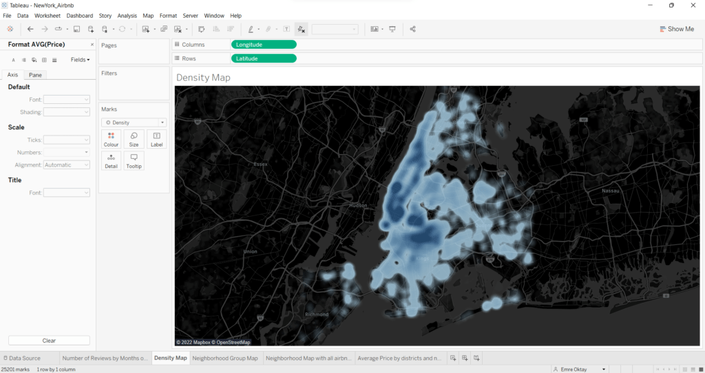
I have chosen a dark theme for the look of the map since I believe that the density maps transparency works best in this format where city/district names are more readable. You can play with the opacity and size settings with the Color and Size buttons in the Marks Card to your liking, low opacity means more readability.
Quick Tip:
- Place Latitude and Longitude in the columns and rows and convert them to dimensions.
- Select “density” option in the Marks card.
- Go to “Map” –> “Background Maps” and select “Dark”.
- Go to “Map” –> “Map Layers” in the toolbar at the top, check “Streets, Highways, Routes” and “County Names”.
QUICK OBSERVATION:
From the density map, it can be seen that most of the listings exists in the Manhattan area of New York, particularly the southern parts. Another very dense area is upper side of Brooklyn. The least listings exist in the Staten Island area.
On top of the density map, I think it is a good idea to create a Neighborhood Group / Borough Map where the boroughs show clear boundaries. This could be used for filtering purposes in our dashboard at the end. This is the look of my Borough Map that I have created:
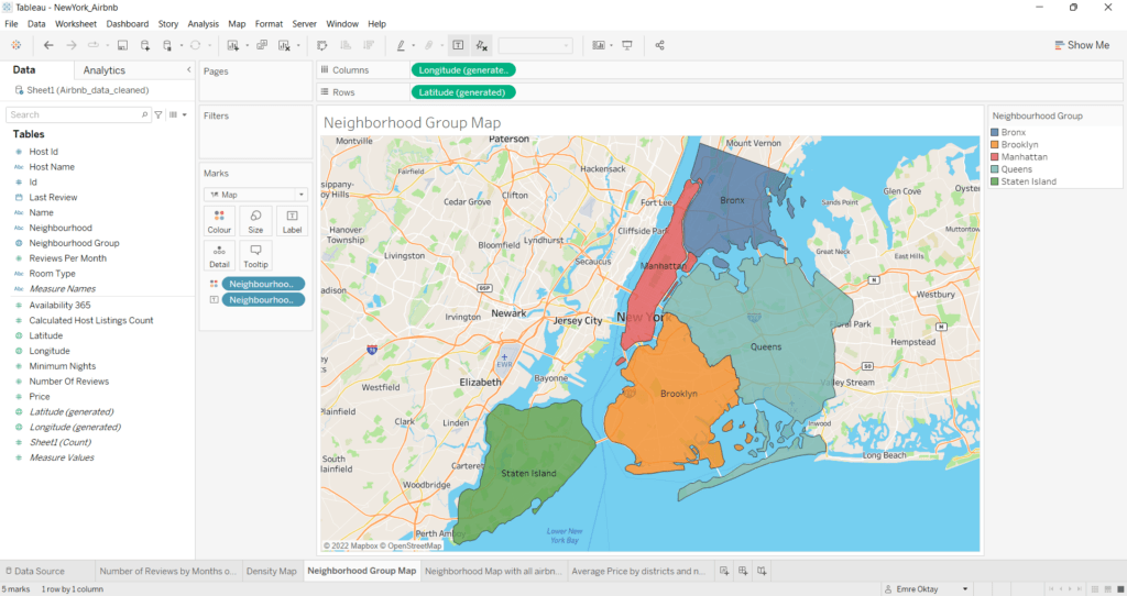
For this I used a different map background of “Streets“. The Borough Map includes five distinct values therefore I can use color to categorize. Another important point is that the boroughs need to be assigned a geographical role. This way, Tableau can automatically draw shapes based on the borders of the five neighborhood groups of New York. The latitude and longitude data used in the view is generated from assigning the geographical role of the “Neighborhood Group” field.
Bar Charts
After I created my maps, having bar charts for comparison purposes is a good addition to the final dashboard. This is where users can really educate themselves on what are the average price ranges for each room type and smaller neighborhoods within the boroughs.
I will create two separate sheets for supplying the information. First. I want to plot the average prices of each Airbnb location broken down by the individual neighborhoods that exist in a borough. This is my resulting bar chart for comparing prices within boroughs:
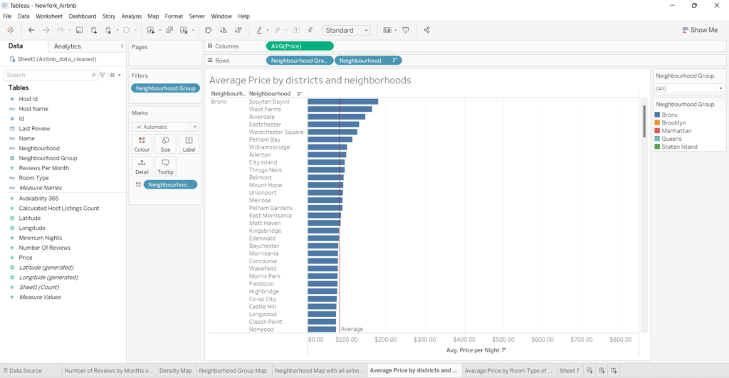
I have filtered and color coded the boroughs in this sheet as well so it matches the colors of the Borough Map. The filter allows the user to select desired borough or all. In addition, I have also added an Average Line for each borough so that comparing average prices of specific neighborhoods with the average price per borough is easier.
Quick Tip:
- Click the Analytics Pane
- Drag and Drop “Average Line” into the view.
- Make sure you do ‘by pane’.
QUICK OBSERVATION:
Manhattan area has the highest price average ($197.98) with Bronx having the lowest ($81.73).
I will proceed to creating a very similar view. Only this time, I want to compare average prices for each room type within each borough. Here is the resulting bar chart:
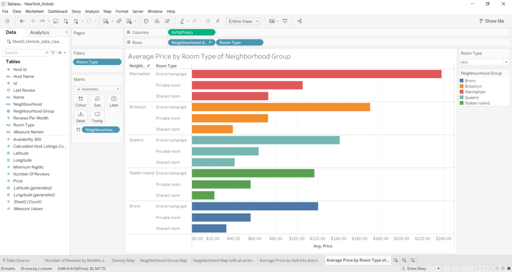
The boroughs are color-coded again for categorization. As for the filter, the user can select the desired room type or all to do comparisons between the boroughs.
The Dashboard
I believe I have made all the charts I need to create an informative dashboard from the maps and charts I have created about the Airbnb data of New York. For this, I make a straight forward dashboard without dazzling visual elements. Just a simple environment to communicate my findings. Here is a screenshot of my resulting dashboard and the link to the dashboard in my Tableau Public account:
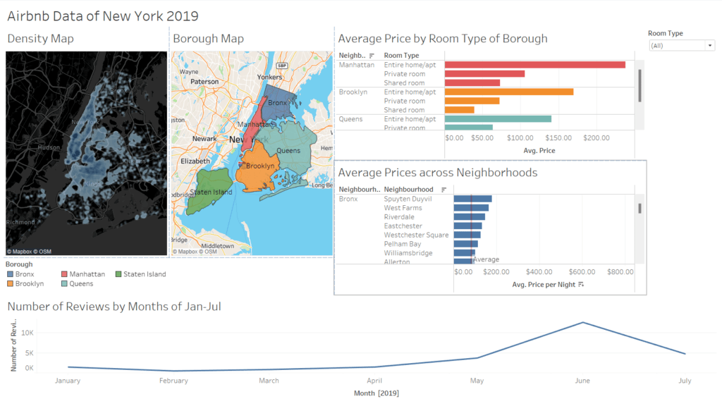
The borough map is used as a filter in the dashboard to only show results of the selected borough across the charts. It displays all if none are selected.
This dashboard incorporates every view I have created. It outlines which areas of New York is more densely populated with Airbnb locations, displays the number of reviews done for each listing in the year of 2019 and describes and compares average prices for room types between boroughs and compares average prices of listings made in each neighborhood of the boroughs.
From this dashboard, you should be able to pick out the most suitable neighborhood for your next Airbnb location on your next holiday abroad 😉


