In this third blog of a series about data visualization and Tableau, I will discuss the importance of typography for your data visualization. Shortly, good usage of typography can make the difference between an ordinary and an extraordinary design. I will answer the following three questions: Why typography is important? What is typography? And, how to use it within Tableau? At the bottom of this page, you will also find a list of helpful resources. I hope you will enjoy reading this blog and learn from it. While writing I definitely did.

Why typography is important?
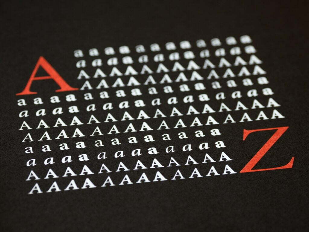
Typography is everywhere we look. It is on the websites we visit, in the books we read, and in the dashboards we make. It plays a central role in data visualization. The power lies in its ability to alter how you feel about a message being conveyed. If done right, it enhances the experience of reading the visualization. Typography can complement your analyses, provide context, add branding, and much more.
What is typography?
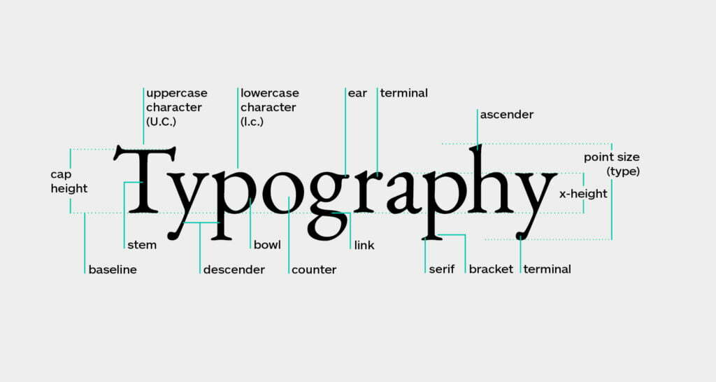
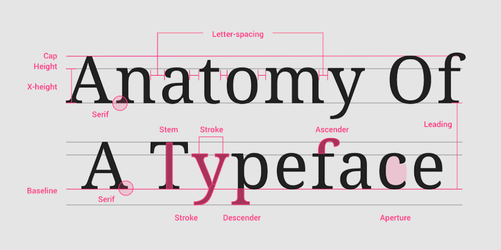
At its most basic definition, typography is the style or appearance of text. In order to learn about the details of typography you need to start learning the extensive vocabulary (see image below). For more information, please have a look at the following glossaries: Type Glossary, Fontshop, and The A-Z of typographic terms.

For now, lets focus on font and typeface only. While both terms are often used interchangeably they refer to the collection of letters, numbers, punctuation, and other symbols. Typefaces are usually grouped together in a font family. These typefaces share common characteristics and a common name. For instance, Arial, Times New Roman, or the Tableau font family. The latter, released in 2016, has been designed with the overall goal of simplicity and readability in the visually dense data visualization environment.

How to use typography within Tableau?
I would always recommend starting simple. The tips below are here to help you avoid some of the common mistakes I already encountered.
- Use the default typeface Tableau if you are overwhelmed by the choices Tableau has to offer. This typeface has been specifically designed for dense data visualizations.
- Try being consistent by formatting your font at the Workbook level.
- If there is already a style/brand guide available use it. Probably someone has spent a great deal of time designing the font styles, sizes, and spacing.
- Try avoiding font pairing (i.e. using multiple different font families together) when you’re not completely sure how this works.
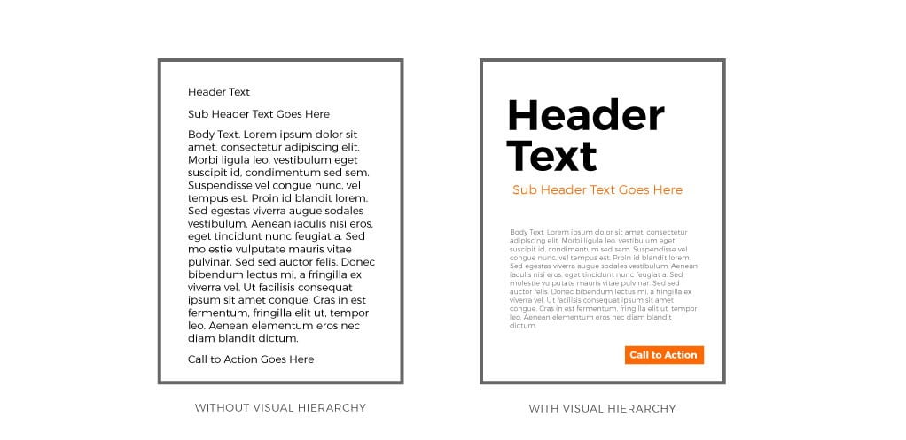
- Most of the Pre-attentive attributes we use in data visualization also directly apply to your text. For example, think about using size and color to establish a typographic hierarchy within your dashboard.

- Try using Lorum Ipsum as a placeholder when designing your typographic hierarchy. Oh, and don’t forget to change your text back afterwards 😉
- Tableau is using points to define font sizes. Other common design tools, like Adobe Illustrator or Figma, are using pixels. You can use this converter to see the difference.
- You can add your own custom fonts to Tableau. This provided great flexibility and opens another world of possibilities. But beware, when working with Tableau Server or Online, use a so-called web safe font. This ensures that Tableau can render the font correctly. Make sure the font is on this list of fonts installed with most browsers.
Helpful resources:
- Beginning Graphic Design: Typography (YouTube)
- Material Design: understanding typography
- Your ultimate guide to understanding typography
- How To Use Typography In UI Design: A Beginners Guide
- How to Design a Typographic Hierarchy in Tableau
- Ten Tableau Text Tips in Ten Minutes
- The ultimate guide to font pairing
- The A-Z of typographic terms
- Fontshop: glossary of common type terminology
- Wordmark: helps you choose fonts based on a word or a phrase
- Font Generator: create cool and fancy fonts
- Adobe Fonts
- Google Fonts
- Google Fontpair: your ultimate guide to free fonts and how to use them
- Typescale Visual Calculator
Next up, visual variables and what it has to do with making beautiful maps in Tableau.
Thanks for reading and don’t forget to tell your friends! If you want to improve your Tableau skills, have a look at our Tableau and Alteryx Training Page. For more information about consultancy, please have a look at our website. Finally, if you want to know more or just have a chat? Just contact me through LinkedIn.


