Using icons are considered to be quite a beneficial tool for web design. They are easy to understand graphics that grabs the user’s attention immediately due to their simplistic visual nature. It is also a great tool to pass language barriers that can arise with plain text. In addition, they add a great deal for navigation as well as adding character to your design.
In this blog post, I will be going through how to create interactive icons that can be used in your Tableau dashboards by going through an example dashboard I have posted in my Tableau Public profile which can be found here. For this visualization, I worked with a dataset that included the percentages of females and males that have participated in the study who believe whether if they could beat a given animal or not in an unarmed fight. This dataset can be accessed here.
Without further ado, we begin with the first step:
Obtaining and Importing the Icons into Tableau
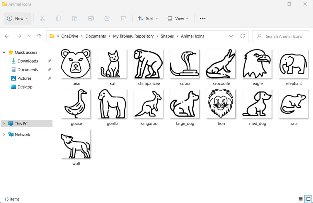
After loading the dataset, you will need to decide for what category you need icons for. In this case, I needed an icon for each animal present in the dataset. Finding icons began with a simple Google search where I stumbled upon a library with many free icons and digital stickers for download from a site called www.flaticon.com. From there, I downloaded all the animal icons that I needed and saved them to a folder.
After placing all my icons into a folder, then I move that folder into the “Shapes” folder found in “My Tableau Repository“. These icons are essentially are to be used as shapes in our Tableau project. Therefore the next step will include working with the “Shape” type under the “Marks” card.
Assigning the Shape Palette
Once we have the icons we need under the Shapes folder. We can launch Tableau and assign each icon to each data item into the corresponding table (In my case the Animal column). For this, drag the desired table into the “Columns” shelf as well as the “Shape” shelf after selecting “Shape” from the dropdown menu from the “Marks” card. If the dropdown is left on “Automatic“, the shapes shelf will not appear.
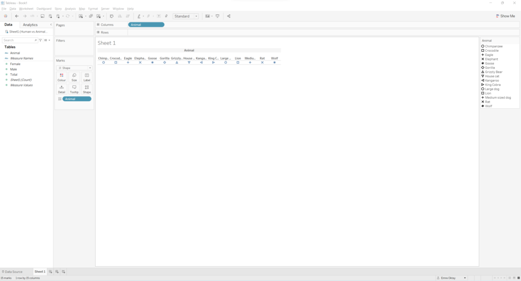
As it can be seen, different shapes are automatically assigned to each column. Now it is time to switch out the sample shapes with the ones we have obtained.
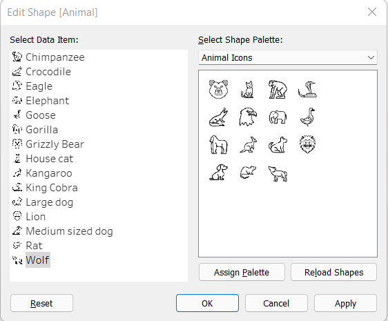
For this:
- Click on the “Shapes” shelf under the “Marks” card.
- In the pop-up menu, first click “Reload Shapes” then select your shape palette (in my case I named it Animal Icons).
- Then one by one, assign each data item with the desired shape by first clicking the data point, then clicking the desired shape and click “Apply“.
Creating the Icons
Once all the icons are assigned as shapes to each data item, the standalone icons can be created. For this, each icon can be in its own separate worksheet, I decided to do it that way. In order to do this, you must add a filter. In my case, the first animal icon I want to create is the Chimpanzee, so I CTRL + click the “Animal” pill in the “Columns” shelf and drag it to the “Filters” card and only select “Chimpanzee“.
This might make your icon very small in the worksheet, so make sure to change the view from “Standard” to “Entire View“.
We have our first logo, but we should do some cleaning up by hiding the title, header and the axis labels as well as getting rid of the format borders.
- For this right click the title area of the sheet and select “Hide Title“.
- After that, right click the axis label and select “Hide Field Labels for Columns“.
- For hiding the header, left click the header and untick the box that says: “Show Header“.
- Finally, right click anywhere on the white space and select “Format…”. Go to the “Format Borders” tab and select “None” from the “Row Divider” header, this will hide the two divider lines at the top and bottom of the view.
Once all these steps are followed, your icon should look something like this:
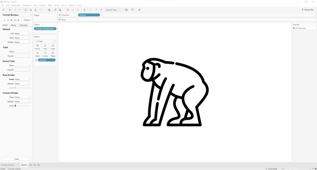
To do all your desired icons, duplicate the worksheet and change the filter to another item.
Functionality in a Dashboard
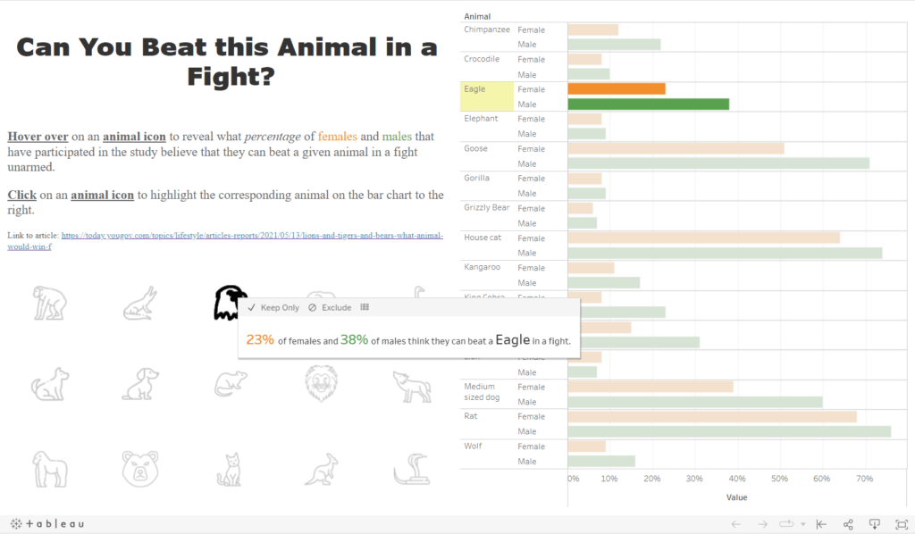
Once you create all your icons, they can be added to your dashboard and used for any functionality you desire. On my dashboard on Tableau Public, I placed all the sheets in horizontal Objects and distributed the icons evenly. I added the percentages data on the tooltip of every icon sheet. I also added a bar chart where all the data is displayed, the icons function as a highlighter for the bar chart. Here is a sample view:
If you want to learn more about Tableau, Alteryx or Snowflake? Check out our trainings and consultancy services on The Information lab NL.
Sources and Credits
All icons used in the example dashboard were downloaded from Flaticon.com. The special artists include:
- Freepic
- Flaticon/Smashicons
- Flaticon/iconixar
- Flaticon/Nadiinko
- Flaticon/Icongeek26
- Flaticon/tulpahn
- Flatiocon/Good Ware
- Flaticon/photo3idea-studio
Blog post on the importance of using icons:
https://blog.pixelfish.com.au/benefits-of-using-icons-in-web-design
Dataset used in Dashboard:


