In this series, I will explore how compositions are different from comparisons, and what chart types you can use to visualise a composition. Start at Part 1 here.
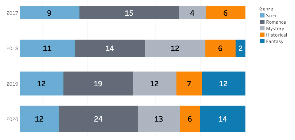
Stacked bar charts are an excellent way to show a composition. Doubly so in Tableau, which makes the process quick and easy! Join me today as we recreate the bar charts from last time.
Building a better bar chart
We started out last time by creating a simple bar chart and converting it into a stacked bar chart. You don’t have to create a simple bar chart first, but we might as well — we’ll have two charts for the price of one! Creating a bar chart in Tableau is very fast. We simply drag a dimension (Genre) onto Columns and a measure (Number of Books) onto Rows…
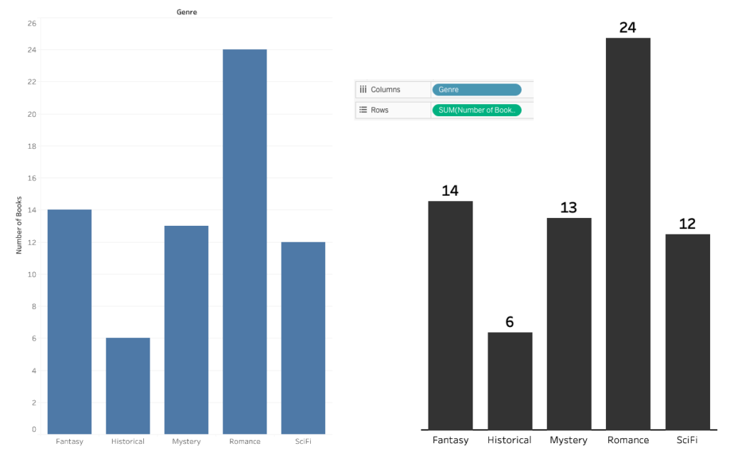
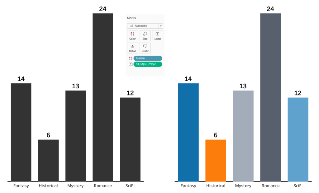
… and we are greeted by the bar chart on the left. Feel free to make this a bit prettier! To get the bar chart on the right, I have added the same measure again onto Labels, removed the axis and the tick marks, and changed the colour of the bars to something less… blue. Of course, we could also drag our dimension to Colour, so let’s do that now:
Stacking the bar chart
Right, so that’s the bar chart. How do we convert it into a stacked bar chart? Simply remove the dimension from Columns…
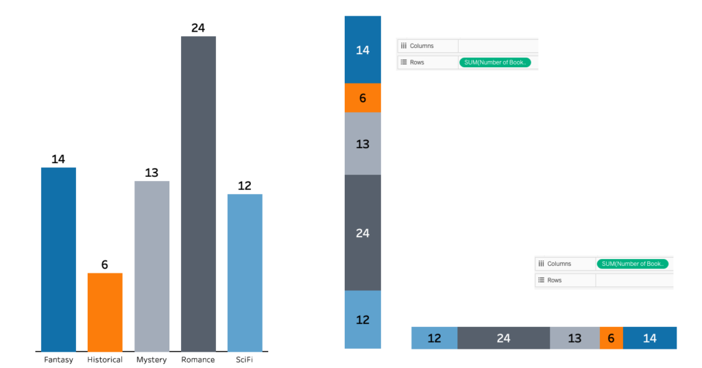
… oh, that did the trick already. It really is that simple. Tableau is now showing our genre dimension on Colour only. To change the orientation of the chart, simply swap the measure from Rows to Columns.
Alright, we have recreated one of the bars, 2020 to be precise. We had four though, one for each year from 2017 to 2020. Let’s add the missing years to our data, and split the view by year. To do this, we drag year onto Rows:

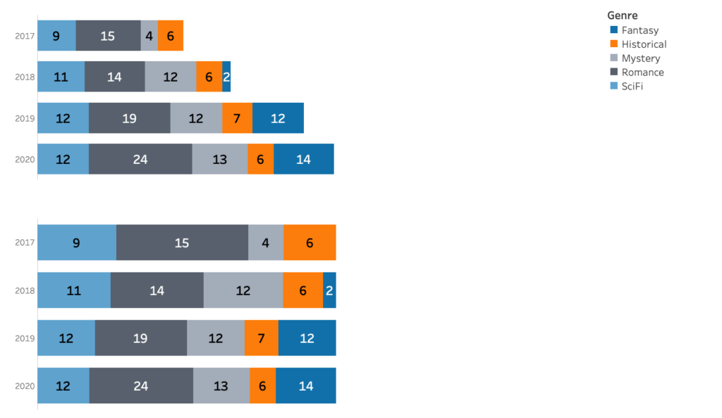
Hmm. We are seeing parts-of-wholes all right, but all the wholes are different sizes? Note that the bars represent the number of books, which increases every year. If I’m interested in seeing the relative distribution of genres, this would be so much easier if every year were the same size. To make every year the same size, we need a way to express the total that stays constant over the years. We can get this by converting our measure to a percentage of total. Every year, all books will add up to 100% of all books that year – the whole remains the same.
We can use a quick table calculation to convert our measure to a percentage of total. Right-click the measure, go to Quick table calculation, and select Percent of Total. All bars are now the same length, meaning all the wholes are now the same size, meaning I can now easily evaluate the contributions of the different parts to the whole:
Bringing value back
But wait. Converting my measure from a total to a percentage was great to illustrate the part-to-whole relationship, but it did come at a cost. It is now much harder to visually compare the absolute number of books by year. Did we mess up, do we need to undo that last step? Not necessarily. We can achieve the best of both worlds by reintroducing the absolute measure. But how? I can no longer use length, since then we would be back where we started. Luckily there is another spatial dimension to play with: Width.
A proportional stacked bar chart is a way to show both relative and absolute values. We can add the absolute value to our stacked bar chart by dragging the absolute number of books to Size. We need to split the number by year though, or we would be displaying the same total across years. The simplest way to do that is to use a calculated field. We want the number of books to be fixed to every year. This expression would look like this:
{ FIXED [Year]:SUM([Number of Books])}
Create the calculated field. Dragging the calculated field to Size, we arrive at our destination for today:
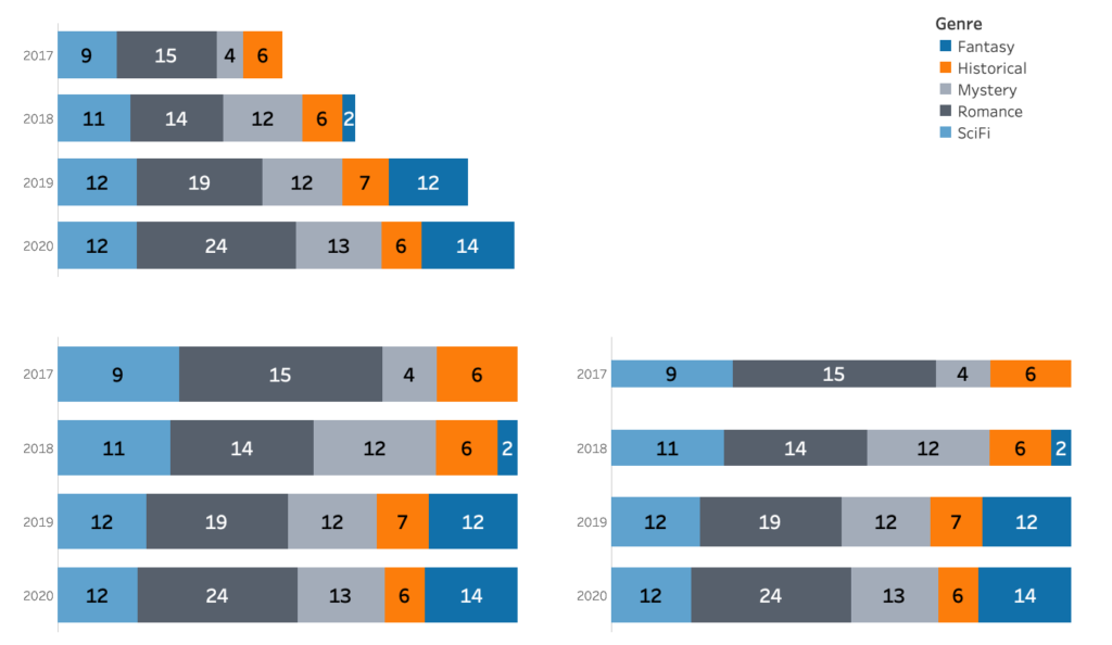
The width of the bars on the right shows me the total number of books that year. At the same time, I can still see relative contributions easily, because the length of the whole does not change.
More part-to-whole visualisations next time! I’ll bring pie and donuts.
Part 4 available here.


