
This is my second blog of a series about data visualization and Tableau. In this blog, I will answer the following three questions: What is color theory? Why should you care about color theory? And, how can you use it within Tableau? I hope you will enjoy reading this blog and learn from it. While writing I definitely did.

What is color theory?
Color theory is both the science and art of using color. It involves the methods used to create colors as well as the messages colors communicate. By understanding color theory basics, you can create and use color palettes more effectively. I will discuss four components of color theory, namely: the color wheel, color models, color properties, and color schemes.
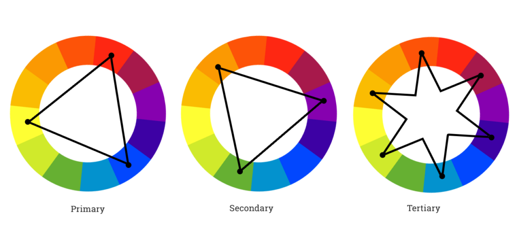
Color wheel
The color wheel is used to group colors into three categories: primary, secondary, and tertiary. This makes twelve basic colors in total: three primary (red, yellow, and blue), three secondary (mix of primary colors), and six tertiary (mix of primary and secondary colors). Furthermore, when drawing a line through the center of the wheel, you can separate warm (reds, oranges, and yellows) from the cool colors (blues, greens, and purples).
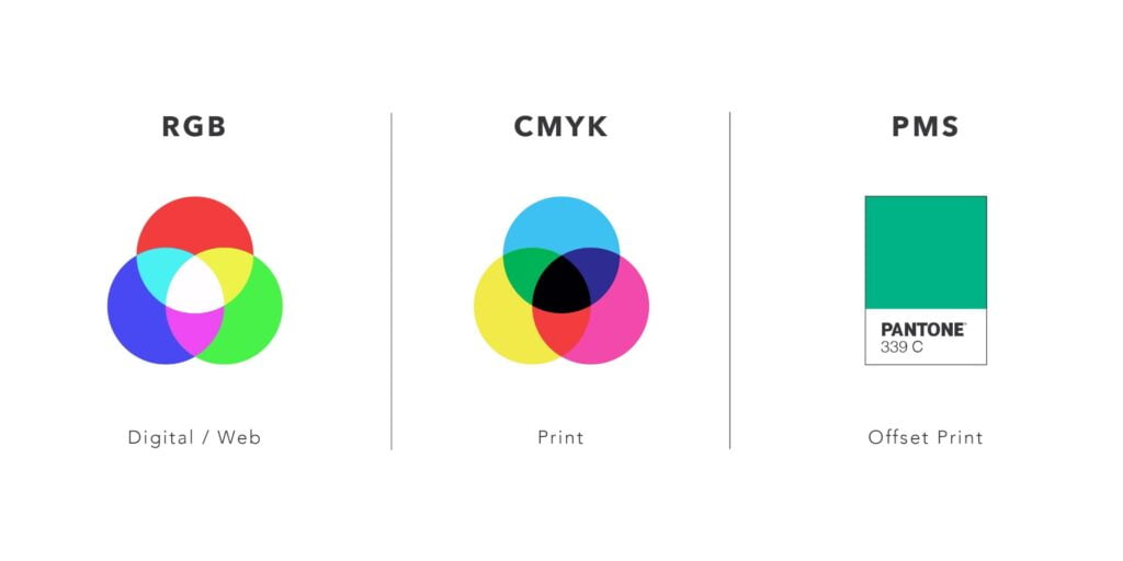
Color models
There are two main color models: the additive or RGB model and the subtractive or CMYK model. RGB stands for Red, Green, and Blue (RGB). In this model, the more color you add, the closer you get to white. On the other hand, we have CMYK which stands for Cyan, Magenta, Yellow, and Key (i.e. Black). Here, subtractive means that you subtract the light from the paper by adding more color. The more colors you add, the closer you get to black. If you want to know more, please have a look at this video.
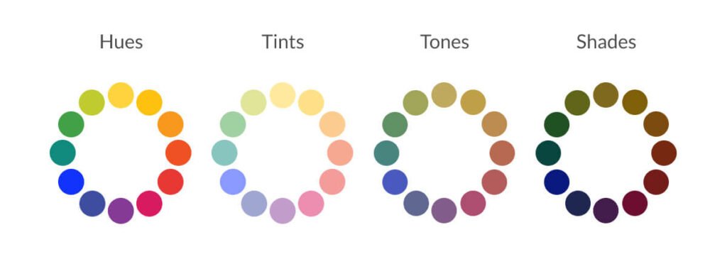
Color properties
When choosing colors, the color wheel gives you opportunities to create brighter and darker colors by mixing white, black, and gray with the original colors (also known as hue). This creates the following variants: shade (by adding black), tint (by adding white), and tone or saturation (by adding gray). The online tool 0 to 255 is great to lighten and darken your colors.
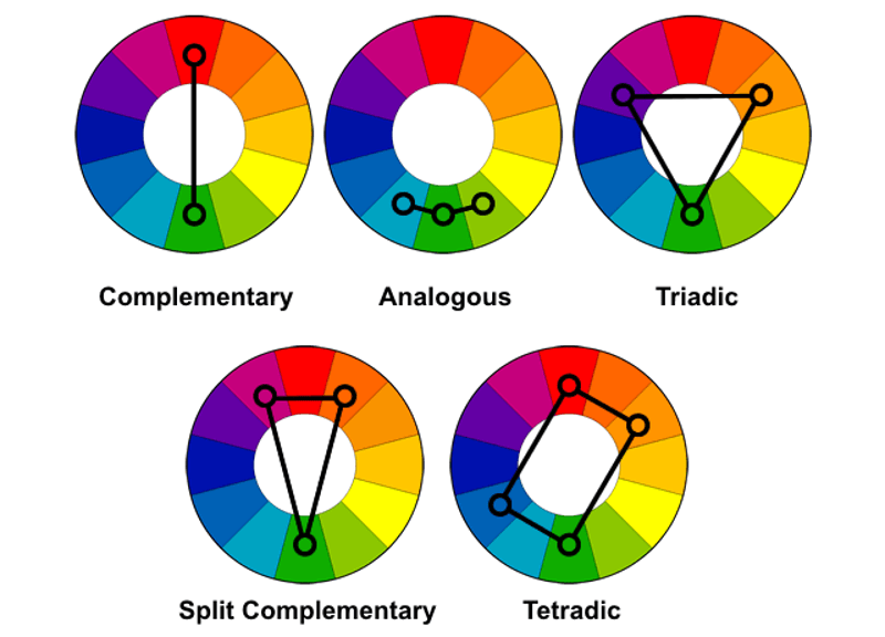
Color schemes
There are multiple methods to combine colors. These are called color schemes. Below I briefly describe four ‘popular’ types::
- Complementary: two colors directly across from each other on the color wheel.
- Triadic: three colors that are equally placed in lines around the color wheel.
- Analogous: two to five colors adjacent to each other on the color wheel.
- Tetradic: four colors distributed evenly around the color wheel.
Try it yourself by using the Adobe color wheel.
Why should you care about color theory?
Color is one of the most important aspects, if not the most important, of your design. Each color has a different meaning and thereby sets a different mood. It also helps you to convey the message you want by guiding the viewer’s eye. By understanding color theory, you can create a visualization that makes a bigger impact. Want to know more about the different meanings of color? Check out this article.
How can you use it within Tableau?
By using the knowledge of color theory you can start creating your own color palettes. There are numerous tools you can find online. Some of the ones I have used are Color Hunt, Picular, Coolors, Color Picker, Colormind, and Color Brewer.
Tableau has a number of predefined color palettes. However, you can also create your own palettes by modifying the preferences file. Check out this Tableau Help article and learn how to create your first palette. Also, have a look at the Color Tool for Tableau which can automatically generate a preference file.
Now you only need to decide on the nature of your data. If you want to visualize a discrete dimension such as Region your palette should contain several distinct colors. Another type of palette within Tableau is the sequential color palette. This type is used for continuous fields, mostly measures. This palette uses a single color varying in intensity. Finally, Tableau lets you create diverging color palettes. These are great for showing contrast.
Helpful resources:
- Color theory and the color wheel: https://www.canva.com/colors/color-wheel/
- Understanding color theory: https://99designs.nl/blog/tips/the-7-step-guide-to-understanding-color-theory/
- Diverging versus sequential color palettes: https://blog.datawrapper.de/diverging-vs-sequential-color-scales/
- Create accessible color palettes: http://colorsafe.co/
- Generate Tableau palettes from an image: https://color.tableaumagic.com/
Next up, typography and what it has to do with your data visualization within Tableau.
Thanks for reading and don’t forget to tell your friends! If you want to improve your Tableau skills, have a look at our training page. If not, we are there to help you. For more information, please have a look at our website. Finally, if you want to know more or just have a chat? Just contact me through LinkedIn.