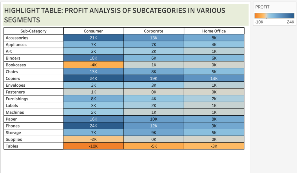
Tableau lets us visualise data as many chart types. One of which is the “Highlight Table”.
Highlight Tables are an advanced version of Excel tables (cross tabs). Tableau uses conditional formatting to a view of a normal table. We can grab the insights of the data on the first sight as it highlights all the values using shades of colour. (Default colour is blue and orange; we can edit it as per our requirements).
To create a highlight table we require one or more dimension and measure in the rows and columns shelf in the Tableau worksheet.
After dragging the dimensions and measures, we can create a highlight table in 2 ways.
1. On the marks card, select the mark type as “Square”.
2. On the menu, click on Show me and select “Highlight Tables”.
STEPS TO CREATE A HIGHLIGHT TABLE
DATA SOURCE: Sample Super Store
OBJECTIVE: To analyse the profit yielded by subcategories in each segment.
STEP 1: Drag Segments to the columns shelf and Sub category to the rows shelf.
STEP 2: Drag ‘Profit’ to Label and Color in the Marks card. This will highlight the values in blue and orange.
STEP 3: To view as highlight table select square as mark type from marks card or select show me from menu and click on highlight tables.
STEP 4: The table is created.
ADVANTAGE
The highlight tables is the first step to demonstrate the importance and ease of visualizations to the environments using legacy systems like Excel Tables opening the doors to understand data much better.
This also has an advantage that it does not take away the table and spreadsheet culture that we are familiar with.
DISADVANTAGE
This type of chart is not suitable to visualise data that has more number of records as it lets us scroll indefinitely.
INSIGHTS FROM THE HIGHLIGHT TABLE
- Copiers have been yielding the highest profit in all 3 segments.
- Consumer segment has the highest profit with Phones and copiers contributing the most.
- Tables has generated a loss in all 3 segments.


