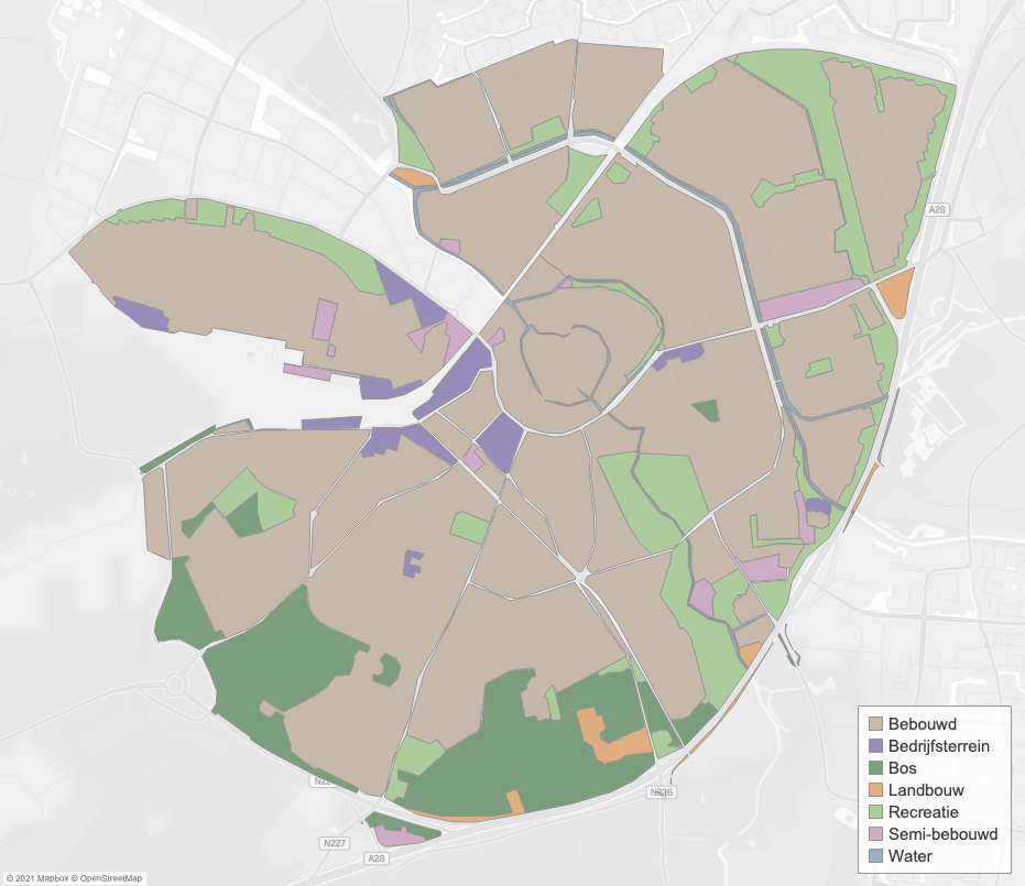
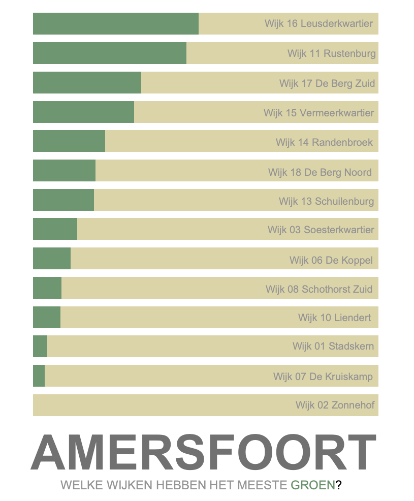
Tableau 2021.2 brings some new, long expected spatial functions. This is good news for users who work with maps and spatial data. In this post we will go deeper into these new spatial functionalities using an example. This example is about the Dutch city of Amersfoort. We are going to investigate which neighbourhoods have most public green. View the full dashboard here (dashboard in Dutch).
Area Calculations
The first new spatial function in Tableau 2021.2 we will discuss is the Area function. Using the area function we can use Tableau to calculate areas. Besides, we can opt for different units (meters, miles etc.).

We are using a dataset containing land usage in Amersfoort (Data: CBS Bestand Bodemgebruik 2015). The land use is subdivided in a number of categories. We would like to know the amount of public green in each neighbourhood. We can now easily calculate the area using the Tableau 2021.1 area function. Firstly, we create a new calculated field. Subsequently, we enter the column containing the geometry. Lastly, we enter the units we want to calculate with. In our case we choose kilometers.

We have now calculated the area of different land usages. Subsequently, we can easily visualise this data using Tableau. We use a bar chart to visualise which neighbourhoods relatively have most public green.

Map Layers Control
Once upon a time, many Tableau versions ago, maps were introduced to Tableau. Throughout the years, many new mapping functionalities were added. However, two widely requested features were missing. Firstly, the possibility to add multiple map layers to one map. Secondly, the possibility to toggle map layers on and off. Well, the wait is over! Tableau has now introduced ‘Map Layer Control’. And it was worth the wait.
What does it do? It’s simple. The map layer control allows users to toggle on or off map layers. Super useful if you added multiple layers and don’t want to drown your users in information.
Let’s take our previous example about public green in Amersfoort. We would like to see the amount of public green in a map as well. We can do this by creating a pie chart per neighbourhood. The pies represent the amount of public green vs non-green. Besides the pie chart, we also want to show the areas that are used in the area calculation. Lastly, we want to include the neighbourhood boundaries as well. Using the map layer control, users can now toggle these different layers on or off themselves.
In short, these new spatial functions in Tableau 2021.2 are most welcome. Since these additions add loads of new possibilities for using maps in Tableau. You can view the whole dashboard here (dashboard in Dutch).

Want to know more about maps and spatial in Tableau? Let’s connect on LinkedIn. Also, I will post dashboards using maps on Tableau Public. Want to improve your Tableau skills? Have a look at our training sessions. Lastly, my colleagues and I are glad to help with any of your (spatial) data questions!


