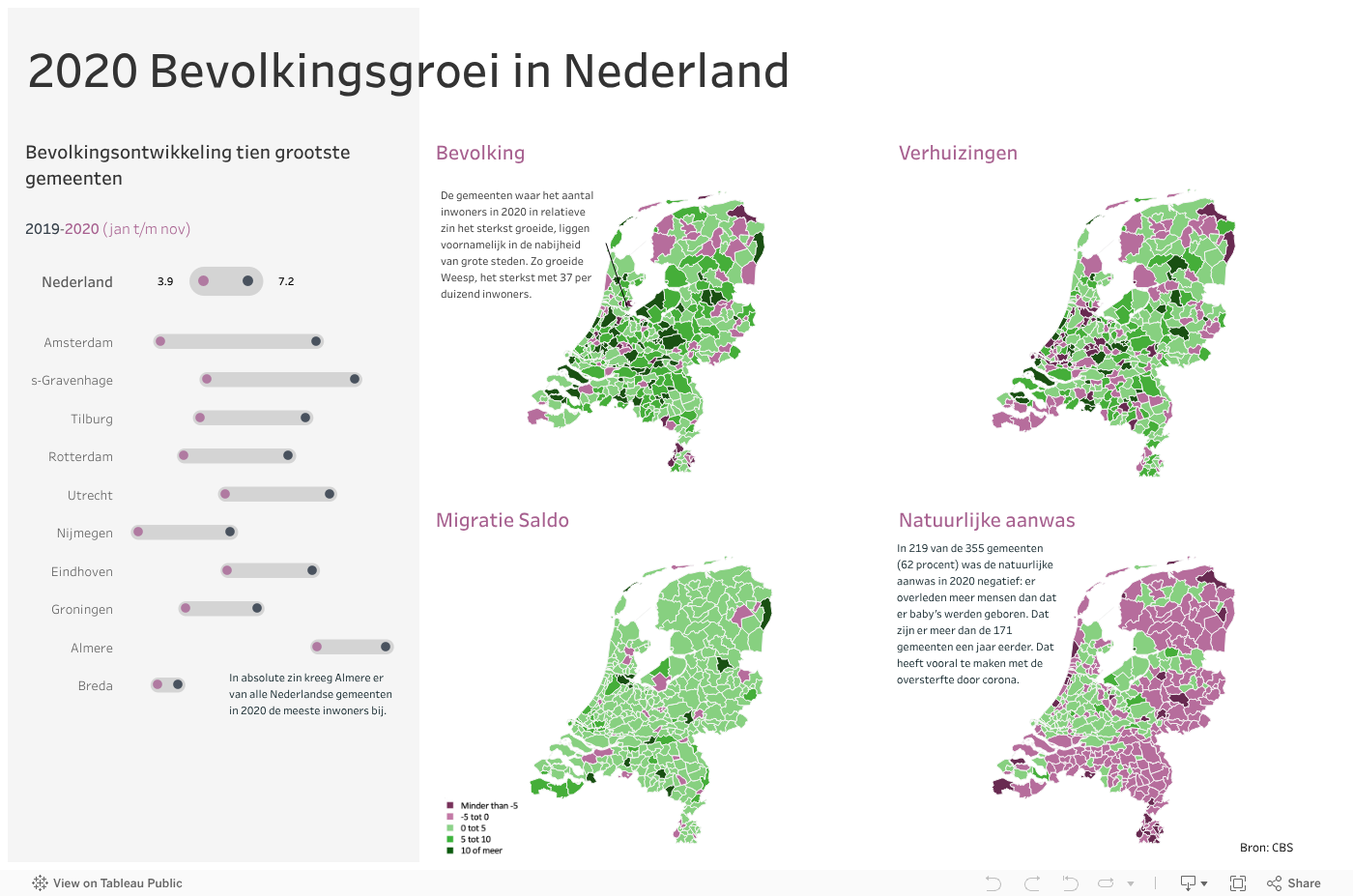
Dashboards are located in a place between data and design. The objective of a dashboard is to allow users to learn something about their data and take decisions. So the ‘ultimate’ dashboard is the one that provides actionable insights and is adopted by your end-users. Using this dashboard below as an example, I’ll share 3 design tips on legend, annotations, and margins that you can implement in Tableau.
Tip 1 – Legend design
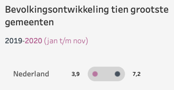
By default, Tableau will automatically create a simple legend for you. To give your dashboard more space, you can integrate the legend into the sub-title of the chart. Like the example below, I gave a color of each year of my legend.
If you want more inspiration for your legend, look at this blogpost from Ken Flerlage https://www.flerlagetwins.com/2019/06/legends.html
Tip 2 – Increase your margins
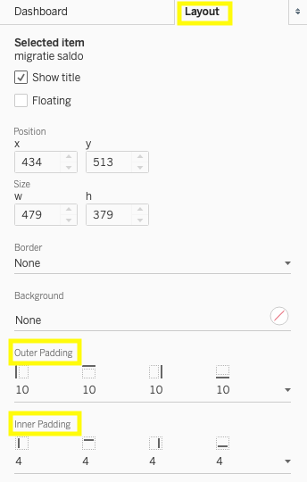
In your dashboard, white space is the area of blankness between your different elements. By increasing the space around them, you will help users to concentrate on your charts.
Thus, don’t hesitate to increase the outer or inner padding around the visualisations of your dashboard. This design tip will ensure they are framed with a balanced area of white space.
Tip 3 – Add context with annotations
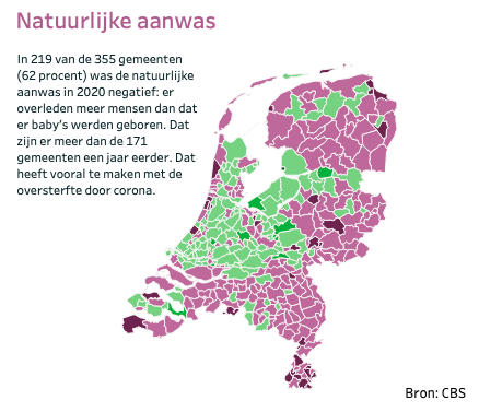
Looking at this map in our dashboard, you might wonder why this population change happened last year?
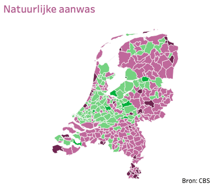
So we have a map with a really interesting trend that gives no clues as to what causes it. By adding the annotations, it will answer these kind of questions. In Tableau, you can use Annotations on any chart or map. Right click on a mark and select ‘Annotate’.
Do you want to learn more about Tableau or Alteryx? Do you want to use these tools to their full potential? Check out our trainings and consultancy services!


