What’s your UI design problem?
You want to present the end-user with different groups of charts that fall into distinct categories, but displaying everything on one view would the experience of the user. Therefore, they need to be provided with some means of navigating between different dashboard and returning back to their starting position
So we need to give our end-users a sort of plan, like a central ‘station’ from which they can access any dashboards they want to visit.
The design solution? Global navigation using navigation buttons!
Global navigation is an area of the dashboard reserved for buttons, links or any other design element affording movement in the dashboard. This area should be identical across all different dashboards as it should provide a consistent means of navigation.
Let’s start with a simple example. In this dashboard below, the global navigation consists of one horizontal bar of 5 navigation buttons. This navigation bar include category titles that direct the user to the associated content when clicked.
Whichever section of the dashboard end-users are on, the top-level navigation bar is located in the same position. This is ensuring them to move quickly from one section to another without any backward steps. Arranging category labels along the top will give the end-users an overview of the dashboard and informs them of where they can go and where they are.
How to create this navigation bar in Tableau?
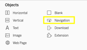
In Tableau Desktop, we can combine multiple buttons together. First, drag a horizontal container and drag the navigation objects. Configure your buttons and then select the container, click the arrow and choose ‘Distribute Evenly”.


Do you want to learn more about Tableau or Alteryx? Do you want to use these tools to their full potential? Check out our trainings and consultancy services!


