Recently I was taking a quick look into the built-in Tableau Server 2020.1 beta reports.
A colleague was talking about them and described how Tableau has really improved upon the reports that are currently available on Server.
Whilst having a sneak-peak into those reports a certain part of the report caught my eye, it was a highlight table as a Viz in Tooltip.
I know, Viz in Tooltip is not something new and neither is using a highlight table, but as you can see the axis have arrows and a quadrant is highlighted using a border.
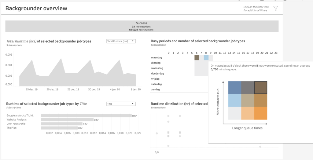
I was immediately intrigued about the method of creating this, and pleasantly surprised about the nifty trick used.
My thinking went along the lines of creating the axis separate as picture and combining a highlight table or some such, which would need three individual sheets brought together in the tooltip.
Imagine my surprise when opening up the tooltip and all I could see was one sheet.
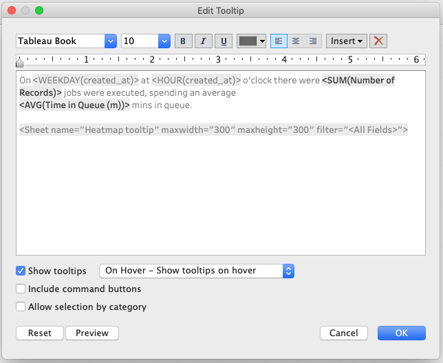
Opening up this sheet shows that what we are actually seeing is a shape which is based on a field.
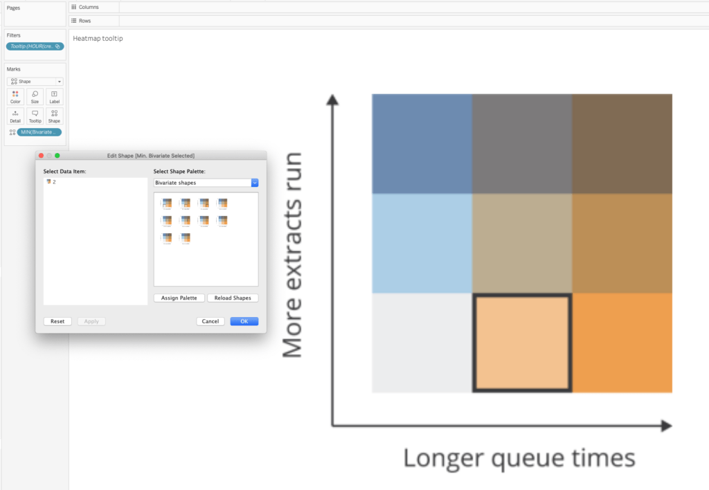
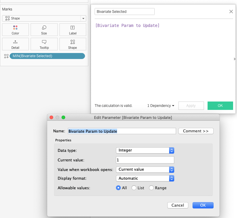
Digging further shows that this field is filled by a parameter value.
So we shouldn’t be too surprised by now that the parameter will be used in a parameter action, such that based on the value shown in the original viz this field is filled with an integer.
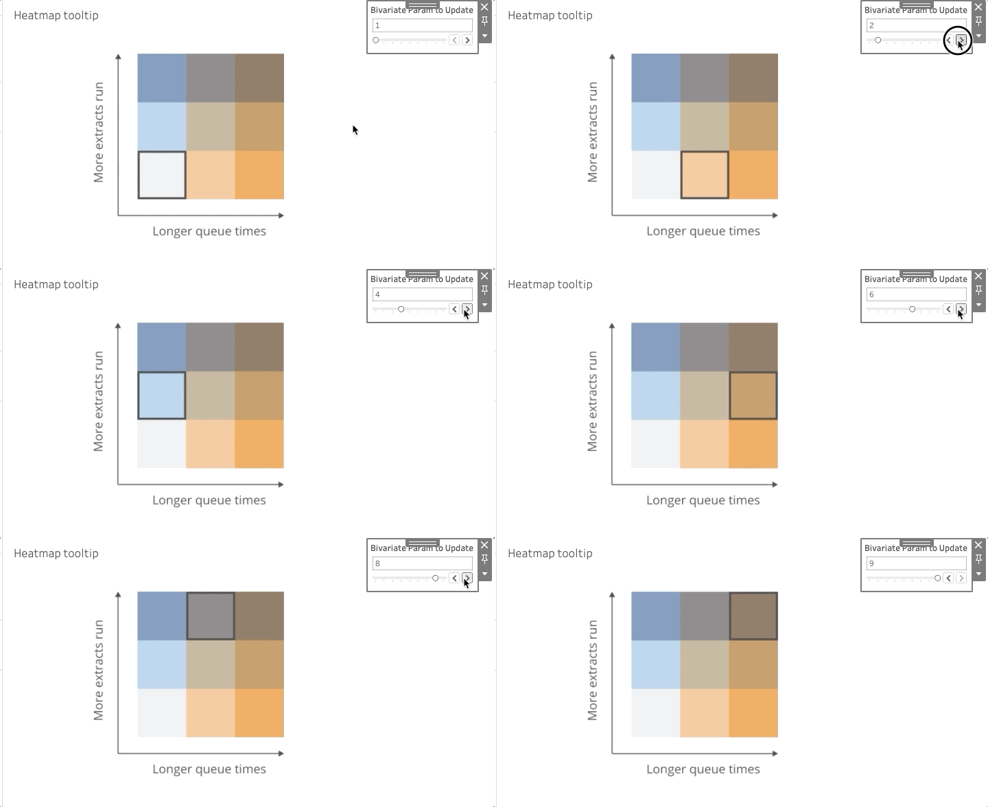
I really like this way of creating what seems to be a viz, by using a shape with a high-res image. Instead of using difficult LOD expressions and images for the axis or some such which would need to be aligned, this Tableau developer decided to use static images.
I can imagine using this trick in different ways, for instance to showcase logo’s or static pictures.
If you would like to have a look and cannot wait or won’t have access to the new 2020.1 Server Reports I’ve published a version on how this would work on Tableau Public.


